Next.js image optimization techniques
Last edited:
Before we start looking at the image optimization techniques which Next.js provides out of the box, let’s agree on one thing... I will try to avoid all those trendy terms which the performance world is crazy about today, such as Core Web Vitals, Largest Contentful Paint, Cumulative Layout Shift, First Input Delay, etc. The terms are well-described by experts in the performance niche, for example in Addy Osmani’s book about image optimization. And I will focus more on the practical side of image optimisation in the Next.js context.
Why bother about performance
Do you know why companies spend thousands on performance optimization? The answer is simple - because the performance is directly correlated with whether customers give their money to the companies or not.
A typical customer wants to get a service or product as fast as possible, and the site which satisfies the need faster than others gets more sales, signups, conversions, and, as a result, more revenue.
The golden rule of performance optimization
The golden rule of any performance optimization for me can be simply put as giving users what they want in the shortest time possible or providing a temporary alternative, for example, some useful information, an entertainment option or freedom of doing anything else while waiting for the requested result.
Give users what they want in the shortest time possible or provide a temporary alternative.
If satisfying a user's need as fast as possible is ensured by direct performance optimization measures, for example making the server faster, then providing the user with a temporary alternative only offers a temporary relief while performing the requested action, for example displaying a progress indicator. The last significantly improves user experience (UX).
Therefore, in this post, I will logically divide image performance optimization techniques into two types, such as optimizing image load and providing a temporary alternative.
Start from examples
I assume you’re familiar with React and Next.js. If you need to refresh your knowledge of Next.js, please follow my Next.js Tutorial first.
I’ve prepared a few examples which you can use to experiment with Next.js Images.
Let’s start from cloning my examples project from Github:
$ git clone https://github.com/kkomelin/nextjs-image-optimization-examples.gitOpen the project in your IDE and look inside the /pages folder. The Next.js pages, located in this folder, are named according to the corresponding image optimization techniques.
Run the app with:
$ yarn devThen open localhost:3000 in Chrome to see the list of available examples. We will go step by step from the top to the bottom.
Native <img> tag
The first example demonstrates the use of the native HTML tag just to compare it with other examples.
<img
  src="/sunset1.jpg"
  alt="Sunset"
  width={600}
  height={450}
/>
All images used in this post are served from the /public folder including sunset1.jpg. Please note that Next.js forces using their <Image> component instead of the native <img> tag by including the corresponding linter check to the app build process, so to build the app I had to disable the check by adding "@next/next/no-img-element": "off" to the rules section of the .eslintrc config.
Let’s run the example and open in Chrome with Chrome Dev Tools activated localhost:3000/native-img-tag.
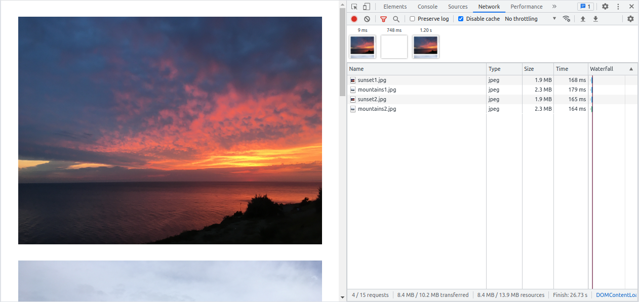 sunset1.jpg - 1.9MB - jpeg - 4032x3024
You may see that all images have been loaded “as is” with their original resolution (4032x3024), size (> 1MB) and format (JPG). However, we only need 600x450 pixels in our case, so there is obviously room for improvement.
Unoptimized Next.js images
The /pages/unoptimized-images.js file contains an example of Next.js Image component settings which simulate the <img> tag behavior.
<Image
  src="/sunset1.jpg"
  alt="Sunset"
  width={600}
  height={450}
  unoptimized={true}
  loading="eager"
  layout="fixed"
/>
We can run the code by opening localhost:3000/unoptimized-images in the browser.
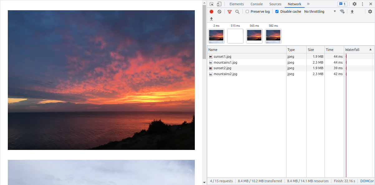 sunset1.jpg - 1.9MB - jpeg - 4032x3024
Next enables a few performance optimization techniques by default, so I had to add a few attributes to disable them for now. Later I will show you the techniques in action but what’s more interesting at this stage is to look at what HTML code the Image component renders.
<span style="box-sizing: border-box; display: inline-block; overflow: hidden; width: 600px; height: 450px; background: none; opacity: 1; border: 0; margin: 0; padding: 0; position: relative">
  <img
    alt="Sunset"
    src="/sunset1.jpg"
    decoding="async"
    data-nimg="fixed"
    style="position: absolute; top: 0; left: 0; bottom: 0; right: 0; box-sizing: border-box; padding: 0; border: none; margin: auto; display: block; width: 0; height: 0; min-width: 100%; max-width: 100%; min-height: 100%; max-height: 100%">
</span>
You may see a <span> wrapper around the standard <img> tag with some styles. The wrapper and styles are here for better positioning, sizing and scaling the image on the page.
I should also mention that it’s possible to import an image as a React component or from an external source.
// Import as a React component.
import sunsetImage from '../public/sunset1.jpg';

<Image
  src={sunsetImage}
  {/*... */}
/>

// Use an external image.
<Image
  src="https://example.com/image1.jpg"
  {/*... */}
/>
But if you’re using external images, don’t forget to add the image domain through the Next config. Otherwize, it won’t work.
// next.config.js
module.exports = {
  // ...
  images: {
    domains: ['example.com'],
  },
}
Optimizing image load
Better format, size and resolution
It’s time to optimize the images. I did it in /pages/better-format-size-resolution.js where I enabled default image optimization by removing the following property:
unoptimized={true}So the component looks like the following:
<Image
  src="/sunset1.jpg"
  alt="Sunset"
  width={600}
  height={450}
  loading="eager"
  layout="fixed"
/>
To see what’s changed, let’s open the example localhost:3000/better-format-size-resolution.
 sunset1.jpg - 10.9kB - webp - 640x480
As you may see, the image path has changed to localhost:3000/_next/image?url=%2Fsunset1.jpg&w=640&q=75.
Here q=75 means that the default image quality is 75%.
If you need to adjust default quality, use quality property:
<Image quality="90"/>Next has changed the image format from JPG to WebP because my browser supports this modern format which demonstrates better compression.
Hey, wait a minute... Why does it serve images of 640px width if we requested 600px? That’s because this value is configured through Next.js config. The default breakpoints are:
// next.config.js
module.exports = {
  images: {
    deviceSizes: [640, 750, 828, 1080, 1200, 1920, 2048, 3840],
  },
}
Next uses the closest defined value of the width to generate the image, so if you know the exact resolutions of images in your app, feel free to add their widths to the list to make the generated resolutions match the requested resolutions as close as possible. And I will add 600 to the list to achieve better optimization results:
// next.config.js
module.exports = {
images: {
deviceSizes: [600, 640, 750, 828, 1080, 1200, 1920, 2048, 3840],
},
}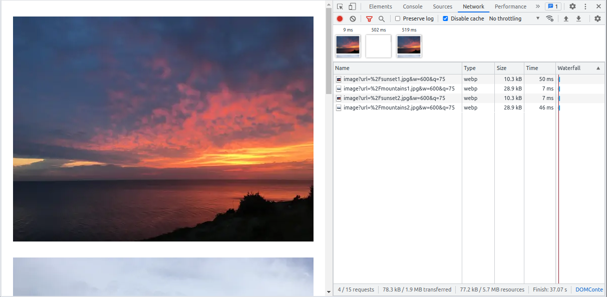 sunset1.jpg - 10.3kB - webp - 600x450
Responsive images
You probably know that it’s possible to serve a better image resolution based on the device (viewport) size using <img srcset=""> and <picture> HTML features, or image-set in CSS.
Next.js Image component utilizes srcset property to serve images adaptively.
So far, we have used a fixed layout for images which worked similarly to the native <img> tag. Now we’re going to enhance our images by adding alternative image variants for different device sizes. Next does it for us automatically if we set the layout property to responsive.
<Image
  src="/sunset1.jpg"
  alt="Sunset"
  width={600}
  height={450}
  loading="eager"
  layout="responsive"
/>
If we open this example in the browser localhost:3000/responsive-images, we will see the srcset property with all possible variants added to the resulting image:
<span style="box-sizing: border-box; display: block; overflow: hidden; width: initial; height: initial; background: none; opacity: 1; border: 0; margin: 0; padding: 0; position: relative">
<span style="box-sizing: border-box; display: block; width: initial; height: initial; background: none; opacity: 1; border: 0; margin: 0; padding: 0; padding-top: 75%"></span>
<img
alt="Sunset"
sizes="100vw"
srcset="/_next/image?url=%2Fsunset1.jpg&w=600&q=75 600w,
/_next/image?url=%2Fsunset1.jpg&w=640&q=75 640w,
/_next/image?url=%2Fsunset1.jpg&w=750&q=75 750w,
/_next/image?url=%2Fsunset1.jpg&w=828&q=75 828w,
/_next/image?url=%2Fsunset1.jpg&w=1080&q=75 1080w,
/_next/image?url=%2Fsunset1.jpg&w=1200&q=75 1200w,
/_next/image?url=%2Fsunset1.jpg&w=1920&q=75 1920w,
/_next/image?url=%2Fsunset1.jpg&w=2048&q=75 2048w,
/_next/image?url=%2Fsunset1.jpg&w=3840&q=75 3840w"
src="/_next/image?url=%2Fsunset1.jpg&w=3840&q=75"
decoding="async"
data-nimg="responsive"
style="position: absolute; top: 0; left: 0; bottom: 0; right: 0; box-sizing: border-box; padding: 0; border: none; margin: auto; display: block; width: 0; height: 0; min-width: 100%; max-width: 100%; min-height: 100%; max-height: 100%">
</span>As you see, Next adds image variants for each device size listed in the config, ranging from 600px to 3840px width.
I intentionally decreased and increased the viewport width, to test the responsive images.
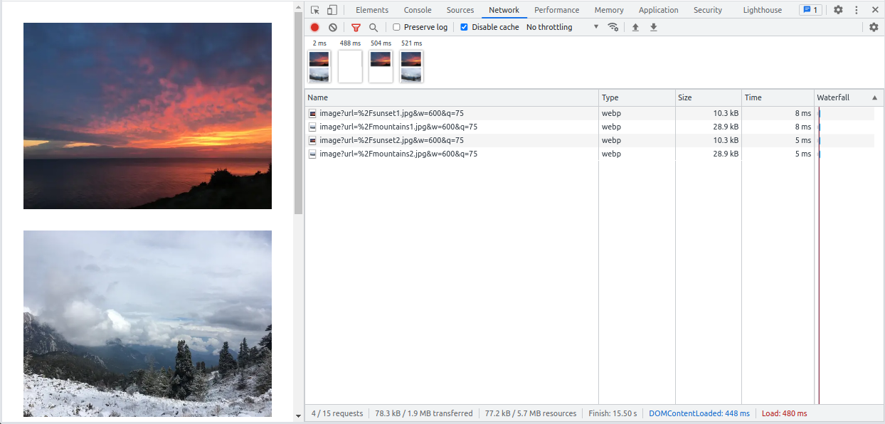 sunset1.jpg - 10.3kB - webp - 600x450
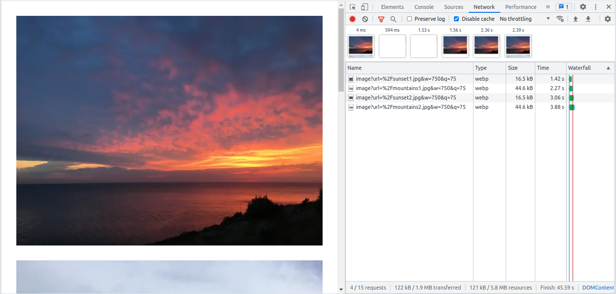 sunset1.jpg - 16.5kB - webp - 750x563
Only those four images which better fit my viewport size are loaded and displayed.
While working on the examples, I noticed a nasty problem caused by predefined Image component styles. I wanted to put Image components inside a Flexbox container to display them in a column but the styles conflicted and it caused the images to become invisible. To work around, I had to report the bug and switch to the CSS Grid container.
Lazy loading
Next.js Image component enables lazy loading by default, meaning that the app only loads and displays the images which are currently on the user screen, reducing the amount of data which user downloads. It’s not only beneficial for the end-user but it’s also good for the server because it doesn’t have to run image generation for images which might never become necessary.
Since the lazy loading is a default setting for the Next Image component, let’s just remove loading="eager" to make it work.
<Image
  src="/sunset1.jpg"
  alt="Sunset"
  width={600}
  height={450}
  layout="responsive"
/>
Run the app and open the lazy loading example localhost:3000/lazy-loading.
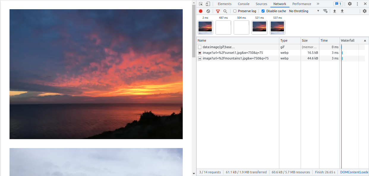 sunset1.jpg - 16.5kB - webp - 750x563
In the screenshot, we see that only two visible images are loaded on page load. Others will be loaded on demand or, in other words, when you scroll to them.
Preload images
Sometimes you may need to preload the most important images in advance. Next.js Image component can prioritize loading the image through priority=.
In the screenshot below, mountains2.jpg which is located at the bottom of the page is loaded earlier than others because of the increased priority.
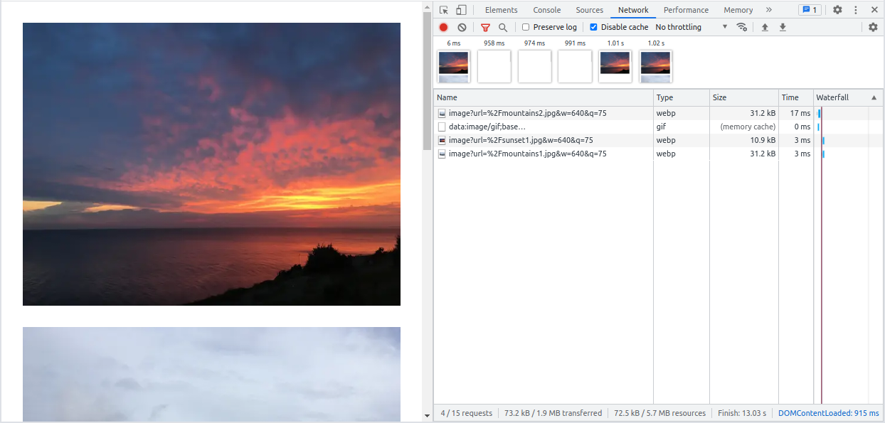 Image preload with Next.js in Chrome Dev Tools
In the screenshot, we see that only two visible images are loaded on page load. Others will be loaded on demand or, iGood news is that the image preload feature is compatible with responsive images. You may check out the related example by running the examples project and opening localhost:3000/image-preload.
CDN and image transformation services
Sometimes it’s beneficial to use a third-party image service to transform and deliver images. The main reasons are:
- the image is served from the geographically closest datacenter using CDN network,
- a cloud provider may have more transformation options,
- you don’t need a performant CPU to process images and extended disk space to store them.
Next.js Image component supports a few cloud providers out of the box by setting the loader property of the component.
Next.js doesn’t have a built-in integration preset for the Uploadcare service but we have developed an image loader and a helpful UploadcareImage component which you may use to integrate your project with Uploadcare easily. Check out our docs for more info.
Providing a temporary alternative
For images, the temporary alternative is usually a loading indicator, a blurred version of the original image or an image of a lower quality. The temporary image replacement prevents the page content from jumping up and down, and indicates that the image is being loaded.
Next can generate a blurred placeholder image automatically or let us provide our own custom placeholder image.
Default placeholder
Next can generate a placeholder based on the image but it requires the image to be imported statically.
// pages/default-placeholder-image.js
import sunset1 from '../public/sunset1.jpg';

<Image
  src={sunset1}
  alt="Sunset"
  width={600}
  height={450}
  layout="responsive"
  placeholder="blur"
/>
This code produces the following nice effect:
The placeholder here is a small-resolution inline image following original image colors and represented by a string like this one: “data:image/jpeg;base64…”.
Run the examples app and see it in action here localhost:3000/default-placeholder-image.
Custom placeholder
To show how to add a custom placeholder image, I’ve created a gray 1x1 pixel image in the base64 encoding through PNG Pixel service and passed it to my image components through blurDataURL property:
<Image
  src="/sunset1.jpg"
  alt="Sunset"
  width={600}
  height={450}
  layout="responsive"
  placeholder="blur"
  blurDataURL="data:image/png;base64,[IMAGE_CODE_FROM_PNG_PIXEL]"
/>
On the page localhost:3000/custom-placeholder-image, it looks like this:
As a user, I would definitely appreciate such a UX improvement.
Image component limitations
Nothing in the programming world is 100% perfect, and the Image component has room for improvement too. I’d like to briefly mention what I would improve.
Hard to adjust default CSS styles
<Image
  src="/sunset1.jpg"
  alt="Sunset"
  width={600}
  height={450}
  loading="eager"
  className="image"
/>
This code will add the image class to the <img> tag and not to its parent <span> wrapper rendered by the Image component, so it’s hard to override the wrapper styles. The same is valid for the style property of the image component.
Conflicts with flexbox
I initially put my images inside a Flexbox container but then had to replace it with CSS Grid because I caught a next/image bug. It turned out it’s a known issue and Next.js developers are currently working on a solution.
Increased server load and disk space utilization
Although generating an image at runtime has its own benefits, it's a resource-consuming operation.
Image generation is a calculation process meaning it actively uses CPU and RAM. If you load a page with ten images located in a visible part of the page the first time (without cache; without lazy loading enabled), you trigger ten calculation processes on the server. Therefore, if you need loading="eager", use it cautiously to avoid unnecessary server load.
Another thing I’d like to point out is disk space utilization. When a user loads a page with a Next.js Image component on it the first time, Next generates an image of a suitable size and format. The resulting image is stored in the filesystem cache which is located in the ./next/cache/images folder of the project. When the user loads the page next time, the image is served directly from cache, which saves CPU time. However, if your app has many different images, for example with responsive variants, you need to monitor your disk space utilization to prevent the cache from eating out all available disk space.
However, as I mentioned before, both the disk utilization and server load issues can be addressed by switching to an external image transformation service and CDN.
<Image> pros and cons
Let me quickly sum up what I like about Next.js Image component and what can be better.
| Pros | Cons |
|---|---|
| More compact image format by default | Difficult to override default CSS styles |
| Smaller image size by default | Conflicts with Flexbox |
| Better image resolution by default | Increased server load and disk space utilization (if used unwisely) |
| Lazy loading of images by default | |
| Responsive images support | |
| Image preloading support | |
| Image placeholder support |
Conclusions
- When choosing an alternative to the native HTML tag, you should accept the fact that someone predefined styles for it which are not always easy to adjust. Good news is the Next team is listening to our feedback and already working on a solution for this and other limitations in their experimental next/future/image component.
- If you can’t optimize image load for some reason, consider adding a temporary image replacement because it drastically improves UX.
- With next/image, images are not generated during build phase which speeds up the app deployment, but the generation still consumes the same resources and machine time at runtime.
- I personally think Next.js is on the right track with their image UX and performance improvements. This is what I miss in the native HTML <img> tag.
- External CDN and image transformation services can improve performance and add more flexibility to your images. We have developed the Uploadcare loader exactly for the purpose of integration with Uploadcare CDN and transformation services. Read how to use it here.
What’s next
You may review the official next/image docs or the image component examples in case you are looking for something specific which you didn’t find in my post.
The built-in Next.js image optimization is not the only way of improving image performance in Next, so you may check out cyrilwanner/next-optimized-images and twopluszero/next-images projects if you’d like to consider alternative solutions.