> For clean Markdown of any page, append .md to the page URL.
> For a complete documentation index, see https://uploadcare.com/docs/llms.txt.
> For AI client integration (Claude Code, Cursor, etc.), connect to the MCP server at https://uploadcare.com/docs/_mcp/server.
# Responsive images
> Uploadcare provides an extensive responsive images toolkit to build adaptive designs and optimize your web app performance.
Uploadcare helps you deliver the optimal image size and resolution for any device
and bandwidth, improving page loading times and user experience.
You can automate image responsiveness in several ways:
* Automatically via [Adaptive image component](/docs/adaptive-image/)
* Use framework integration:
* [Next.js image loader and component](https://github.com/uploadcare/nextjs-loader)
* [Nuxt](https://image.nuxt.com/providers/uploadcare)
* Manually
Additionally, you can enhance the display of responsive images by leveraging
[art direction techniques](#art-direction) to create custom layouts for different devices.
## Creating a responsive image manually
To make a single image responsive:
* [Resize](/docs/transformations/image/resize-crop/#operation-resize) the image to fit the widest
container, ideally preserving its aspect ratio.
* Set width: 100%; declaration to the image block so that the image
adapts to the container width automatically.
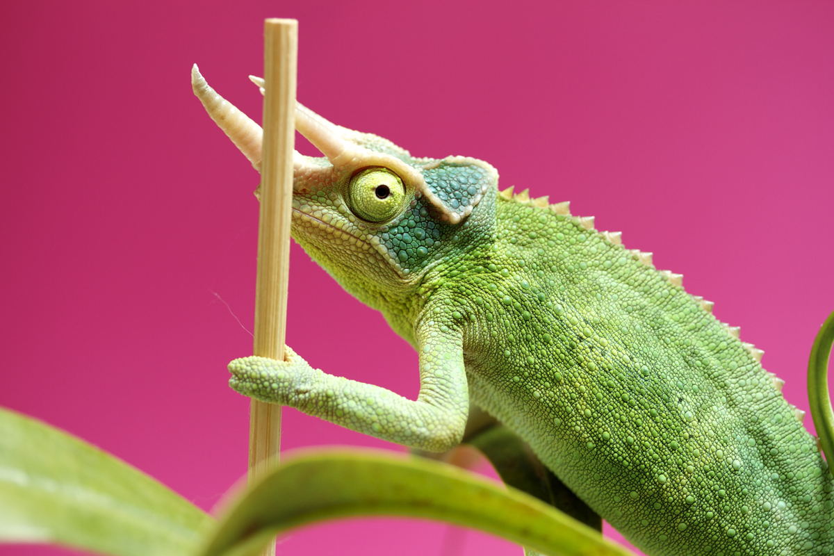
* For instance, if your original image resolution is 4928x3280px with
a file size of 1.85 MB:
```
https://examples.ucarecd.net/36f90908-afb9-4e0a-b254-1b769faf8f3a/
```
If the container width is limited to 1200 px on the widest screens,
use the resize operator in the image URL to reduce its resolution and file size:
```
https://examples.ucarecd.net/36f90908-afb9-4e0a-b254-1b769faf8f3a/-/resize/1200x/
```
Insert the updated image URL into the `src` attribute of the `` tag:
```html
```
The original image width has been reduced to 1200px, and the file size
has been reduced to just 125 KB.
### Optimize the image for high pixel ratios
Set an additional version of the image for HiDPI screens with
the `` element and the `x` descriptor.
Retina screens have a pixel ratio of 2. To optimize for them:
* Multiply the `resize` value by 2.
* Reduce the image quality using
the [`quality` operation](/docs/compression/#operation-quality).
* Add the alternative image link to the `srcset` attribute followed by the
`2x` descriptor that ties the image to devices with a 2x pixel ratio.
```html
```
Example with the same image on Uploadcare Image CDN to produce an alternative
retina version of it:
### Optimize an image for different screen widths and breakpoints
Use URL API to:
* Create various resized versions of the image for different
screen widths.
* Add them to the `srcset` attribute followed by a `w` descriptor
with screen width in pixels
* Add the `sizes` attribute to the `` element to set primitive
media conditions. It should contain information on how much of the
viewport will be occupied by the image
Example from the previous section that now contains various versions
of an image optimized for many different widths in `w` descriptors.
Replace `36f90908-afb9-4e0a-b254-1b769faf8f3a` with your image UUID and `examples` with your project's subdomain:
```html
`
/>
```
In this example, this value of `sizes` tells the browser to set the
image width to `50vw` if the viewport width is 1000px or more; otherwise,
occupy most of the screen width:
`sizes="(min-width: 1200px) 50vw, 90vw"`
Take a look at this to see our pal Greenpaws adapt to various screen sizes,
and make sure to try some of your own pictures in it.
## Art direction \[#art-direction]
The art direction issue involves wanting to change the image displayed
to suit different image display sizes. For example, in a broader sense,
apply filters, control colors, and so on, or a web page includes a large
landscape shot with an object in the middle when viewed in a desktop browser.
When viewed on a mobile browser, that same image is shrunk down,
making the object in the image tiny and hard to see. It would probably
be better to show an image on mobile, which zooms in on the object.
Usually, your image looks the same in portrait versions of devices,
on desktops, and in landscape versions.
That may be fine for square images, but the subjects of the wide images
will probably end up looking too small on mobiles:

Use automatic cropping of an image to an object using the
[`scale_crop`](/docs/transformations/image/resize-crop/#operation-scale-crop) operation
instead of resizing images and combining them with media queries.
To use the same image for different layouts — for example, a landscape image
showing the entire scene for a desktop layout and a portrait image showing
an enlarged main subject for a mobile layout — use the `` element.
Use `srcset`/`sizes` to create a resolution switcher example, serving the same-size
image at different resolutions depending on the device resolution or different
image sizes depending on the viewport widths.
```html
```
Note: We recommend using the `media` attribute only in art direction scenarios.
If you use `media`, don't also offer media conditions within the sizes attribute.

 ```
Example with the same image on Uploadcare Image CDN to produce an alternative
retina version of it:
### Optimize an image for different screen widths and breakpoints
Use URL API to:
* Create various resized versions of the image for different
screen widths.
* Add them to the `srcset` attribute followed by a `w` descriptor
with screen width in pixels
* Add the `sizes` attribute to the `
```
Example with the same image on Uploadcare Image CDN to produce an alternative
retina version of it:
### Optimize an image for different screen widths and breakpoints
Use URL API to:
* Create various resized versions of the image for different
screen widths.
* Add them to the `srcset` attribute followed by a `w` descriptor
with screen width in pixels
* Add the `sizes` attribute to the `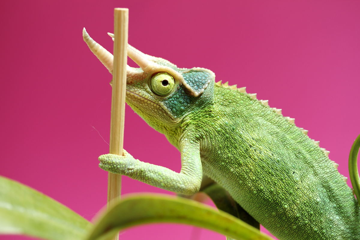 `
/>
```
In this example, this value of `sizes` tells the browser to set the
image width to `50vw` if the viewport width is 1000px or more; otherwise,
occupy most of the screen width:
`sizes="(min-width: 1200px) 50vw, 90vw"`
Take a look at this to see our pal Greenpaws adapt to various screen sizes,
and make sure to try some of your own pictures in it.
## Art direction \[#art-direction]
The art direction issue involves wanting to change the image displayed
to suit different image display sizes. For example, in a broader sense,
apply filters, control colors, and so on, or a web page includes a large
landscape shot with an object in the middle when viewed in a desktop browser.
When viewed on a mobile browser, that same image is shrunk down,
making the object in the image tiny and hard to see. It would probably
be better to show an image on mobile, which zooms in on the object.
Usually, your image looks the same in portrait versions of devices,
on desktops, and in landscape versions.
That may be fine for square images, but the subjects of the wide images
will probably end up looking too small on mobiles:

Use automatic cropping of an image to an object using the
[`scale_crop`](/docs/transformations/image/resize-crop/#operation-scale-crop) operation
instead of resizing images and combining them with media queries.
To use the same image for different layouts — for example, a landscape image
showing the entire scene for a desktop layout and a portrait image showing
an enlarged main subject for a mobile layout — use the `
`
/>
```
In this example, this value of `sizes` tells the browser to set the
image width to `50vw` if the viewport width is 1000px or more; otherwise,
occupy most of the screen width:
`sizes="(min-width: 1200px) 50vw, 90vw"`
Take a look at this to see our pal Greenpaws adapt to various screen sizes,
and make sure to try some of your own pictures in it.
## Art direction \[#art-direction]
The art direction issue involves wanting to change the image displayed
to suit different image display sizes. For example, in a broader sense,
apply filters, control colors, and so on, or a web page includes a large
landscape shot with an object in the middle when viewed in a desktop browser.
When viewed on a mobile browser, that same image is shrunk down,
making the object in the image tiny and hard to see. It would probably
be better to show an image on mobile, which zooms in on the object.
Usually, your image looks the same in portrait versions of devices,
on desktops, and in landscape versions.
That may be fine for square images, but the subjects of the wide images
will probably end up looking too small on mobiles:

Use automatic cropping of an image to an object using the
[`scale_crop`](/docs/transformations/image/resize-crop/#operation-scale-crop) operation
instead of resizing images and combining them with media queries.
To use the same image for different layouts — for example, a landscape image
showing the entire scene for a desktop layout and a portrait image showing
an enlarged main subject for a mobile layout — use the `