Since 2015, WordPress has responsive image support, so it’s quite easy to maintain pictures of multiple resolutions for whatever device screen size your site visitors might have. The first WordPress version to introduce responsive img tag parameters (such as srcset) was v4.4. It adds basic responsive options without any WordPress image plugins, but you might need to add a simple PHP code on your server for more control over image sizes. The rest of the work is simply done in a text (or HTML) editor for posts.
This article will help front-end developers and publishers who work with WordPress, the most popular Content Management System (CMS). Here, you’ll find out how to use common techniques to provide optimal image resolution for your website. So, let’s get to boosting your markup and publishing skills!
Before you try applying any of the following suggestions, make sure that you’re not using any WordPress version that’s older than 4.4. Basic knowledge of HTML is always useful for those who want to master responsive images for WordPress, and in general. And yes, access to the PHP code on the server that hosts your WP site or blog is also necessary.
Responsive design has become a must-have requirement for any modern website. The reasons are pretty clear to most people by now, but let me quickly run through exactly what you’ll get if you have responsive images versus using static “one-size-doesn’t-fit-all” images.
Responsive images improve User Experience (UX) on a website and make pages load faster, which in turn helps your website ranking. They also improve your Search Engine Optimization (SEO) efficiency and even slightly reduce Google AdWords’ Cost Per Click (CPC) among competing resources that take more time to load.
All websites should have responsive images, and WordPress websites in particular, because the responsive image feature is there by default.
To sum up this paragraph, you and your visitors will get:
- The best suitable image quality for a given display;
- Faster loading, which saves traffic;
- Better Google search ranking and SEO.
So, it's worth spending 5 minutes to learn how to get responsive images in your WordPress CMS.
The only downside of responsive images in WordPress is that you’ll have to precompile multiple copies for every image to fit different screen sizes (at least three copies for small, medium and large screens). Some of these images will be put on the backburner and they might never be requested by a legacy smartphone. It’ll take up more server storage, but there are workarounds (described later in this article) like cloud storage and adaptive delivery using third-party services.
A regular, non-responsive picture has a code like this:
<img src="images/flower.jpg" alt="A rose" width="90%">
The width can be set in pixels or as a percent of the element of the page body in which the picture is specified (e.g., in a div element). As you can see, the source link points to one image file and it'll be shown on all devices.
A responsive image in WordPress would have the following code:
<img srcset="images/flower-small.jpg 480w,
             images/flower-medium.jpg 800w"
     sizes="(max-width: 600px) 480px,
            800px"
     src="images/flower.jpg"
     alt="A responsive rose flower">
src points to the default image file, which will be shown on IE and some other legacy browsers that don’t support srcset.srcset lists paths to multires file versions separated by commas, along with widths specified in pixels separated by spaces.sizes help the client's web browser select a picture to load, depending on the current page width (on the client’s device).
The picture size in sizes can be specified in pixels, which are not actual device screen pixels, but CSS pixels that are scaled accordingly to the screen pixel density and page zoom. Also, you can use other CSS units, for example:
em or rem — a unit relative to the parent element’s font size (div); and to the root font size, respectively. 1 rem equals 16px if the root style is font-size: 16px.vw — equals the percent of the viewport taken up (unlike %, which relates to the parent element, e.g., div).
Usage is as follows: (min-width: 80rem) 50vw. That means that if a smartphone web browser or a desktop browser’s window is wide enough to display 80 root-size characters, the width of the respective img element should take up 50% of the viewport. The browser will pick the closest image size from srcset.
Also, you can use the calc() function in the sizes parameter if you have borders or a toolbar that you need to subtract in addition to percent of the base. It looks like this:
<img sizes="(min-width: 36em) calc(0.333 * (100vw - 12em)), 100vw" />
WordPress will do most of the work for you automatically. When you add images to the media library, it’ll generate a handful of image versions of different sizes:
- Thumbnail: maximum dimension (height or width) is 150px.
- Medium: width is up to 300px.
- Medium Large: width is up to 1024px.
- Large: height is up to 1024px.
- Full: original image without crop or resize.
Later, when you add an image in the text editor and select the one from the library, it’ll add the srcset and sizes code automatically.
You can get by with the default sizes just fine. However, WordPress stops at 1024px and doesn’t generate images for larger screens and smartphone screens with extra pixel density. To override the defaults, modify the functions.php and specify screen sizes that your users might have in 2020.
add_theme_support( 'post-thumbnails' );
add_action( 'after_setup_theme', 'aw_custom_add_image_sizes' );
function aw_custom_add_image_sizes() {
add_image_size( 'small', 300, 9999 );
add_image_size( 'medium-small', 450, 9999 );
add_image_size( 'xl', 1200, 9999 );
add_image_size( 'xxl', 2000, 9999 );
add_image_size( 'xxxl', 3000, 9999 );
add_image_size( 'portfolio_full', 9999, 900 );
}
add_filter( 'image_size_names_choose', 'aw_custom_add_image_size_names' );
function aw_custom_add_image_size_names( $sizes ) {
return array_merge( $sizes, array(
'small' => __( 'Small' ),
'medium-small' => __( 'Medium Small' ),
'xl' => __( 'Extra Large' ),
'xxl' => __( '2x Extra Large' ),
'xxxl' => __( '3x Extra Large' ),
'portfolio_full' => __( 'Portfolio Full Size' ),
) );
}
After you update your server code, all further uploaded images will appear sharp on retina screens and 4K desktop displays.
While writing this article, I found out that there are still quite a lot of people who search for the best image size for a blog or website. There is no such thing, because the best image is one that adapts to multiple resolutions by using multiple versions of the same image.
The general recommendations for maximum image sizes are as follows: the header picture, which sometimes takes up the whole width of the screen, should appear on the largest 4K displays without noticeable compression & resizing artifacts. In-text pictures and screenshots should normally match the width of your blog feed.
Now, almost all blogs have at least one picture per post, while some blogs, e.g., technical how-tos that show user interfaces, may include 5-10 pictures per post. Visitors might access your blog through a variety of devices, from older smartphones with smaller screens and slower CPUs, to modern iPads with retina displays or desktops with 4K displays.
Keep in mind that desktop website versions almost never take up 100% of the viewport in the browser, so you need to stick to the feed width rather than to the display size itself on larger screens.
You need to consider these screen sizes, especially width, for creating image source sets:
| Device | Diagonal | Resolution | Pixel Density (DPI) | CSS Pixel Ratio (DPPX) |
| Apple iPhone SE | 4.7" | 750 x 1,334 | 326 | 2 |
| Samsung Galaxy S20 | 6.2" | 1,440 x 3,200 | 563 | 4 |
| iPad with retina (3/4) | 9.7" | 2,048 × 1,536 | 264 | 2 |
| Apple MacBook Air | 13.3" | 2,560 × 1,600 | 227 | 2 |
| PC with a 4K display (e.g., LG 27UD88-W) | 27" | 3,840 x 2,160 | 151 | 1-2 |
While Diagonal and Resolution are well known to everybody, the two others might need clarification. Pixel density shows how many pixels stack within one inch. The smaller the pixels on the device are, the more the Dots Per Inch (DPI) value is.
The CSS Pixel Ratio parameter kicks in when the DPI is extra high (e.g., on retina displays). It’s also called Dots Per Pixel — how many physical dots or pixels on a device screen fit into one pixel on an HTML webpage. Most tablets and smartphones now have a DPPX value from 2 to 4. On computers, the DPPX value depends on the system’s global zoom settings (Win/Mac/Linux). Usually, it’s 2, but some users use x1.5 or x2 scaling, which changes the DPPX accordingly. So, DPPX is not a hardwired property of a display, but rather a feature that’s controlled by the system.
Hi-res displays increase the font resolution, and stretch images using interpolation algorithms. That’s processed by the device, while a webmaster works with CSS pixels, which are automatically transformed and adjusted to the user’s actual display.
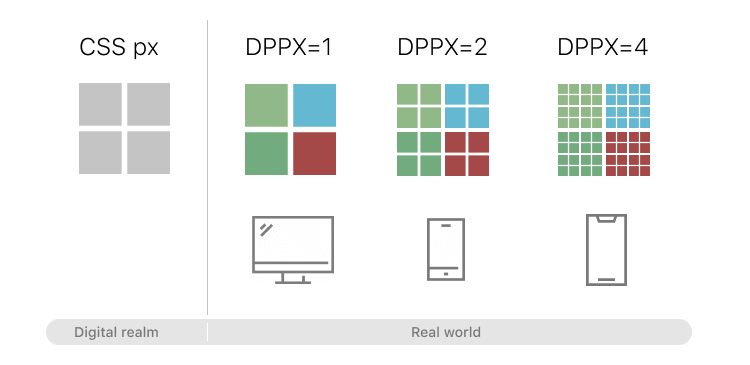 DPPX with CSS pixel relation chart.
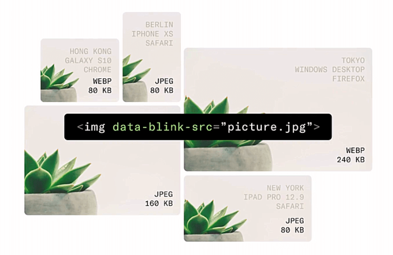
If your WordPress site is heavy on images or you have problems with image delivery, there is a better choice than built-in responsive images. You can store all images in a secure cloud and deliver them via a CDN (without any setup) to any device in an optimal resolution, format and compression. One of the major advantages is that you don’t need to hog up space in your online storage with multiple copies of different-sized versions of images that you want to be responsive.
Uploadcare works with WordPress sites, but it requires less coding and management, and provides optimization for network connection speed in addition to generating responsive images on the fly.
When you look under the hood, Uploadcare CDN servers don’t store copies of all the possible image sizes. The service automatically generates the most suitable version of an image for a specific device on demand.
Not only the screen resolution, but also the network connection speed affects the image conversion process, ensuring the maximum loading speed with the best visual result possible on a given device working on a given network.
The proprietary Adaptive Delivery technology is fast and reliable, and image responsiveness is at its very core. Integrate it with your website in 3 simple steps: whitelist the image sources, connect the SDK (a tiny 3 KB to keep your webpages light and fast), and then just use this code to embed images:
<img data-blink-src="picture.jpg">
And the service will automatically adapt, crop, or even enhance pictures for different devices and their viewports. The algorithm is somewhat similar to the one YouTube uses. It publishes the same video in different resolutions, and then serves the one that matches your context, so the video will play without hiccups.
 Uploadcare adaptive delivery for various screens and devices
With Uploadcare’s JS SDK that offers you adaptive delivery, you won’t have to fiddle with ‘srcsets’ and ‘sizes.’ Read more details on responsive images in the Uploadcare documentation →
This CMS is used by more than 60 million websites. Indeed, WordPress is a well-known and time-proven system which has been helping people manage blogs and websites since 2003. Now, in 2020, 36% of all websites still use this platform for managing content. Among other CMSs, such as Joomla and Drupal, it's the absolute leader, and its market share is 63.3% (according to w3techs.com).
If you're running a blog on your website, you most probably use the WordPress platform, and if you’re considering starting your own blog, it's a great choice. Just don’t forget to implement responsive images on your blog to make it even more fast and efficient.