Introduction to Web Components
Modular programming is a software design technique that emphasizes separating the functionality of a program into independent, interchangeable modules. This approach makes it easier to maintain, test, and reuse code across different projects. However, when it comes to front-end development, creating modular and reusable components can be challenging due to the lack of native support for encapsulation and reusability. This is where Web Components come in.
At Uploadcare, our File Uploader is a custom component built with Web Components. In this series of web component articles, you’ll learn what Web Components are, why they are important, and how you can use them to create custom, reusable elements on the web.
What are Web Components?
Web Components are web platform APIs that allows developers to create custom, reusable, and encapsulated HTML elements. These elements can be used in web pages and web applications just like standard HTML elements. The concept behind Web Components is to enable developers to create their own elements that encapsulate functionality, styles, and behavior, making it easier to build complex user interfaces.
Why use Web Components?
Web Components offer several advantages that make them an attractive choice for modern web development:
-
Reusability: Once you create a Web Component, you can reuse it across different projects and pages. This reduces code duplication and improves maintainability.
-
Encapsulation: Web Components encapsulate their internal structure and styles, preventing conflicts with other elements on the page. This makes it easier to manage large codebases and ensures that components behave consistently.
-
Interoperability: Web Components are based on standard web technologies, so they can be used with any framework or library, including React, Angular, and Vue.js. This makes them a flexible solution for building components that work across different projects.
-
Native Browser Support: Modern browsers natively support Web Components, meaning you don’t need to rely on external libraries or polyfills to use them. This results in better performance and less dependency on third-party code.
Web component APIs
Web Components are built on three key technologies: Custom Elements, Shadow DOM, and HTML Templates. These technologies work together to allow developers to create custom, reusable, and encapsulated elements on the web.
Custom elements
Custom Elements allow developers to define their own HTML tags and link to specific functionality with them. These custom tags can behave just like standard HTML elements while also including the unique behavior, styling, and functionality you specify.
A custom element is defined as a JavaScript class that extends the HTMLElement.
Let’s define a custom element called <my-greeting> to display a greeting message.
class MyGreeting extends HTMLElement {
  constructor() {
    super();  // Always call super() first in the constructor
    this.textContent = 'Hello, World!';
  }
}

// Define the new element
customElements.define('my-greeting', MyGreeting);
Now, you can use this custom element in your HTML:
<my-greeting></my-greeting>This will render the text “Hello, World!” wherever the <my-greeting> tag is used.
Shadow DOM
Shadow DOM provides encapsulation by creating a separate, hidden DOM tree for your component. This hidden DOM tree is isolated from the main document’s DOM, meaning that the styles and scripts within a component’s Shadow DOM do not affect the rest of the page, and vice versa.
This is essential for creating reusable components that won’t accidentally affect other parts of a web page.
Let’s modify our <my-greeting> component to use Shadow DOM, ensuring that its styles are encapsulated.
class MyGreeting extends HTMLElement {
  constructor() {
    super();
    // Attach a shadow root to the element
    const shadow = this.attachShadow({ mode: 'open' });

    // Create a <p> element in the shadow DOM
    const paragraph = document.createElement('p');
    paragraph.textContent = 'Hello, Shadow DOM!';

    // Apply styles to the shadow DOM
    const style = document.createElement('style');
    style.textContent = `
      p {
        color: blue;
        font-weight: bold;
      }
    `;

    // Attach the paragraph and style to the shadow DOM
    shadow.appendChild(style);
    shadow.appendChild(paragraph);
  }
}

customElements.define('my-greeting', MyGreeting);
In this example, the <p> element’s styles are encapsulated within the component’s Shadow DOM.
Even if there are conflicting styles on the main page,
they won’t affect the content inside the <my-greeting> component.
HTML templates
HTML Templates allow you to define HTML templates that are not rendered immediately when the page loads. Instead, these templates can be cloned and used dynamically within your components. This is particularly useful when creating reusable components where the structure is predefined but can be inserted into the DOM when needed.
Let’s create a template that our <my-greeting> component will use to render its content.
<template id="greeting-template">
  <style>
    p {
      color: green;
      font-size: 20px;
    }
  </style>
  <p>Hello from a template!</p>
</template>
You can then use this template within our custom element:
class MyGreeting extends HTMLElement {
  constructor() {
    super();
    const shadow = this.attachShadow({ mode: 'open' });

    // Get the template from the DOM
    const template = document.getElementById('greeting-template');
    const content = template.content.cloneNode(true);

    // Attach the cloned content to the shadow DOM
    shadow.appendChild(content);
  }
}

customElements.define('my-greeting', MyGreeting);
In this example, the content from the <template> with the ID greeting-template is cloned
and inserted into the Shadow DOM of the <my-greeting> component.
This allows you to define reusable chunks of HTML that can be inserted into your components dynamically.
Piecing it all together
Using all three web APIs, let’s create a custom <user-card> element that displays user information
such as a profile picture, name, and description.
The component will use Shadow DOM to encapsulate its styles and structure, a
nd define the element’s structure using an HTML template that will be reusable across different web pages.
Step 1: Define the HTML template
First, create a user-card-template.html file for the user card. This template will include the structure of the card and some basic styles.
<template id="user-card-template">
  <style>
    .card {
      border: 1px solid #ccc;
      border-radius: 8px;
      padding: 16px;
      max-width: 250px;
      font-family: Arial, sans-serif;
    }

    .profile-picture {
      border-radius: 50%;
      width: 80px;
      height: 80px;
    }

    .name {
      font-size: 20px;
      margin: 12px 0 8px;
      color: #333;
    }

    .description {
      font-size: 14px;
      color: #666;
    }
  </style>

  <div class="card">
    <img class="profile-picture" src="" alt="Profile Picture">
    <div class="name"></div>
    <div class="description"></div>
  </div>
</template>
This template defines a simple card layout with a profile picture, a name, and a description, along with some basic styling.
Step 2: Create the custom element
Next, define the custom element <user-card> using Custom Elements.
You’ll also attach the Shadow DOM to encapsulate the component’s structure and styles.
Create a user.js file with the content:
// Fetch the template file
fetch('user-card-template.html')
  .then(response => response.text())
  .then(data => {
    const templateContainer = document.createElement('div');
    templateContainer.innerHTML = data;
    document.body.appendChild(templateContainer);

    // Define the custom element
    class UserCard extends HTMLElement {
      constructor() {
        super();
        const shadow = this.attachShadow({ mode: 'open' });

        // Get the template content
        const template = document.getElementById('user-card-template');
        const templateContent = template.content.cloneNode(true);

        // Attach the template content to the shadow DOM
        shadow.appendChild(templateContent);

        // Set the profile picture, name, and description
        shadow.querySelector('.profile-picture').src = this.getAttribute('image');
        shadow.querySelector('.name').textContent = this.getAttribute('name');
        shadow.querySelector('.description').textContent = this.getAttribute('description');
      }
    }

    // Define the new custom element
    customElements.define('user-card', UserCard);
  });
The code above defines the UserCard class that extends HTMLElement. In the constructor, it does the following:
- Fetches the user-card-template.html file.
- It then attaches a Shadow DOM to the component.
- Next, it clones the content of the template and append it to the Shadow DOM.
- And finally, it dynamically sets the content of the card (image, name, and description)
using attributes provided on the
<user-card>element.
Step 3: Use the <user-card> element in HTML
You can now use the <user-card> element in HTML and provide the necessary attributes.
<!DOCTYPE html>
<html lang="en">
  <head>
    <meta charset="UTF-8">
    <meta name="viewport" content="width=device-width, initial-scale=1.0">
    <title>User Card Component</title>
  </head>
  <body>
    <!-- Use the custom user-card element -->
    <user-card
      image="https://ucarecdn.com/6618f7fb-306f-4da8-917b-9163fbe3ce0d/jamin.png"
      name="Trust Jamin"
      description="Technical Writer at Uploadcare. Loves coding and open-source."
    ></user-card>

    <script src="user-card.js"></script>
  </body>
</html>
Result
When you load this HTML file in a browser, you’ll see a user card with a profile picture, a name,
and a description. The styles and structure are fully encapsulated within the <user-card> element,
ensuring that they don’t interfere with the rest of your page’s content.
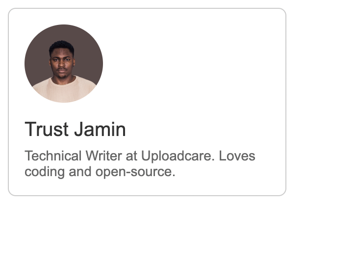 User Card Component
When you inspect the element in the browser you will see the structure of the element as shown below:
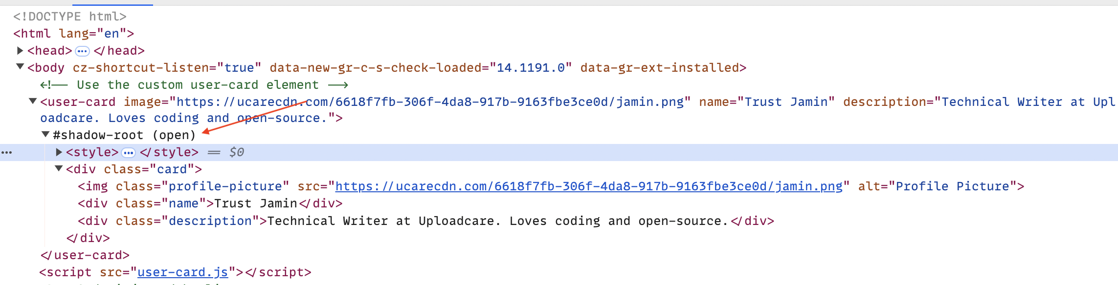 User Card Component Structure
Conclusion
Web Components offers an efficient way to create modular, reusable, encapsulated elements on the web. By combining Custom Elements, Shadow DOM, and HTML Templates, you can build complex user interfaces that are easy to maintain and reuse across different projects
In this article, we’ve covered the basics of Web Components and how to create custom elements using these APIs. We’ve also demonstrated how to create a simple user card component that encapsulates its structure and styles using Shadow DOM and HTML Templates.
If you want to learn more about Web Components, check out the MDN Web Docs for detailed information and examples.
In the next article in the series, we’ll explore Web Components adoption in modern web development,
Stay tuned!