How to add and customize CSS background image
Last edited:
Adding background images to your web page can set the mood, enhance branding, and make your site visually appealing. But how do you do it without cluttering your HTML or sacrificing performance?
In this guide, you’ll learn how to add a background image in CSS, make it responsive, best practices to follow, and how you can optimize background images with Uploadcare.
What are CSS background images?
The background-image property in CSS allows you to decorate HTML elements with visuals like images, graphics, and patterns without bloating your markup. You can use image formats like AVIF, WebP, JPEG, PNG, SVG, or even gradients.
You can use the CSS background-image property to set an image as the background of an element,
such as a div, section, or even the entire body of your webpage.
css-selector {
  background-image: url('path/to/image.jpg');
}
Where css-selector is the HTML element you want to style, background-image is the CSS property being applied,
and url() is a function that specifies the path to the image file.
Note that the image path can be relative (located in the same project as your HTML code) or absolute (hosted somewhere else with an http:// or https:// address). You can also use data URIs for smaller images.
When and why should you use CSS background images?
CSS background images let you add decorative visuals to elements without cluttering your HTML. They’re ideal when the image doesn’t carry semantic meaning.
The image is usually displayed behind the element’s content, thus enhancing the design of your site while keeping your markup clean and semantic.
If you’d like a background for a specific element, like a section or a div, without using solid colors, a CSS background image is the right choice. It can help make your design more visually appealing.
It can also improve download speed and performance when using CSS Sprites, allowing you to combine multiple images into a single file. This reduces the number of HTTP requests the browser makes, leading to faster load times.
Use them when:
- The image is purely decorative
- You need to create a specific layout or design effect
- You want to apply effects like parallax scrolling or fixed backgrounds
- You want to use CSS properties to control the position, size, and how the image is displayed
Using CSS background image, like for a hero banner, is a great use case. The visual in this case doesn’t convey semantic meaning.
In other cases, where semantic meaning is important,
like a company logo, an <img> is more appropriate and better tag for accessibility reasons.
How to add a background image in CSS
Let’s start with the basics.
Here is an example of how to set the background image in CSS for a div element with a .hero class:
.hero {
  background-image: url('hero-bg.jpeg');
}
It sets the image as the background for elements with the .hero class.
Do note that the element should have a visible height either through its own styles or its content for the background image to appear as expected.
In many cases, setting an explicit height, min-height,
or using padding on child elements ensures the image displays correctly.
Otherwise, the element might collapse to zero height,
especially if it’s empty, and the background won’t be visible at all.
.hero {
  background-image: url('hero-bg.jpeg');
  height: 100vh;
}
The will render the element like this:
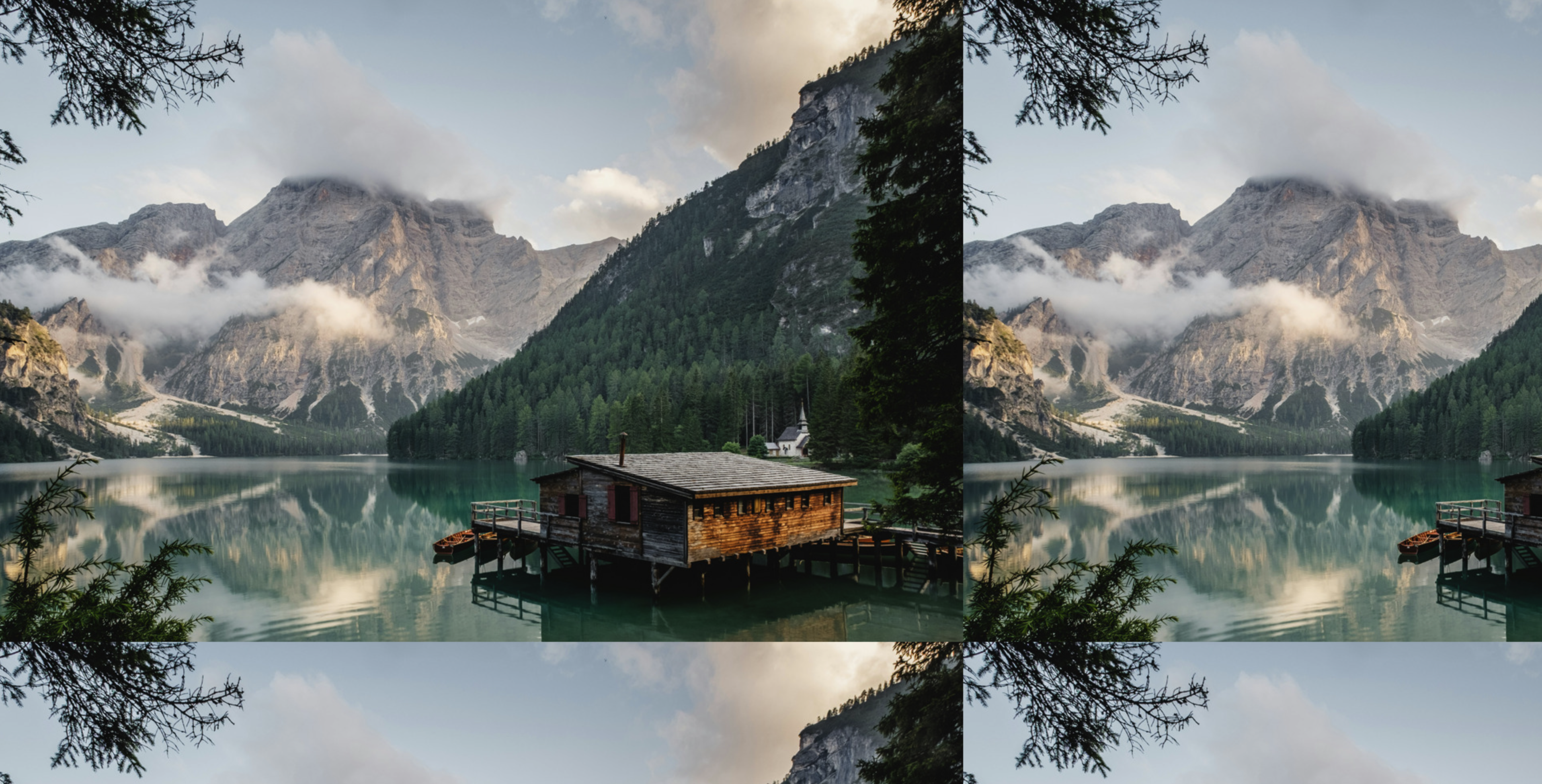 CSS background image example
Although the above example is a good start, it does not look very good on smaller screens, and the image is repeated. Let’s explore some CSS properties you can use to customize the background image.
Essential CSS background properties
You can apply some CSS properties to control your background images fully. Here’s a quick rundown of a few of them:
background-image property
The background-image property is the first step in adding a background image.
It sets the image to be used as the background of an element.
.hero {
  background-image: url('hero-bg.jpeg');
}
You can also add multiple images by separating them with commas:
.hero {
 background-image:url('star.png'), url('hero-bg.jpeg');
}
This will stack the images on top of each other, with the first image on top.
 CSS background multiple image example
Or use a gradient with an image:
.hero {
  background-image: linear-gradient(to right, rgba(41, 102, 201, 0.8), rgba(254, 180, 123, 0.8)), url('hero-bg.jpeg');
}
CSS background gradient example
Some supported images for this property include:
- JPEG: Common format for photos and complex images
- PNG: Good for images with transparency
- SVG: Scalable vector graphics, great for logos and icons
- WebP: Modern format that provides better compression and quality
- AVIF: A newer format that offers even better compression and quality than WebP
- GIF: Good for simple animations, but not ideal for static images
For better performance and quality, use WebP or AVIF. They are smaller and provide better quality than traditional formats like JPEG and PNG.
background-position property
The background-position property controls where the image appears inside the element.
You can use values (top, bottom, left, right, center), percentages,
or even exact unit measurements like px or rem.
.hero {
  background-image: url('hero-bg.jpeg');
  background-position: center;
  height: 100vh;
}
The above code will center the image in the element.
 CSS background position example
You can also use percentages to position the image:
.hero {
  background-image: url('hero-bg.jpeg');
  background-position: 50% 50%;
  height: 100vh;
}
Using 50% 50% centers the image both horizontally and vertically — specifically, the center of the image aligns with the center of the container.
If you use, say, 20% 20%, the point that’s 20% across and 20% down the background image will align with the same relative point in the container.
For a list of all the possible values, check out the MDN documentation.
background-repeat property
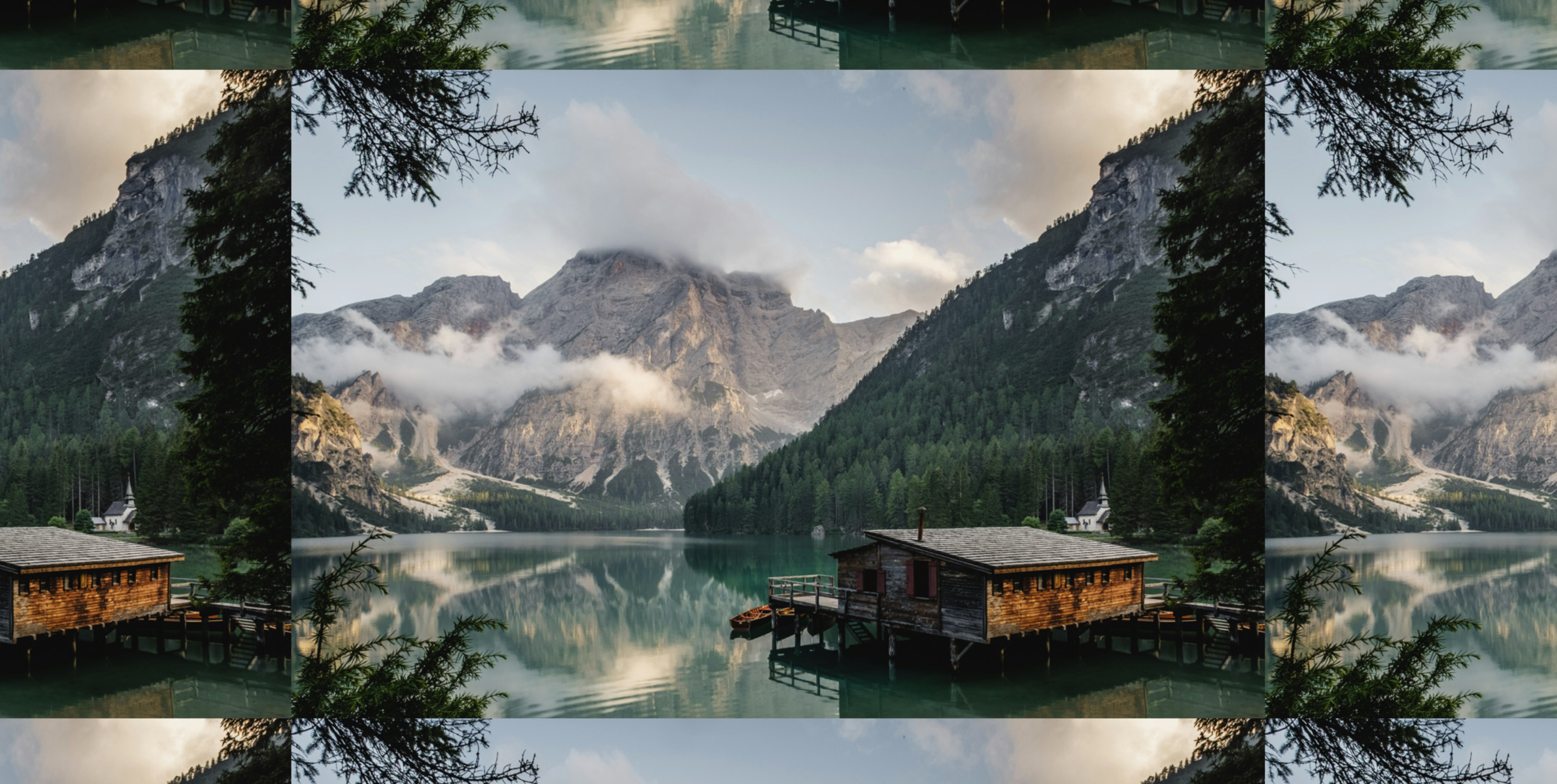
As you must have noticed, the background image in the previous examples is repeated multiple times.
This is because the default value for the background-repeat property is set to repeat when the image is smaller than the element.
That means the image will repeat horizontally and vertically to fill the entire element.
The background-repeat property controls if and how the image repeats.
To control the repetition, you can use values like no-repeat, repeat-x, repeat-y, round or space.
Let’s say you want to display the image only once; you can set the background-repeat property to no-repeat:
.hero {
  background-image: url('hero-bg.jpeg');
  background-repeat: no-repeat;
  height: 100vh;
}
The image appears just once, without repetition.
 CSS background repeat example
Notice that the image is centered in the element and does not repeat. Ideally, the image should to be a full-screen background image, but it does not fill the entire element because it is smaller than the element itself.
To fix this, let’s use the next property, background-size.
background-size property
The background-size property controls how the image scales within the element.
You can use values like cover, contain, or specify the image’s dimensions.
Popular values include:
cover: fills the element while maintaining the aspect ratiocontain: makes sure the whole image is visible100% 100%: stretches to fit both width and height (can distort)
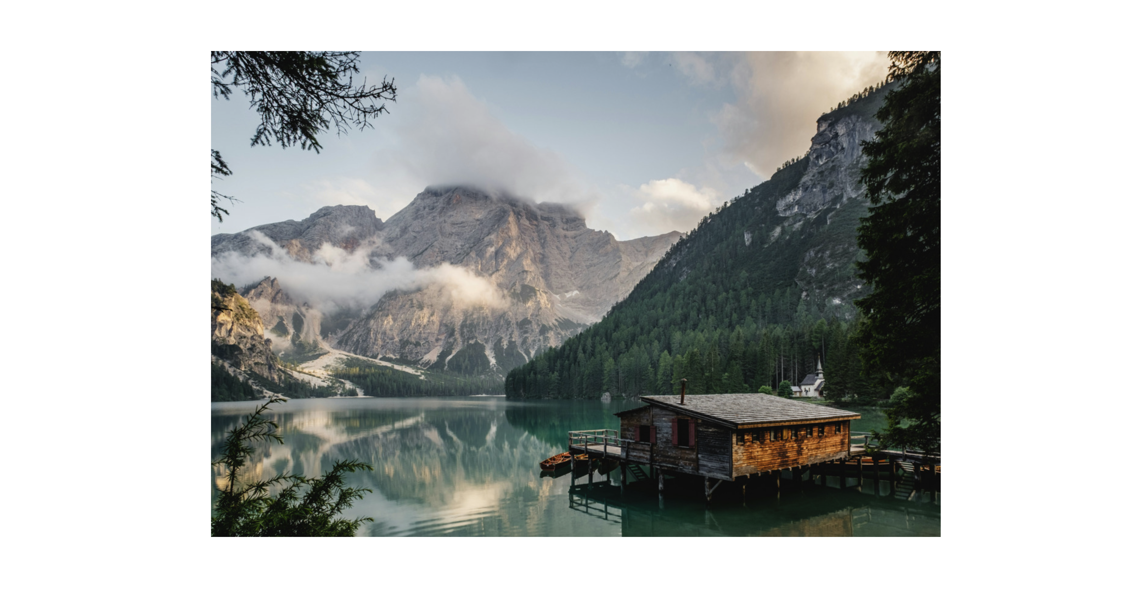
.hero {
  background-image: url('hero-bg.jpeg');
  background-size: cover;
  height: 100vh;
}
If you’re wondering how to make the background image fit full screen in CSS,
the background-size: cover property is your go-to for full-bleed visuals
 CSS background size example
background-attachment property
The background-attachment property controls how the background image behaves when you scroll the page.
Have you ever visited a site with a parallax effect, where the background image of the content stays moves at a different speed
than the content while the scrolling?
CSS background attachment example
That’s the magic of background-attachment.
You can use the following values for the background-attachment property:
scroll: the default value, the background is fixed relative to the element and is attached to the element’s bordersfixed: the background stays fixed relative to the viewport while the content scrolls creating a parallax effectlocal: the background is fixed relative to the element content, so it scrolls with the content of the element
.hero {
  background-image: url('hero-bg.jpeg');
  background-attachment: fixed;
  height: 100vh;
}
Combining properties
Combining all these properties can create stunning effects. For example, you can create a full-screen background image with a parallax effect like this:
.hero {
  background-image: url('hero-bg.jpeg');
  background-size: cover;
  background-position: center;
  background-repeat: no-repeat;
  background-attachment: fixed;
  height: 100vh;
}
Creates a full-screen background image that stays fixed while the content scrolls, creating a parallax effect.
CSS background image example
How to make background images responsive
Responsiveness is important when dealing with background images, as you want your images to look great on all devices, from desktops to smartphones.
Here are some tips to make your background images responsive.
Use background-size: cover
The cover value for background-size will ensure the image covers the entire element while maintaining its aspect ratio.
It might crop the image a bit, but it’s a good trade-off for responsiveness.
For large screens, you can use background-size: cover to ensure the image fills the entire element,
and for smaller screens, you can use background-size: contain to ensure the entire image is visible
while maintaining its aspect ratio.
When combined with background-position: center, this keeps the focal point of the image in the center,
making it look good on all screen sizes, especially on mobile devices.
Another option is to specify the size in percentages or viewport units (like vw and vh) to make it more flexible.
For example:
.hero {
  background-image: url('hero-bg.jpeg');
  background-size: 100% 100%;
  height: 100vh;
}
The image stretches to fill the entire element, but it may distort the image if the element’s aspect ratio is different from that of the image.
Use media queries
If you want to change the background image based on the screen size, you can use media queries to swap in different images or adjust the size of the image.
Media queries are CSS techniques that allow you to apply styles based on the screen size or device type. This is particularly useful for responsive design.
If the user’s device meets the conditions specified, the styles inside the media query will be applied, allowing you to create a responsive design that adapts to different screen sizes and devices.
For example, you can set a different background image for mobile devices like this:
@media (max-width: 768px) {
  .hero {
    background-image: url('hero-mobile.jpg');
    background-size: contain;
  }
}
With this change, the background image will be swapped with hero-mobile.jpg when the screen width is 768px or smaller.
For even more control across screen sizes, you can pair your background images with image-set().
Learn more in our guide on responsive images with image-set.
Optimizing background images for performance
While background images can enhance your design, they can also slow down your site if not optimized properly. A 2 MB background image can lead to a sluggish experience, especially on mobile devices.
Here are some tips to optimize your background images for performance.
Use the right format
Choose the right image format for your background images, as this can drastically reduce the load time of your web page. Consider using WebP or AVIF for better compression and quality for modern browsers. These formats are smaller than older formats like JPEG and PNG but maintaining high quality.
Compress your images
Before using an image, use image compression tools to reduce its file size without sacrificing quality. Tools like Squoosh, TinyPNG, or ImageOptim can help you achieve this. You can also use Uploadcare’s built-in optimization features to automatically compress and optimize your images on the fly.
Use lazy loading
Lazy loading is a technique that defers the loading of images until they are in the viewport.
This can significantly improve the initial load time of your web page.
Although native lazy loading applies to <img> tags,
you can mimic it for background images using Intersection Observers in JavaScript
or by dynamically applying classes to load images only when they are in the viewport.
const lazyLoadBackgrounds = () => {
  const lazyBackgrounds = document.querySelectorAll('.lazy-bg');

  const options = {
    root: null,
    rootMargin: '0px',
    threshold: 0.1
  };

  const observer = new IntersectionObserver((entries, observer) => {
    entries.forEach(entry => {
      if (entry.isIntersecting) {
        entry.target.classList.add('loaded');
        observer.unobserve(entry.target);
      }
    });
  }, options);

  lazyBackgrounds.forEach(bg => {
    observer.observe(bg);
  });
};

document.addEventListener('DOMContentLoaded', lazyLoadBackgrounds);
The code above uses the Intersection Observer API to detect when elements with the class .lazy-bg are in the viewport
and adds the class .loaded to them.
.lazy-bg {
  /* Initially no background image */
  background-image: none;
}

.loaded {
  /* Add the background image when loaded */
  background-image: url('hero-bg.jpeg');
}
This will initially set the background image to none, and when the element is in the viewport, it will add the background image.
Use CSS sprites
If you have multiple small images (like icons), consider using CSS sprites. This technique combines multiple images into a single image file, reducing the browser’s HTTP requests. While it’s an older technique, it can still be relevant for specific use cases where you want to use multiple small images for the background.
Use a CDN
If you’re serving large background images, consider using a Content Delivery Network (CDN) to serve them. CDNs cache images on servers around the world, reducing the distance between the user and the server, resulting in faster load times. Uploadcare offers a CDN that automatically optimizes and serves your images.
To learn more about optimizing images for performance, check out our guide on optimizing images for website performance.
Using Uploadcare to serve optimized background images
We would be remiss not to mention a smoother way to manage and deliver optimized background images.
Uploadcare allows storing, optimizing, and serving your images from a lightning-fast CDN. This means faster load times and automatic format conversion ( WebP and AVIF).
To use Uploadcare for your background images, sign up and upload your images to Uploadcare. Then, use the provided file URL in your CSS:
.hero {
  background-image: url('https://6ca2u7ybx5.ucarecd.net/YOUR_IMAGE_UUID/-/preview/1600x900/');
}
But Uploadcare is more than just a CDN provider, it offers a full media solution such as a File Uploader and APIs for optimizing and delivery your images to your user anywhere for example, its URL-based API allows you resize, crop, and convert your image on the fly — no editing required
Transformations are URL-based tools that let you resize, crop, and convert your image on the fly — no editing required
Adding the transformation -/preview/1600×900/ to the URL will resize the image to 1600×900 pixels.
You can also use transformations like -/format/webp/ or /-/crop/ to manipulate an image on the fly.
Using this dynamic transformation, you can easily create responsive background images without uploading multiple versions.
@media (max-width: 768px) {
  .hero {
    background-image: url('https://6ca2u7ybx5.ucarecd.net/YOUR_IMAGE_UUID/-/preview/800x450/');
    background-size: contain;
  }
}Want to fine-tune how your background images appear? Check out our guide on how to crop images in CSS using Uploadcare’s transformation tools.
Uploadcare also provides a uc-img component that lets you easily add images to your HTML with built-in optimizations.
This component automatically handles lazy loading and responsive images and can also serve optimized background images.
To use the uc-img component, import the uc-img component library into your page:
<script src="https://cdn.jsdelivr.net/npm/@uploadcare/file-uploader@v1/web/uc-img.min.js" type="module"></script>uc-img {
--uc-img-pubkey: 'YOUR_PUBLIC_KEY';
}Where YOUR_PUBLIC_KEY is your Uploadcare public key from your Uploadcare project.
Then, you can use the uc-img component in your HTML like this:
<uc-img is-background-for="#target" src="SOURCE_IMAGE_PATH"></uc-img>Where is-background-for is an attribute that targets the CSS selector of the element you want to apply the background image,
and SOURCE_IMAGE_PATH is the path to your image.
To see this in action, here’s an example of how to use the uc-img component to create a responsive background image:
<div id="hero">
  <div>
    <h1>Hello World</h1>
    <p>
      Lorem ipsum dolor sit amet, consectetur adipisicing elit. Deleniti doloremque perferendis laborum possimus
      distinctio libero. Odio iste laboriosam repellendus molestias minima reiciendis facilis voluptate nisi et
      molestiae esse, eligendi quia.
    </p>
  </div>

  <uc-img
    is-background-for="#hero"
    src="https://6ca2u7ybx5.ucarecd.net/64e2c9da-0835-4d04-9d34-a5a4f5ad0421/photo1470770841072f978cf4d019e/"
  ></uc-img>
</div>
In your CSS, you can set the background properties like this:
#hero {
  height: 100vh;
  background-size: cover;
  background-position: center;
  background-repeat: no-repeat;
  background-attachment: fixed;
}
Conclusion
Adding and customizing CSS background images doesn’t need to be complicated. With the right mix of CSS background properties, responsive techniques, and performance best practices, and using an optimization tool like Uploadcare, you can create stunning visuals without sacrificing speed or usability.
Ready to serve optimized background images on your websites? Try out Uploadcare today
Happy styling!