Building an accessible file uploader: A developer’s guide
At Uploadcare, we are constantly working towards creating an inclusive web experience for our customers and with inclusivity in mind, we’ve ensured that our file uploader is accessible to our users, including those with disabilities.
In this article, we’ll cover why accessibility is essential when building a reusable widget for web applications and how we created an accessible File Uploader.
Why accessibility matters
Inclusion is guaranteed by accessibility. Creating accessible web applications ensures that all users, regardless of ability or device, can utilize them, promoting inclusivity.
Having accessibility in your application ensures that your application meets the Web standards for building applications. Various countries also rules mandating that websites be accessible to people with disabilities, like the Americans with Disabilities Act (ADA). Ensuring your websites are accessible helps avoid legal issues and ensures your application meets regulatory requirements.
Building an accessible File Uploader
There are four principles in which the WCAG guideline is built according to the WCAG at a Glance (a short version of WCAG standards):
-
Perceivable: Content on your website and widget elements should be displayed in ways that users can easily notice. This indicates that no matter how a user accesses your website or widget, they should still be able to understand the content whether they are reading or listening to it.
-
Operable: Your components and navigation must be functional, allowing users to engage with all elements through different methods (such as keyboard navigation).
-
Understandable: The information and user interface should be easy to understand, providing accurate and consistent content.
-
Robust: Due to the fact that your users will utilize a variety of devices to reach your website, the content needs to be durable in order to consistently function with different user devices, including assistive technologies, and should be resistant to future changes.
Let’s talk about how we have utilized these principles at Uploadcare while developing our File Uploader to make it accessible.
If you’re interested in making your own file uploader more accessible, we have a video tutorial just for you! It walks you through everything you need to know, including how to enhance keyboard navigation, use ARIA attributes, and even test accessibility using a screen reader like VoiceOver. It’s a great way to make your uploader user-friendly for everyone!
Keyboard navigation
Although the majority of users can use a mouse to navigate your component, some users with motor or visual impairments cannot; therefore, it is crucial to incorporate keyboard navigation or provide that option within your component.
We utilize the default browser focus for all interactive components in the uploader, such as file selection and submission. We’ve made sure that focus states are easily seen and that there are visual clues to help users upload files.
Semantic HTML
When building a reusable widget, it is vital that it has a semantic structure. This helps structure your applications so that assistive technologies can easily understand them.
We used custom HTML tag wrappers around semantic HTML to convey meaning and structure effectively.
Specifically, our custom <uc-modal> element functions as the core element for uploading a file,
but this is just a regular HTML <dialog> element for file selection.
On the other hand, we used <button> elements for actionable items such as submitting files, opening a file explorer,
or canceling an upload.
We provide these elements with appropriate labels and titles where necessary to improve the user experience and ensure that assistive technologies can navigate the uploader.
For example, to tell assistive technologies, such as screen readers,
that only the content within the modal should be interactive when the modal is open,
we used the ARIA attribute aria-modal="true" to indicate when the modal is open.
<!-- file uploader modal in opened state -->
<uc-modal aria-modal="true">
  <dialog open></dialog>
</uc-modal>
For buttons with icons, we also provided titles to explain further what actions the button serves for assistive technologies:
<!-- Edit file button with title -->
<button type="button" title="Edit">
  <uc-icon name="edit-file"></uc-icon>
</button>

<!-- Remove file button with title -->
<button type="button" title="Remove">
  <uc-icon name="remove-file"></uc-icon>
</button>
Error handling & user feedback
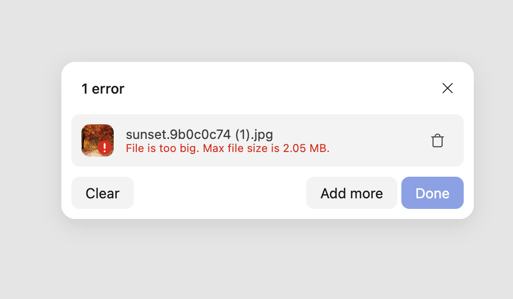
Effective communication of errors and feedback is important when making a component accessible. We ensured that all error messages were conveyed both visually and audibly. For example, when a user tries to upload a file type that is not supported or too large, the error message is displayed on the screen with a visual representation explaining the error.
 Error message in Uploadcare File Uploader
We provided support for users of screen readers and other assistive technologies by using aria-live and aria-label
to announce errors and feedback from screen readers.
<div aria-live="polite" aria-label="File sunset.9b0c0c74 (1).jpg in status failed">
  <span class="uc-file-name" title="sunset.9b0c0c74 (1).jpg">
    sunset.9b0c0c74 (1).jpg
  </span>
  <span class="uc-file-error">File is too big. Max file size is 2.05 MB.</span>
</div>
We also implemented this when a file is successfully uploaded:
<span aria-live="polite" class="uc-header-text">1 file uploaded</span>

<div aria-live="polite" aria-label="File cat.jpg in status finished">
  <span class="uc-file-name" title="cat.jpg">cat.jpg</span>
</div>
This ensures that users know the upload status and can take appropriate action.
Color contrast ratio
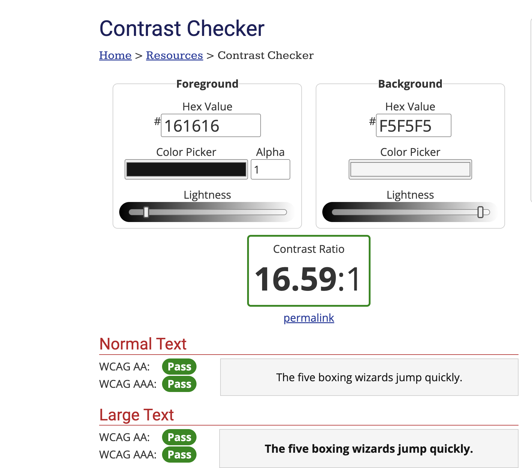
We focused on color contrast in order to meet the needs of users with visual impairments. The File Uploader ensures that all text and interactive elements has a decent color contrast ratio to enable users distinguish text from its background.
This is done by choosing colors with a contrast ratio of 4.5:1 or higher for standard text.
 Color contrast checker on Uploadcare File Uploader colors
ARIA attributes
ARIA attributes are collections of roles and attributes that improve accessibility for assistive technologies such as screen readers, aiding individuals with disabilities in understanding webpage content.
By using aria-live="polite" attributes in our File Uploader,
we can make sure the content is accessible to assistive technologies and users can understand what is going on.
Mobile-first design
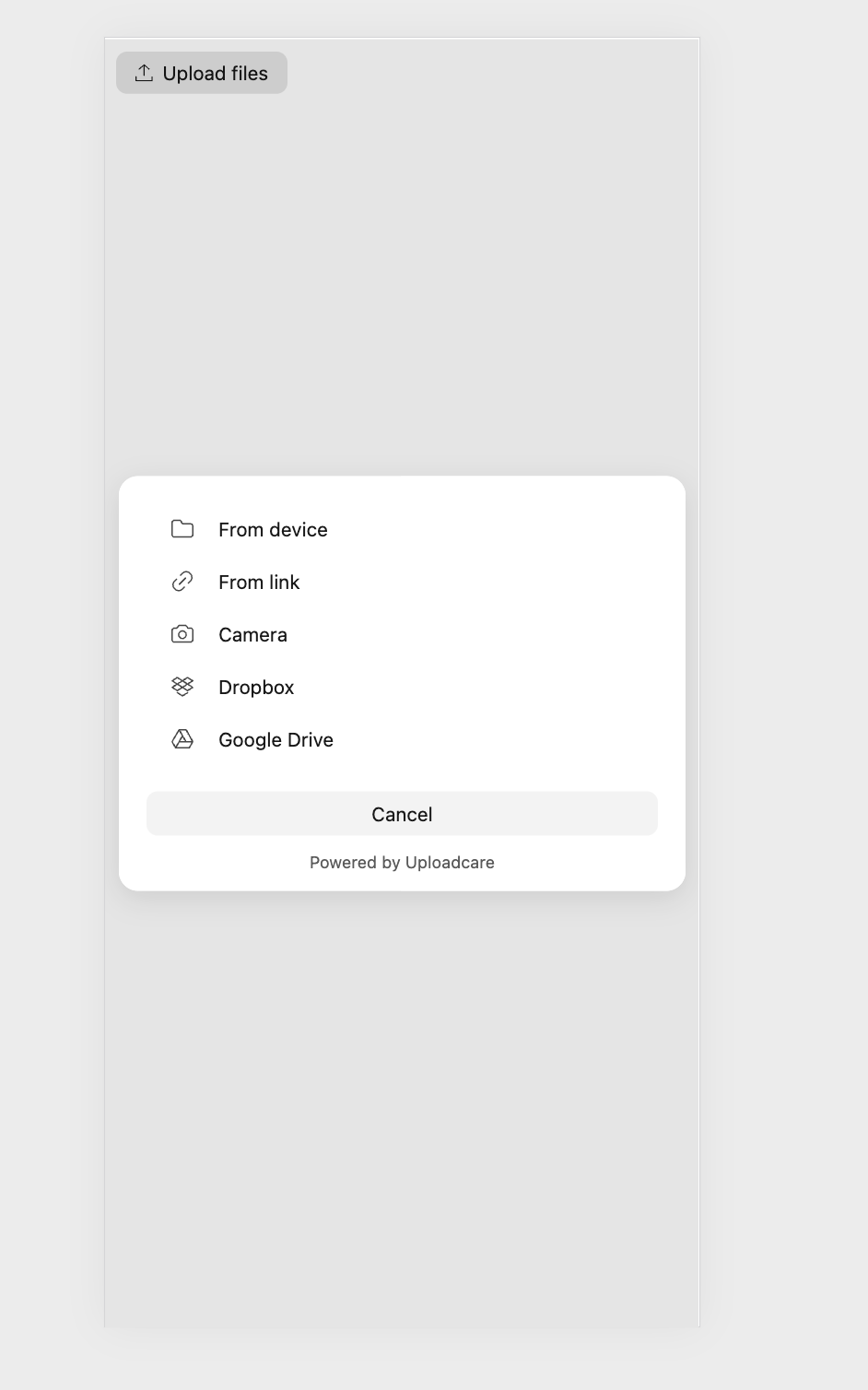
Our File Uploader is created prioritizing mobile devices, making sure it can be used on all types of devices. We ensured that the uploader is completely responsive and that all interactive features are easily reached on mobile devices.
 Mobile view of Uploadcare File Uploader
Testing for accessibility
There are multiple tools available for testing accessibility in your web applications. Below are a few resources that can aid in assessing the accessibility of your web applications.
-
Lighthouse is a free tool that automates the process of enhancing the performance, quality, and accessibility of your web applications.
-
axe: An extension for browsers that detects accessibility problems on your website.
-
WAVE: An evaluation tool for web accessibility that offers visual indicators on the accessibility of your website content.
-
NVDA: A no-cost screen reader for Windows that allows you to evaluate screen reader compatibility.
-
VoiceOver: An integrated screen reader designed for macOS and iOS, perfect for conducting evaluations on Apple products.
-
Talkback: An integrated screen reader designed for Android devices.
-
JAWS: A screen reader for Windows that must be purchased to assist in testing screen reader compatibility.
-
Color Contrast Checker: A tool designed to assist in verifying the color contrast ratio of text and interactive components.
Conclusion
In this article, we covered some ways in which we improved our File Uploader’s accessibility. Although our File Uploader isn’t fully compliant with all of the WCAG requirements, we are constantly working towards making it fully accessible to everyone.
Giving importance to accessibility when developing your web applications not only ensures compliance with Web standards but also allows you to create a usable web for everyone, regardless of their circumstances. By following WCAG guidelines, you can create web applications that provide a better user experience for all.