How to create a custom video player in JavaScript and HTML
Last edited:
HTML5 provides a built-in video player, but it lacks customization options.
If you want to create a custom video player in JavaScript and HTML,
you can use the <video> element and add your own controls.
In this guide, we’ll walk through the steps of how to create a video player in JavaScript with custom controls
and an appealing UI and implement Adaptive Bitrate Streaming (ABS) for better performance in the player.
The custom video player will include the following features:
- Play/Pause
- Volume control (A slider to adjust the volume)
- Mute/Unmute toggle
- Video seeking (A progress bar to seek through the video)
- Current time and duration display
- Adaptive bitrate streaming (using Uploadcare for video hosting and adaptive delivery)
You can see the final result in this CodeSandbox.
Prerequisites
Before you begin, you will need:
- Basic knowledge of HTML, CSS, and TypeScript
- A text editor or IDE for coding
- A web server to serve the video (you can use Uploadcare to serve your video, which will provide adaptive bitrate support; you’ll learn more about this later in this guide)
Set up your project
For this project, you’ll use Vite to set up a fast development environment. You can create a new project by running the following command in your terminal:
npm create vite@latest custom-video-playerWhen prompted, select “Vanilla” as the framework and “TypeScript” as the variant. This will set up a new Vite project with TypeScript support.
Navigate into the custom-video-player directory, and install the dependencies:
npm installYou can now run the development server for the project:
npm run devThis will start the development server, and you can view your project in your browser at http://localhost:5173.
Open the project in your text editor or IDE and remove src/counter.ts. You won’t need it for this tutorial.
Create the HTML structure
In the src directory, open the index.html file and replace its content with the following HTML structure:
<!DOCTYPE html>
<html lang="en">
  <head>
    <meta charset="UTF-8">
    <meta name="viewport" content="width=device-width, initial-scale=1.0">
    <title>Custom HTML5 Video Player</title>
    <link rel="stylesheet" href="./src/style.css">
  </head>
  <body>
    <h1>Custom HTML5 Video Player</h1>
    <div class="video-container">
      <video id="video" width="800" controls>
        <source src="https://6ca2u7ybx5.ucarecd.net/793148f7-ab69-4877-8334-b46775754477/" type="video/mp4" />
        <p>Your browser doesn't support HTML5 video.</p>
      </video>
    </div>
    <script src="./src/main.ts" defer type="module"></script>
  </body>
</html>
The code above creates a simple HTML structure with a <video> element.
The src attribute of the <source> tag points to a video hosted on Uploadcare.
You can replace this URL with your own video URL if you have one.
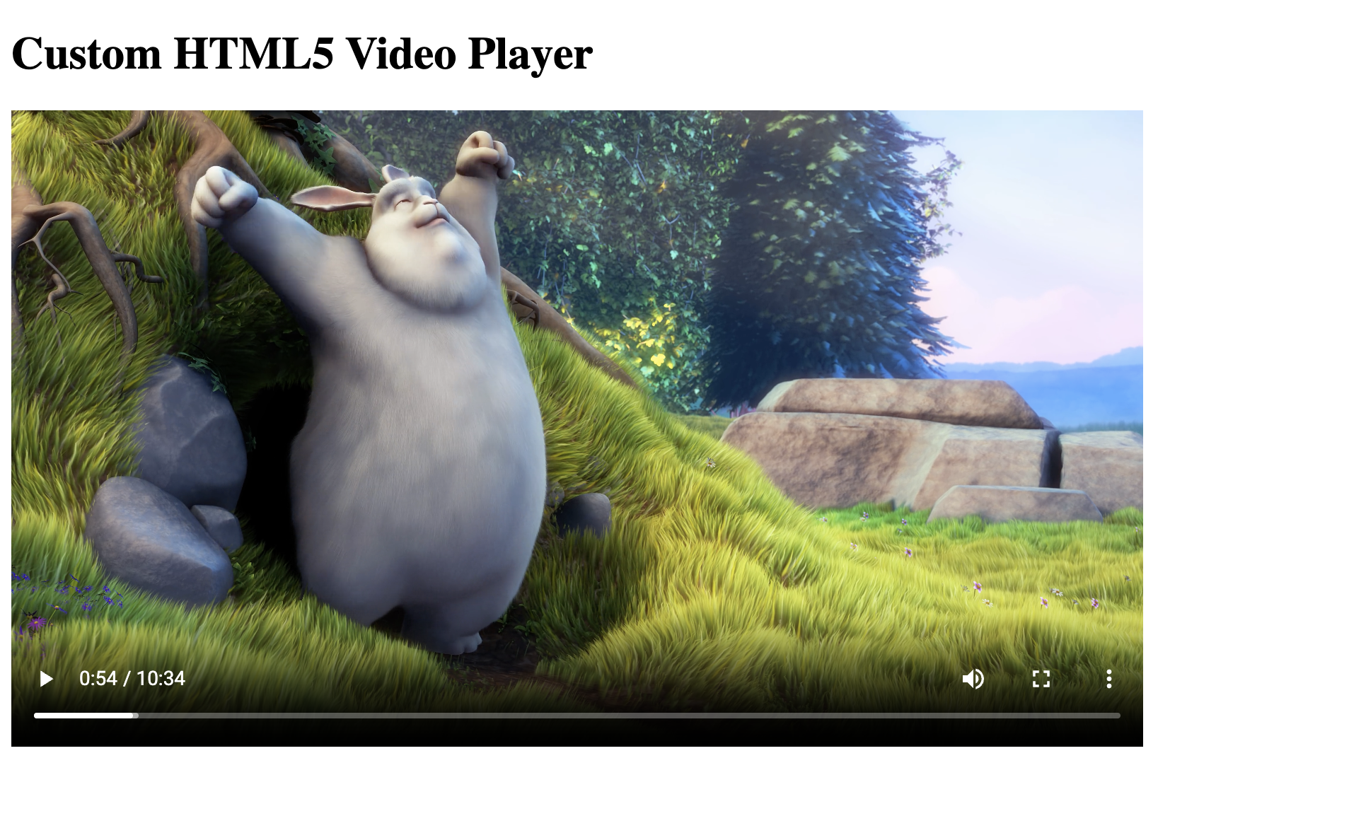 Custom video player HTML structure
Also, notice the controls attribute in the <video> tag.
This attribute adds the default video controls provided by the browser,
which include pause/play and control over video playback. You will create custom controls later.
To customize the player, first remove the controls attribute from the <video> tag in the index.html file.
This will turn off the default browser controls, allowing you to create your custom controls.
Styling the HTML video player with CSS
Now that you have the basic HTML structure, let’s add some styles to make the video player look better. Update the src/style.css file with the following code:
* {
  margin: 0;
  padding: 0;
  box-sizing: border-box;
}

body {
  font-family: -apple-system, BlinkMacSystemFont, 'Segoe UI', Roboto, Oxygen, Ubuntu, Cantarell, 'Open Sans', 'Helvetica Neue', sans-serif;
  background-color: #f5f5f5;
  color: #333;
  max-width: 1000px;
  margin: 0 auto;
  padding: 20px;
}

h1 {
  text-align: center;
  margin-bottom: 30px;
  color: #333;
}

.video-container {
  position: relative;
  background: #000;
  border-radius: 8px;
  box-shadow: 0 4px 12px rgba(0, 0, 0, 0.1);
  overflow: hidden;
  margin: 0 auto;
  max-width: 100%;
}

#video {
  width: 100%;
  height: auto;
  display: block;
  cursor: pointer;
}

.loading-indicator {
  position: absolute;
  top: 50%;
  left: 50%;
  transform: translate(-50%, -50%);
  background-color: rgba(0, 0, 0, 0.5);
  border-radius: 50%;
  width: 60px;
  height: 60px;
  display: flex;
  justify-content: center;
  align-items: center;
  z-index: 10;
}

.spinner {
  width: 40px;
  height: 40px;
  border: 4px solid rgba(255, 255, 255, 0.3);
  border-top: 4px solid #ffffff;
  border-radius: 50%;
  animation: spin 1s linear infinite;
}

@keyframes spin {
  0% { transform: rotate(0deg); }
  100% { transform: rotate(360deg); }
}

.controls {
  position: absolute;
  bottom: 0;
  left: 0;
  right: 0;
  padding: 10px;
  background: linear-gradient(transparent, rgba(0, 0, 0, 0.7));
  display: flex;
  align-items: center;
  transition: opacity 0.3s ease;
}

.video-container:hover .controls {
  opacity: 1;
}

.video-container:not(:hover) .controls {
  opacity: 0.3;
}

.control-buttons-container {
  display: flex;
  align-items: center;
  gap: 10px;
}

button, .control-button {
  background: transparent;
  border: none;
  cursor: pointer;
  color: white;
  margin: 0 5px;
  padding: 5px;
  border-radius: 50%;
  display: flex;
  align-items: center;
  justify-content: center;
  transition: background-color 0.2s, transform 0.2s;
}

.control-button:hover, button:hover {
  background-color: rgba(255, 255, 255, 0.2);
}

button:active {
  transform: scale(0.95);
}

.play-pause-button {
  width: 40px;
  height: 40px;
  border-radius: 50%;
}

svg {
  fill: white;
  width: 24px;
  height: 24px;
}
.pause-icon {
  display: none;
}

.volume-control {
  display: inline-flex;
  align-items: center;
  margin: 0 10px;
  width: 80px;
  position: relative;
}

.volume-high-icon {
  display: block;
}

.volume-icon, .mute-icon{
  display: none;
}

.volume-slider-container {
  display: flex;
  align-items: center;
  width: 80px;
}

#volume-slider {
  width: 100%;
  height: 5px;
  -webkit-appearance: none;
  appearance: none;
  background: rgba(255, 255, 255, 0.3);
  outline: none;
  border-radius: 5px;
  transition: opacity 0.2s;
}

#volume-slider::-webkit-slider-thumb {
  -webkit-appearance: none;
  appearance: none;
  width: 12px;
  height: 12px;
  background: white;
  border-radius: 50%;
  cursor: pointer;
}

#volume-slider::-moz-range-thumb {
  width: 12px;
  height: 12px;
  background: white;
  border-radius: 50%;
  cursor: pointer;
  border: none;
}

.progress-container {
  flex: 1;
  display: flex;
  align-items: center;
  margin: 0 15px;
}

.progress-bar {
  height: 5px;
  background: rgba(255, 255, 255, 0.3);
  width: 100%;
  border-radius: 5px;
  cursor: pointer;
  position: relative;
  margin-right: 10px;
}

.progress-filled {
  width: 0%;
  height: 100%;
  background: #ff0000;
  border-radius: 5px;
  position: absolute;
  top: 0;
  left: 0;
  transition: width 0.1s ease-in-out;
}

.progress-bar:hover .progress-filled {
  background: #ff3333;
}

.time-display {
  color: #fff;
  font-size: 0.85em;
  min-width: 100px;
  text-align: center;
}

.quality-control {
  position: relative;
  display: inline-block;
}

.quality-menu {
  position: absolute;
  bottom: 40px;
  right: 0;
  background: rgba(0, 0, 0, 0.8);
  border-radius: 4px;
  padding: 5px 0;
  min-width: 120px;
  z-index: 1000;
}

.quality-option {
  color: white;
  padding: 8px 15px;
  cursor: pointer;
  font-size: 14px;
}

.quality-option:hover, .quality-option.active {
  background-color: rgba(255, 255, 255, 0.2);
}

.hidden {
  display: none;
}

@media (max-width: 768px) {
  .controls {
    padding: 5px;
  }

  .play-pause-button {
    width: 36px;
    height: 36px;
  }

  svg {
    width: 20px;
    height: 20px;
  }

  #volume-slider {
    width: 60px;
  }
}

@media (max-width: 480px) {
  .play-pause-button {
    width: 32px;
    height: 32px;
  }

  svg {
    width: 18px;
    height: 18px;
  }

  #volume-slider {
    width: 40px;
  }
}
The CSS code above provides the styles for the video player, including the video container, controls, buttons, and progress bar. It also includes responsive design adjustments for smaller screens.
This will give your video player a clean and modern look, with a dark background for the controls and a red progress bar to indicate the current playback position.
At the moment, the video player looks like this:
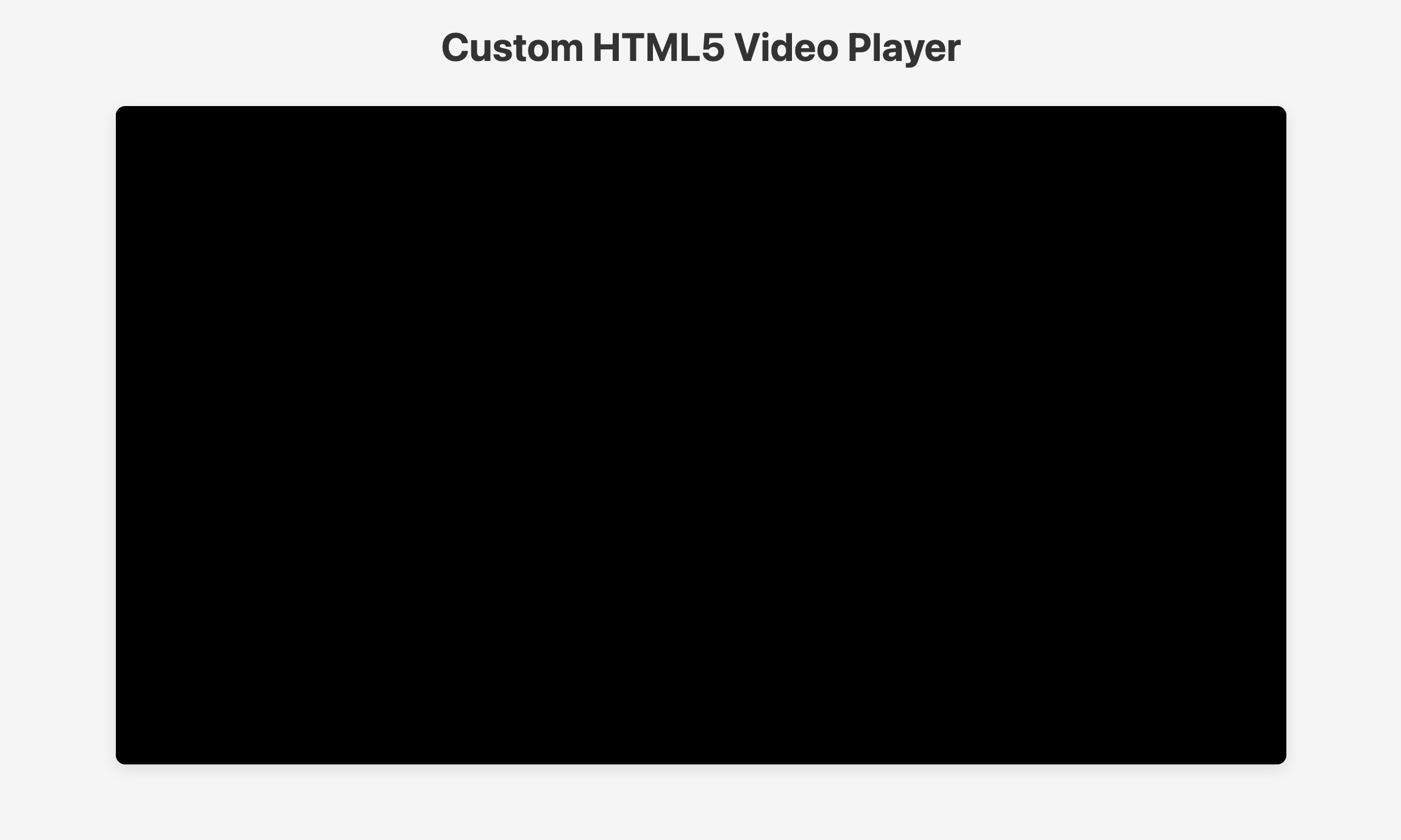 Custom video player with styles
In the following steps, you’ll implement the JavaScript functionality to make the video player interactive and add custom controls.
How to create a video player in JavaScript — Custom controls explained
Before diving into the JavaScript code, let’s first understand what the implementation process entails. Each of the custom controls will include the following:
- An HTML button for the control
- An event listener in JavaScript to listen for user interactions
- Functions to handle the events and update the video player state
Additionally, you’ll update the UI based on the video player state.
Combining all of these events with the CSS you added earlier will create a fully functional custom video player.
Implementing the pause/play functionality
To implement custom controls for the video player, you’ll need to add buttons and icons for play and pause.
Inside the index.html file, add the following code just after the video tag:
<div class="controls">
  <button id="play-pause" class="play-pause-button">
    <svg
      xmlns="http://www.w3.org/2000/svg"
      width="24"
      height="24"
      fill="currentColor"
      viewBox="0 0 24 24"
      class="play-icon"
    >
      <path d="M6.51 18.87a1.002 1.002 0 0 0 1-.01l10-6c.3-.18.49-.51.49-.86s-.18-.68-.49-.86l-10-6a.99.99 0 0 0-1.01-.01c-.31.18-.51.51-.51.87v12c0 .36.19.69.51.87ZM8 7.77 15.06 12 8 16.23z"></path>
    </svg>

    <svg
      xmlns="http://www.w3.org/2000/svg"
      width="24"
      height="24"
      fill="currentColor"
      viewBox="0 0 24 24"
      class="pause-icon"
    >
      <path d="M6 18h4c.55 0 1-.45 1-1V7c0-.55-.45-1-1-1H6c-.55 0-1 .45-1 1v10c0 .55.45 1 1 1M7 8h2v8H7zM14 6c-.55 0-1 .45-1 1v10c0 .55.45 1 1 1h4c.55 0 1-.45 1-1V7c0-.55-.45-1-1-1zm3 10h-2V8h2z"></path>
    </svg>
  </button>
</div>
This code creates a div element with the class controls, which contains a button for the play/pause functionality.
The button includes two SVG icons: one for play and another for pause.
The div with the class controls will be used to hold all the custom controls for the video player.
The play/pause button will toggle between the play and pause icons based on the current state of the video.
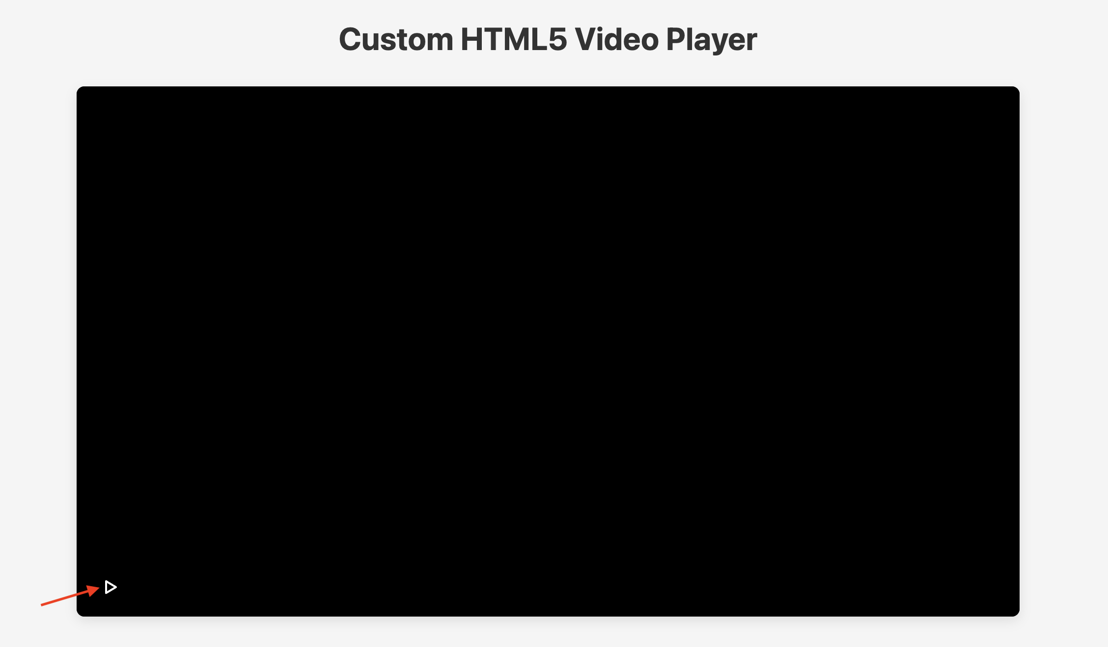 Custom video player Play/Pause button
The CSS code, by default, hides the pause icon, so it will only be displayed when the video is playing. The play icon is visible at all other times.
At the moment, when you click the play/pause button nothing happens because you haven’t added functionality yet.
Let’s fix that by retrieving the control elements and adding functionality to the play/pause button.
In the src/main.ts file, add the following code to retrieve the control elements and set up the initial state of the video player:
document.addEventListener('DOMContentLoaded', () => {
  const video = document.getElementById('video') as HTMLVideoElement;
  const playPauseButton = document.getElementById('play-pause') as HTMLButtonElement;
  const playIcon = document.querySelector('.play-icon') as HTMLElement;
  const pauseIcon = document.querySelector('.pause-icon') as HTMLElement;
});
The code above waits for the DOM to be fully loaded before executing.
It retrieves the video element and the play/pause button and icons from the HTML document.
Next, create a function called updatePlayPauseUI that takes a boolean parameter playing
and updates the visibility of the play and pause icons accordingly based on the current state of the video.
function updatePlayPauseUI(playing: boolean): void {
  playIcon.style.display = playing ? 'none' : 'block';
  pauseIcon.style.display = playing ? 'block' : 'none';
}
The updatePlayPauseUI function lets you easily toggle between the play and pause icons based on the video’s state.
playPauseButton.addEventListener('click', () => {
  if (video.paused) {
    video.play().catch((e) => console.error('Error playing video:', e));
    updatePlayPauseUI(true);
  } else {
    video.pause();
    updatePlayPauseUI(false);
  }
});
The code above checks if the video is currently paused.
If it is, it plays the video using video.play
and updates the UI to display the pause icon with the updatePlayPauseUI function.
If the video is playing, it pauses the video with video.pause() and updates the UI to show the play icon.
Custom video player Play/Pause functionality
Now that you have implemented the Play/Pause functionality, you can proceed to add more custom controls to the video player, making it more interactive and user-friendly.
Add a loading indicator for better user experience
While the video is loading, it’s a good idea to show a loading indicator to inform the user that the video is being prepared for playback. You can add a loading indicator that appears while the video is loading and disappears once the video is ready to play.
To implement this, add the following HTML code inside the video-container div in the index.html file,
just before the video tag to create a loading indicator:
<div class="loading-indicator hidden">
  <div class="spinner"></div>
</div>
Next, retrieve the loading indicator by adding the following code:
const loadingIndicator = document.querySelector('.loading-indicator') as HTMLElement;Then, add event listeners to the video element to show the loading indicator when the video is loading and hide it when the video is ready to play:
video.addEventListener('waiting', () => {
  loadingIndicator.classList.remove('hidden');
});

video.addEventListener('playing', () => {
  loadingIndicator.classList.add('hidden');
});
Custom video player loading indicator
Implementing the video seeking functionality (Progress bar)
To implement video-seeking functionality in your custom video player, you’ll add a progress bar that allows users to seek through the video. This will enable users to jump to different parts of the video by clicking on the progress bar.
First, add the progress elements to the .controls div in the index.html file just after the play/pause button:
<div class="progress-container">
  <div class="progress-bar">
    <div class="progress-filled"></div>
  </div>
  <div class="time-display">
    <span id="current-time">0:00</span> / <span id="duration">0:00</span>
  </div>
</div>
Then retrieve the progress bar elements in the main.ts file by adding the following code:
const progressBar = document.querySelector('.progress-bar') as HTMLElement;
const progressFilled = document.querySelector('.progress-filled') as HTMLElement;
const currentTimeElement = document.getElementById('current-time');
const durationElement = document.getElementById('duration');
Implementing the seek functionality involves a few steps:
-
Display the current time and duration of the video: This will show the user how much of the video has played and how long the video is.
-
Update the progress bar as the video plays: This will be achieved using the
.progress-filledelement based on the current time of the video. -
Handle user interaction with the progress bar: This feature will enable users to click on the progress bar to navigate to a specific time in the video.
Let’s start by displaying the current time and the video’s duration.
First, create a formatTime function that formats the time in seconds to a mm:ss format:
function formatTime(seconds: number): string {
  const minutes = Math.floor(seconds / 60);
  const remainingSeconds = Math.floor(seconds % 60);
  return `${minutes}:${remainingSeconds < 10 ? '0' : ''}${remainingSeconds}`;
}
Next, create an updateProgress function that updates the current time and duration of the video
function updateProgress(): void {
  if (currentTimeElement) {
    currentTimeElement.textContent = formatTime(video.currentTime);
  }

  if (!isNaN(video.duration) && durationElement) {
    durationElement.textContent = formatTime(video.duration);
  }
}
Next, initialize the time display when the video metadata is loaded. This ensures that the duration is displayed correctly when the video is ready to play:
video.addEventListener('loadedmetadata', function () {
  if (currentTimeElement) {
    currentTimeElement.textContent = '0:00';
  }

  if (!isNaN(video.duration) && durationElement) {
    durationElement.textContent = formatTime(video.duration);
  }
});
To make the time display work, attach an event listener to the timeupdate event of the video element
to call the updateProgress function:
video.addEventListener('timeupdate', updateProgress);Let’s also update the progress bar as the video plays.
You can do this by calculating the percentage of the video that has been played
and updating the width of the .progress-filled element accordingly.
Update the updateProgress function to include the following code:
const percent = (video.currentTime / video.duration) * 100;
progressFilled.style.width = `${percent}%`;
Lastly, to allow users to seek through the video by clicking on the progress bar,
add an event listener to the progressBar element that calculates the new time based on where the user clicked:
progressBar.addEventListener('click', seek);

function seek(e: MouseEvent): void {
  const progressBarRect = progressBar.getBoundingClientRect();
  const seekTime =
    ((e.clientX - progressBarRect.left) / progressBarRect.width) *
    video.duration;
  video.currentTime = seekTime;
}

progressBar.addEventListener('click', (e: MouseEvent) => {
  try {
    seek(e);
  } catch (error) {
    console.error('Error while seeking:', error);
  }
});
The code above calculates the new time based on the click position on the progress bar,
sets the currentTime of the video to that value, and handles any errors that might occur.
Head over to your browser and test the video player. You should now see the current time and duration displayed, and the progress bar should update as the video plays. You can also click on the progress bar to seek different parts of the video.
Custom video player progress bar
Implementing playback functionality (Fast forward and rewind)
Let’s add fast-forward and rewind functionality to the video player. This feature will enable users to quickly skip forward or backward in the video for a specified duration.
First, add a .control-buttons-container div with the fast forward and rewind buttons just after the progress bar:
<div class="control-buttons-container">
  <button id="rewind" class="control-button">
    <svg
      xmlns="http://www.w3.org/2000/svg"
      width="24"
      height="24"
      fill="currentColor"
      viewBox="0 0 24 24"
      class="rewind-icon"
    >
      <path d="M21.21 8.11c-.25-.59-.56-1.16-.92-1.7-.36-.53-.77-1.03-1.22-1.48s-.95-.86-1.48-1.22c-.54-.36-1.11-.67-1.7-.92-.6-.26-1.24-.45-1.88-.58-1.31-.27-2.72-.27-4.03 0-.64.13-1.27.33-1.88.58-.59.25-1.16.56-1.7.92-.53.36-1.03.77-1.48 1.22-.17.17-.32.35-.48.52L1.99 3v6h6L5.86 6.87c.15-.18.31-.36.48-.52.36-.36.76-.69 1.18-.98.43-.29.89-.54 1.36-.74.48-.2.99-.36 1.5-.47 1.05-.21 2.18-.21 3.23 0 .51.11 1.02.26 1.5.47.47.2.93.45 1.36.74.42.29.82.62 1.18.98s.69.76.98 1.18c.29.43.54.89.74 1.36.2.48.36.99.47 1.5.11.53.16 1.07.16 1.61a7.85 7.85 0 0 1-.63 3.11c-.2.47-.45.93-.74 1.36-.29.42-.62.82-.98 1.18s-.76.69-1.18.98c-.43.29-.89.54-1.36.74-.48.2-.99.36-1.5.47-1.05.21-2.18.21-3.23 0a8 8 0 0 1-1.5-.47c-.47-.2-.93-.45-1.36-.74-.42-.29-.82-.62-1.18-.98s-.69-.76-.98-1.18c-.29-.43-.54-.89-.74-1.36-.2-.48-.36-.99-.47-1.5A8 8 0 0 1 3.99 12h-2c0 .68.07 1.35.2 2.01.13.64.33 1.27.58 1.88.25.59.56 1.16.92 1.7.36.53.77 1.03 1.22 1.48s.95.86 1.48 1.22c.54.36 1.11.67 1.7.92.6.26 1.24.45 1.88.58.66.13 1.33.2 2.01.2s1.36-.07 2.01-.2c.64-.13 1.27-.33 1.88-.58.59-.25 1.16-.56 1.7-.92.53-.36 1.03-.77 1.48-1.22s.86-.95 1.22-1.48c.36-.54.67-1.11.92-1.7.26-.6.45-1.24.58-1.88.13-.66.2-1.34.2-2.01s-.07-1.35-.2-2.01c-.13-.64-.33-1.27-.58-1.88Z"></path>
      <path d="M10.57 14.47V9.53H8.53v.93h.95v4.01zM12.29 14.23c.32.21.68.32 1.08.32s.76-.11 1.07-.32.56-.51.75-.89c.18-.38.28-.83.28-1.34s-.09-.96-.28-1.34c-.18-.38-.44-.68-.75-.89-.32-.21-.68-.32-1.08-.32s-.76.11-1.08.32-.57.51-.75.89-.27.83-.27 1.33.09.95.28 1.33c.18.38.44.68.76.9Zm.19-3.1c.08-.23.19-.41.35-.53.15-.12.33-.17.53-.17s.39.06.54.18.27.29.35.53.12.52.12.87-.04.63-.12.86-.2.41-.35.53-.33.18-.53.18-.38-.06-.54-.18-.27-.3-.35-.53q-.12-.345-.12-.87c0-.525.04-.63.12-.87"></path>
    </svg>
  </button>

  <button id="fast-forward" class="control-button">
    <svg
      xmlns="http://www.w3.org/2000/svg"
      width="24"
      height="24"
      fill="currentColor"
      viewBox="0 0 24 24"
      class="fast-forward-icon"
    >
      <path d="M19.07 4.93c-.45-.45-.95-.86-1.48-1.22-.54-.36-1.11-.67-1.7-.92-.6-.26-1.24-.45-1.88-.58-1.31-.27-2.72-.27-4.03 0-.64.13-1.27.33-1.88.58-.59.25-1.16.56-1.7.92-.53.36-1.03.77-1.48 1.22s-.86.95-1.22 1.48c-.36.54-.67 1.11-.92 1.7-.26.6-.45 1.24-.58 1.88-.13.66-.2 1.34-.2 2.01s.07 1.35.2 2.01c.13.64.33 1.27.58 1.88.25.59.56 1.16.92 1.7.36.53.77 1.03 1.22 1.48s.95.86 1.48 1.22c.54.36 1.11.67 1.7.92.6.26 1.24.45 1.88.58.66.13 1.33.2 2.01.2s1.36-.07 2.01-.2c.64-.13 1.27-.33 1.88-.58.59-.25 1.16-.56 1.7-.92.53-.36 1.03-.77 1.48-1.22s.86-.95 1.22-1.48c.36-.54.67-1.11.92-1.7.26-.6.45-1.24.58-1.88.13-.66.2-1.34.2-2.01h-2a7.85 7.85 0 0 1-.63 3.11c-.2.47-.45.93-.74 1.36-.29.42-.62.82-.98 1.18s-.76.69-1.18.98c-.43.29-.89.54-1.36.74-.48.2-.99.36-1.5.47-1.05.21-2.18.21-3.23 0a8 8 0 0 1-1.5-.47c-.47-.2-.93-.45-1.36-.74-.42-.29-.82-.62-1.18-.98s-.69-.76-.98-1.18c-.29-.43-.54-.89-.74-1.36-.2-.48-.36-.99-.47-1.5-.11-.53-.16-1.07-.16-1.61a7.85 7.85 0 0 1 .63-3.11c.2-.47.45-.93.74-1.36.29-.42.62-.82.98-1.18s.76-.69 1.18-.98c.43-.29.89-.54 1.36-.74.48-.2.99-.36 1.5-.47 1.05-.21 2.18-.21 3.23 0 .51.11 1.02.26 1.5.47.47.2.93.45 1.36.74.42.29.82.62 1.18.98.17.17.32.34.48.52L15.98 9h6V3l-2.45 2.45c-.15-.18-.31-.36-.48-.52Z"></path>
      <path d="M10.57 14.47V9.53H8.53v.93h.95v4.01zM14.44 9.77c-.32-.21-.68-.32-1.08-.32s-.76.11-1.08.32-.57.51-.75.89-.27.83-.27 1.33.09.95.28 1.33c.18.38.44.68.76.9.32.21.68.32 1.08.32s.76-.11 1.07-.32.56-.51.75-.89c.18-.38.28-.83.28-1.34s-.09-.96-.28-1.34c-.18-.38-.44-.68-.75-.89Zm-.2 3.09c-.08.24-.2.41-.35.53s-.33.18-.53.18-.38-.06-.54-.18-.27-.3-.35-.53q-.12-.345-.12-.87c0-.525.04-.63.12-.87.08-.23.19-.41.35-.53.15-.12.33-.17.53-.17s.39.06.54.18.27.29.35.53.12.52.12.87-.04.63-.12.86"></path>
    </svg>
  </button>
</div>
Next, retrieve the rewind and fast forward buttons in the main.ts file by adding the following code:
const rewindButton = document.getElementById('rewind') as HTMLButtonElement;
const fastForwardButton = document.getElementById('fast-forward') as HTMLButtonElement;
Start by implementing the rewind functionality. Add an event listener to the rewind button that rewinds the video by a specified amount of time (e.g., 10 seconds) when clicked:
rewindButton.addEventListener('click', () => {
  video.currentTime -= 10;
});
Do the same for the fast-forward button, but this time, advancing the video when clicked:
fastForwardButton.addEventListener('click', () => {
  video.currentTime += 10;
});
Clicking the rewind button will rewind the video by 10 seconds, while clicking the fast-forward button will advance it by 10 seconds.
Custom video player Rewind and Fast Forward functionality
Implementing volume control and mute functionality
Currently, the video player lacks volume control and mute functionality. To add these features, you need to create a volume control slider and a mute button.
Update the .control-buttons-container div to include a volume control slider
and volume buttons just after the fast-forward button:
<button id="volume" class="control-button">
  <svg
    xmlns="http://www.w3.org/2000/svg"
    width="24"
    height="24"
    fill="currentColor"
    viewBox="0 0 24 24"
    class="mute-icon"
  >
    <path d="M22 12c0-4.09-2.47-7.61-6-9.16v2.24c2.39 1.39 4 3.96 4 6.92 0 1.85-.64 3.54-1.69 4.89l-1.42-1.42c.7-.98 1.12-2.17 1.12-3.47 0-1.77-.78-3.36-2-4.46v7.05l-2-2V4c0-.37-.2-.71-.53-.88-.32-.17-.72-.15-1.03.05L7.73 6.32 2.71 1.29 1.3 2.7l20 20 1.41-1.41-2.98-2.98A9.94 9.94 0 0 0 22 11.99ZM12 5.87v4.72L9.17 7.76zM12 18.13l-4.45-2.96s-.06-.02-.08-.03c-.06-.03-.12-.06-.19-.08s-.13-.03-.2-.04c-.03 0-.06-.02-.09-.02h-3V9h.76L3.02 7.27C2.41 7.61 2 8.26 2 9v6c0 1.1.9 2 2 2h2.7l5.75 3.83c.17.11.36.17.55.17.16 0 .32-.04.47-.12.33-.17.53-.51.53-.88v-1.76l-2-2z"></path>
  </svg>

  <svg
    xmlns="http://www.w3.org/2000/svg"
    width="24"
    height="24"
    fill="currentColor"
    viewBox="0 0 24 24"
    class="volume-high-icon"
  >
    <path d="M13.47 3.12c-.32-.17-.72-.15-1.03.05L6.69 7h-2.7c-1.1 0-2 .9-2 2v6c0 1.1.9 2 2 2h2.7l5.75 3.83c.17.11.36.17.55.17.16 0 .32-.04.47-.12.33-.17.53-.51.53-.88V4c0-.37-.2-.71-.53-.88ZM12 18.13l-4.45-2.96s-.06-.02-.08-.03c-.06-.03-.12-.06-.19-.08-.06-.02-.13-.03-.19-.04-.03 0-.06-.02-.09-.02H4V9h3s.06-.02.09-.02c.06 0 .13-.02.19-.04a.6.6 0 0 0 .19-.08c.03-.01.06-.02.08-.03L12 5.87zM16 2.84v2.24c2.39 1.39 4 3.96 4 6.92s-1.61 5.53-4 6.92v2.24c3.53-1.55 6-5.07 6-9.16s-2.47-7.61-6-9.16"></path>
    <path d="M18 12c0-1.77-.78-3.36-2-4.46v8.92c1.22-1.1 2-2.69 2-4.46"></path>
  </svg>

  <svg
    xmlns="http://www.w3.org/2000/svg"
    width="24"
    height="24"
    fill="currentColor"
    viewBox="0 0 24 24"
    class="volume-icon"
  >
    <path d="M13.47 3.12c-.32-.17-.72-.16-1.03.05L6.69 7h-2.7c-1.1 0-2 .9-2 2v6c0 1.1.9 2 2 2h2.7l5.75 3.83c.17.11.36.17.55.17.16 0 .32-.04.47-.12.33-.17.53-.51.53-.88V4c0-.37-.2-.71-.53-.88ZM12 18.13l-4.45-2.96s-.06-.02-.08-.03c-.06-.03-.12-.06-.19-.08s-.13-.03-.2-.04c-.03 0-.06-.02-.09-.02h-3V9h3s.06-.02.09-.02c.07 0 .13-.02.19-.04a.6.6 0 0 0 .19-.08c.03-.01.06-.02.08-.03l4.45-2.96v12.26ZM16 7.54v8.92c1.22-1.1 2-2.69 2-4.46s-.78-3.36-2-4.46"></path>
  </svg>
</button>

<div class="volume-slider-container">
  <input type="range" id="volume-slider" min="0" max="1" step="0.1" value="1">
</div>
Next, retrieve the volume control elements, and create an isMuted variable by adding the following code:
const volumeButton = document.getElementById('volume') as HTMLButtonElement;
const muteIcon = document.querySelector('.mute-icon') as HTMLElement;
const volumeHighIcon = document.querySelector('.volume-high-icon') as HTMLElement;
const volumeIcon = document.querySelector('.volume-icon') as HTMLElement;
const volumeSlider = document.getElementById('volume-slider') as HTMLInputElement;

let isMuted = false;
Create a function called updateVolumeUI that updates the volume button icons based on the current volume level and mute state:
function updateVolumeUI(): void {
  if (video.muted || video.volume === 0) {
    isMuted = true;
    muteIcon.style.display = 'block';
    volumeHighIcon.style.display = 'none';
    volumeIcon.style.display = 'none';
    volumeSlider.value = '0';
  } else if (video.volume < 0.5) {
    isMuted = false;
    muteIcon.style.display = 'none';
    volumeHighIcon.style.display = 'none';
    volumeIcon.style.display = 'block';
    volumeSlider.value = String(video.volume);
  } else {
    isMuted = false;
    muteIcon.style.display = 'none';
    volumeHighIcon.style.display = 'block';
    volumeIcon.style.display = 'none';
    volumeSlider.value = String(video.volume);
  }
}
Using this function, you can easily update the volume button icons based on the current volume level and mute state.
Also, create another function called toggleMute that toggles the mute state of the video and updates the volume UI accordingly:
function toggleMute(mute: boolean): void {
  if (mute) {
    video.muted = true;
  } else {
    video.muted = false;

    // Make sure we have a reasonable volume when unmuting if it was at 0
    if (parseFloat(volumeSlider.value) === 0) {
      video.volume = 0.5;
    } else {
      video.volume = parseFloat(volumeSlider.value);
    }
  }
  updateVolumeUI();
}
You can then add an event listener to the volume button that toggles the mute state when clicked:
volumeButton.addEventListener('click', () => {
  toggleMute(!isMuted);
});
For the volume slider, add an event listener that updates the video volume when the slider value changes:
volumeSlider.addEventListener('input', function (this: HTMLInputElement) {
  video.volume = parseFloat(this.value);

  if (this.value === '0') {
    video.muted = true;
  } else {
    video.muted = false;
  }

  updateVolumeUI();
});
Now, when you click the volume button, it toggles between mute and unmute states, and the volume slider allows you to adjust the volume level. The icons will update accordingly based on the current state of the video player.
Custom video player volume control
Implementing Adaptive Bitrate Streaming (ABR) with Uploadcare
Adaptive Bitrate Streaming (ABR) is a technique used to deliver video content over the internet in a way that adapts to the user’s network conditions. This allows for a smoother viewing experience by automatically adjusting the video quality based on the available bandwidth.
To implement ABR you need two things:
-
A video source that supports ABR: Uploadcare video CDN supports adaptive bitrate streaming out of the box for optimized video delivery.
-
A custom video player that can handle ABR: You can use the custom video player you created in this tutorial to implement ABR.
Currently, the video used for this tutorial is hosted on Uploadcare. To enable Adaptive Bitrate Streaming (ABR), let’s make a few minor adjustments to how the video is delivered.
Go to your Uploadcare dashboard and navigate to Settings -> Delivery. Here, you can enable Adaptive Bitrate Streaming for your video files.
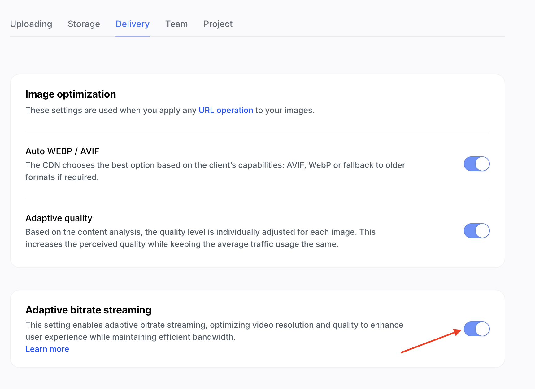 Uploadcare ABR settings
Once you enable ABR, Uploadcare will automatically create multiple versions of your video at different bitrate and resolutions. This allows the video player to switch between these versions based on the user’s network conditions.
In your index.html file, add another source with the src attribute to have an /adaptive_video/ prefix
telling Uploadcare to serve the video in an adaptive manner:
<source src="https://6ca2u7ybx5.ucarecd.net/793148f7-ab69-4877-8334-b46775754477/adaptive_video/" type="application/x-mpegURL">Also add some HTML markup to implement changing the video quality based on the resolutions of videos that Uploadcare will be providing:
<div class="quality-control">
  <button id="quality-button" class="control-button">
    <svg
      xmlns="http://www.w3.org/2000/svg"
      width="24"
      height="24"
      fill="currentColor"
      viewBox="0 0 24 24"
    >
      <path d="M19 3H5c-1.1 0-2 .9-2 2v14c0 1.1.9 2 2 2h14c1.1 0 2-.9 2-2V5c0-1.1-.9-2-2-2zm0 16H5V5h14v14zM7.5 13h2v2h-2zm0-8h2v6h-2zm4 4h2v6h-2zm0-4h2v2h-2zm4 8h2v2h-2zm0-8h2v6h-2z"></path>
    </svg>
  </button>
  <div class="quality-menu hidden">
    <div class="quality-option" data-quality="auto">Auto</div>
    <!-- Quality levels will be added dynamically -->
  </div>
</div>
Implementing the quality selection and ABR functionality involves a few steps:
-
First, check if the browser supports HLS (HTTP Live Streaming) natively or not and use a library like hls.js to handle the adaptive streaming.
-
Next, using the hls.js library, dynamically populate the quality options based on the available video resolutions coming from the video’s manifest file.
-
Finally, implement the functionality to switch between different quality levels when the user selects a quality option from the menu.
To use hls.js, first, install it via npm:
npm install hls.jsThen, import it in your main.ts file and create a variable to hold the HLS instance:
import Hls from 'hls.js';

let hlsInstance: Hls | null = null;
Next, retrieve the quality button and quality menu in your main.ts file:
const qualityButton = document.getElementById('quality-button') as HTMLButtonElement;
const qualityMenu = document.querySelector('.quality-menu') as HTMLElement;
Create a function called getHlsSource to get the HLS source URL from the video element.
This function will look for a source element with the type application/x-mpegURL and return its src attribute:
function getHlsSource() {
  const sources = video.querySelectorAll('source');

  for (const source of sources) {
    if (source.type === 'application/x-mpegURL') {
      return source.src;
    }
  }

  return null;
}

const hlsSource = getHlsSource();
Next, check if the browser supports HLS natively. If it does, set the video source directly. If not, use hls.js to load the HLS source:
if (hlsSource) {
  if (video.canPlayType('application/vnd.apple.mpegurl')) {
    // Native HLS support (Safari)
    video.src = hlsSource;
    console.log('Native HLS support detected, using video.src');

    // Note: Quality selection is limited with native HLS
    if (qualityButton) {
      // Hide quality button for native playback
      qualityButton.style.display = 'none';
    }
  } else if (Hls.isSupported()) {
    // HLS.js support
    hlsInstance = new Hls({
      debug: false,
      autoStartLoad: true,
      startLevel: -1, // Start with auto quality selection
      defaultAudioCodec: 'mp4a.40.2',
    });

    hlsInstance.loadSource(hlsSource);
    hlsInstance.attachMedia(video);

    // Handle HLS events for quality levels
    hlsInstance.on(Hls.Events.MANIFEST_PARSED, function (event, data) {
      // Create quality options in the menu
      populateQualityMenu(data.levels);
    });

    // Handle level switching
    hlsInstance.on(Hls.Events.LEVEL_SWITCHED, function (event, data) {
      if (!hlsInstance) return;

      const currentLevel = data.level;
      updateActiveQuality(currentLevel);
    });
  } else {
    console.warn('HLS is not supported in this browser');
    // Fallback to regular video with original source
  }
}
The code above does the following:
- Checks if the browser supports HLS natively (e.g., Safari) and sets the video source directly
- Initializes hls.js with the video’s HLS source if HLS is not natively supported
- Listens for the
MANIFEST_PARSEDevent to populate the quality menu with available quality levels - Listens for the
LEVEL_SWITCHEDevent to update the active quality in the menu when the user switches quality levels
Next, create a function populateQualityMenu that dynamically populates the quality menu with available quality levels
from the HLS manifest:
function populateQualityMenu(levels: any[]) {
  // Clear existing menu items except auto
  const qualityOptions = qualityMenu.querySelectorAll(
    '.quality-option:not([data-quality="auto"])'
  );
  qualityOptions.forEach((option) => option.remove());

  // Add options for each quality level
  levels.forEach((level, index) => {
    const option = document.createElement('div');
    option.className = 'quality-option';
    option.dataset.quality = String(index);

    // Format display text based on available metadata
    if (level.height) {
      option.textContent = `${level.height}p`;
      if (level.bitrate) {
        option.textContent += ` (${Math.round(level.bitrate / 1000)} kbps)`;
      }
    } else {
      option.textContent = `Level ${index + 1}`;
    }

    option.addEventListener('click', () => {
      setQualityLevel(index);
      hideQualityMenu();
    });

    qualityMenu.appendChild(option);
  });

  // Add event listener for auto quality
  const autoOption = qualityMenu.querySelector('[data-quality="auto"]') as HTMLElement;

  if (autoOption) {
    autoOption.addEventListener('click', () => {
      setQualityLevel(-1);
      hideQualityMenu();
    });

    // Mark auto as active initially
    autoOption.classList.add('active');
  }
}
Also create a function setQualityLevel that sets the quality level based on the user’s selection:
function setQualityLevel(level: number) {
  if (hlsInstance) {
    hlsInstance.currentLevel = level;
    console.log(`Quality level set to: ${level}`);
  }
}
Next, create a function updateActiveQuality that updates the active quality option in the menu based on the current level:
function updateActiveQuality(level: number) {
  if (!hlsInstance) return;

  const options = qualityMenu.querySelectorAll('.quality-option');
  options.forEach((option) => {
    option.classList.remove('active');
  });

  if (level === -1) {
    // Auto mode
    const autoOption = qualityMenu.querySelector('[data-quality="auto"]');
    if (autoOption) {
      autoOption.classList.add('active');
    }
    qualityButton.setAttribute('title', 'Auto Quality');
  } else {
    // Specific level
    const activeOption = qualityMenu.querySelector(
      `[data-quality="${level}"]`
    );
    if (activeOption) {
      activeOption.classList.add('active');
      qualityButton.setAttribute(
        'title',
        `Quality: ${activeOption.textContent}`
      );
    }
  }
}
The function above, updateActiveQuality, updates the active quality option in the menu based on the current level.
It also updates the title of the quality button to reflect the current quality selection.
Finally, create two functions that show and hide the quality menu when the user clicks the quality button and when clicking outside the menu:
qualityButton.addEventListener('click', (e) => {
  e.preventDefault();
  e.stopPropagation();

  if (qualityMenu.classList.contains('hidden')) {
    showQualityMenu();
  } else {
    hideQualityMenu();
  }
});

function showQualityMenu() {
  qualityMenu.classList.remove('hidden');

  setTimeout(() => {
    document.addEventListener('click', closeQualityMenuOnClickOutside);
  }, 10);
}

function hideQualityMenu() {
  qualityMenu.classList.add('hidden');
  document.removeEventListener('click', closeQualityMenuOnClickOutside);
}

function closeQualityMenuOnClickOutside(e: MouseEvent) {
  if (
    qualityButton &&
    qualityMenu &&
    !qualityButton.contains(e.target as Node) &&
    !qualityMenu.contains(e.target as Node)
  ) {
    hideQualityMenu();
  }
}
With these functions, the quality menu will toggle when the user clicks the quality button, and it will close when the user clicks outside of the menu.
Now, when you run your video player, you should see the quality button that allows you to select different quality levels based on the available resolutions provided by Uploadcare’s ABR. The video player will automatically switch between these quality levels based on the user’s network conditions.
Quality selector in custom video player
Also, inspecting the network tab in your browser’s developer tools, you should see that the video is being served with multiple quality levels and the player switches between them based on the available bandwidth.
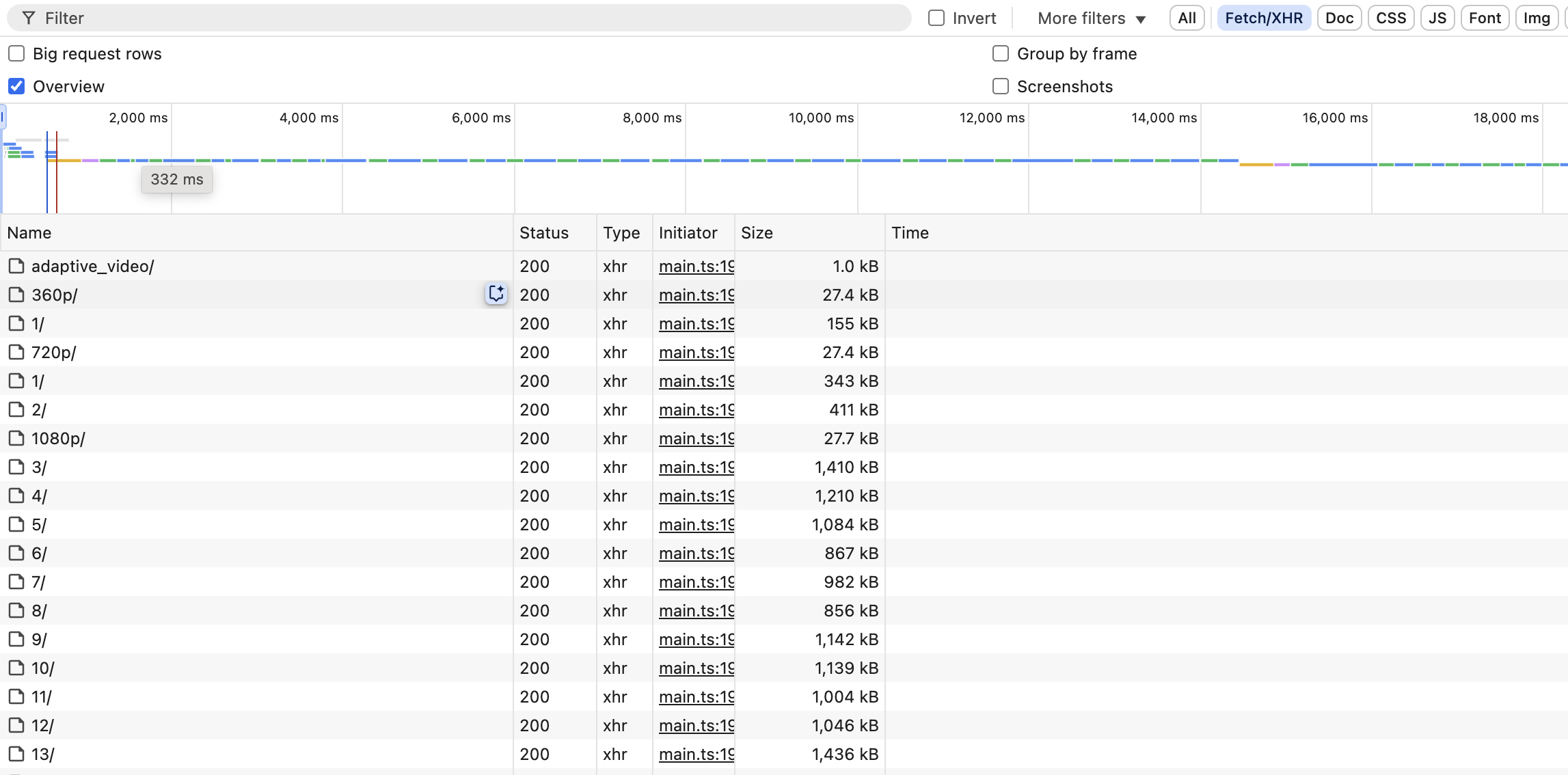 Custom video player network tab
Notice how the player first loads a 360p video and then switches to a 720p video when the network conditions allow it and then to a 1080p video when the network conditions are optimal.
This is made possible by Uploadcare’s Adaptive Bitrate Streaming capabilities, and the custom video player you created is now capable of providing a smooth and responsive viewing experience across different network conditions.
Enabling keyboard controls
To further enhance the user experience, you can also enable keyboard controls for your custom video player. This allows users to control playback using their keyboard, making it more accessible.
To implement keyboard controls, you can add an event listener for various events, such as when the user presses the space bar to play or pause the video, or the arrow buttons for fast forward and rewind, etc. Here’s how you can do it:
document.addEventListener('keydown', function (e: KeyboardEvent) {
  // Space bar: Play/Pause
  if (
    e.code === 'Space' &&
    document.activeElement instanceof HTMLElement &&
    document.activeElement.tagName !== 'BUTTON'
  ) {
    e.preventDefault();
    playPauseButton.click();
  }
  // Left arrow: Rewind
  else if (e.code === 'ArrowLeft') {
    e.preventDefault();
    video.currentTime -= 5;
  }
  // Right arrow: Fast forward
  else if (e.code === 'ArrowRight') {
    e.preventDefault();
    video.currentTime += 5;
  }
  // Up arrow: Volume up
  else if (e.code === 'ArrowUp') {
    e.preventDefault();
    video.volume = Math.min(1, video.volume + 0.1);
  }
  // Down arrow: Volume down
  else if (e.code === 'ArrowDown') {
    e.preventDefault();
    video.volume = Math.max(0, video.volume - 0.1);
  }
  // M key: Mute/unmute
  else if (e.code === 'KeyM') {
    e.preventDefault();
    volumeButton.click();
  }
  // Q key: Quality menu
  else if (e.code === 'KeyQ') {
    e.preventDefault();
    qualityButton.click();
  }
});
To create an immersive experience and enhance the user’s interaction, show or hide the video controls based on mouse activity. Specifically, display the controls when the user hovers the mouse over the video container and hide them when the mouse leaves the area.
const videoContainer = document.querySelector('.video-container') as HTMLElement;
const controls = document.querySelector('.controls') as HTMLElement;

videoContainer.addEventListener('mousemove', showControls);
videoContainer.addEventListener('mouseleave', hideControls);

function showControls() {
  controls.style.opacity = '1';
}

function hideControls() {
  if (!video.paused) {
    controls.style.opacity = '0';
  }
}
Conclusion
In this tutorial, you learned how to create a custom video player in JavaScript with advanced features like Adaptive Bitrate Streaming, rewind and fast-forward functionality, volume control, and quality selection. You also learned how to use Uploadcare’s video CDN to serve your videos, which offers Adaptive Bitrate Streaming out of the box.
You can further enhance your custom video player by adding more features like captions, playback speed control, and more.
If you’d rather not build a video player from scratch, you can check out Uploadcare’s video player component which provides a fully featured video player with Adaptive Bitrate Streaming, and more.
Happy coding!