Cropping images directly in the browser with HTML and CSS gives you flexibility and control over
how images are displayed in your application.
With HTML and CSS, you use elements to focus on specific areas of an image
without having to modify the original files.
This approach is particularly useful for responsive design, dynamic content, and user interfaces
where you need to focus on specific areas of an image without using an external tool
or additional programming language like JavaScript.
Cropping images server-side or via a CDN can optimize performance by reducing file size.
However, client-side cropping with HTML and CSS allows for real-time adjustments
and better user experience in many scenarios, such as carousels, galleries, and profile pictures,
or when fetching images from dynamic sources.
Let’s explore some of the various techniques available for cropping images using HTML and CSS,
using this image from Unsplash as an example:
The original image dimension is 1000×1500 pixels and 256 KB in size:
Image of a person looking out at the sea from a boat
Cropping with height and width
By wrapping an image in a container with fixed dimensions and using the CSS overflow: hidden property,
you can effectively crop the image.
Let’s add the image in a div with a fixed size of 500×500 pixels and hide the overflow:
<divclass="image-wrapper"><imgsrc="https://ucarecdn.com/4a53e4ac-3d8b-43a1-acae-e0149317bd12/user.jpg"alt="Person looking out at the sea from a boat"></div>
This will center the person in the cropped area, but it requires manual adjustment of the margin values.
Cropped image with the person centered
Using the object-fit property for cropping images
The object-fit CSS property allows you to specify
how an image should be resized to fit its container.
Using this property, you can crop images by setting the container dimensions and using specific object-fit values
on the image itself to direct how you want the image to behave.
You’ll also need to need to set the width and height of the image to be 100% of the container
to ensure it fills the space correctly.
.image-wrapper img{width: 100%;height: 100%;/* or contain, scale-down */object-fit: cover;}
The object-fit property has several values that determine how the image is resized within its container:
cover
The image will fill the container while maintaining its aspect ratio. Parts of the image may be cropped to fit.
contain
The image will be scaled to fit within the container while maintaining its aspect ratio.
No cropping occurs, but there may be empty space in the container.
scale-down
The image will be scaled down to fit within the container if it is too large,
otherwise, it will be displayed at its original size.
Cropped image with object-fit: cover
Adjusting with object-position
object-position specifies
how you want to control the alignment of the image within its container when using object-fit.
By default, the image is centered.
You can adjust the cropped area by changing the object-position property to focus on specific parts of the image.
The object-position property accepts values similar to the CSS background-position property,
such as keywords (top, center, bottom, left, right) or percentage/pixel values.
When not specified, it is set to 50% 50% or center center.
To adjust the focus of the cropped image, you can modify the CSS like this:
Using CSS background images is another way you can effectively crop by controlling
how the background image is displayed within an element.
In the case where you want to use decorative images, or when applying cropping effects
without using an <img> tag, the background image approach can be quite handy.
To use it, you’ll need to set the background-image property on a container element
and then use background-size and background-position to control how the image is displayed and cropped.
The background-position property allows you to specify the position of the background image within its container.
You can use keywords like top, center, bottom, left, right, or percentage/pixel values
to adjust the focus of the cropped area.
.background-image-wrapper{/* shifts the focus point */background-position: 95% 80%;}
Using the background-size property, you can control how the background image is scaled within the container.
Common values include:
cover
The background image will cover the entire container, cropping parts of the image if necessary.
contain
The image will be scaled to fit within the container without cropping, maintaining its aspect ratio.
Specific dimensions (e.g., 500px 300px) allow you to set custom sizes for the background image.
The background-size property determines how much of the image is visible within the container
and how it is cropped. Think of it like a zoom level for the background image.
The larger the size, the more zoomed-in the image appears, leading to more cropping.
For example, add this to to the image wrapper to zoom in on the image:
.background-image-wrapper{/* zooms in the image */background-size: 800px;}
Cropped background image with background-size and background-position
These properties work together to give you precise control over how the background image is cropped
and displayed within its container.
Aspect ratio and responsive cropping
When cropping images, maintaining the aspect ratio is crucial for responsive design.
This ensures that images look good on different screen sizes without distortion.
All of the CSS cropping techniques mentioned above can be combined with the aspect ratio property
to achieve this.
Modern aspect-ratio property
The CSS aspect-ratio property allows you to define
a preferred aspect ratio for an element.
When cropping an image, you can use this property to set the aspect ratio to reflect
how you want the cropped image to appear and to maintain consistency across different screen sizes.
.image-wrapper img{width: auto;/* 1:1 aspect ratio for square */aspect-ratio: 1 / 1;}
The aspect-ratio property allows values like 1 / 1, 16 / 9, or 4 / 3, and is supported in most modern browsers,
making it a reliable choice for responsive cropping.
Legacy padding-top hack
Before the aspect-ratio property was widely supported, there was the popular “padding-top hack”
that we’ve all used at some point to maintain aspect ratios.
To use it , you create a parent container with a position of relative and set its width to a specific value
(often 100% for responsiveness) and then set padding-top to a percentage that reflects the desired aspect ratio.
For example, here are some common aspect ratios and their corresponding padding-top values:
In cases where you need to create circular or elliptical crops, such as avatars or profile images,
the border-radius property can be used. By setting the border-radius to 50%,
you can crop in a perfect circle for square images or an ellipse for rectangular images.
Usually, you would combine this with overflow: hidden and container height and width
to hide the parts of the image that lay outside of the cropped area.
For background images, you can apply the same border-radius technique to the container element.
Advanced cropping with clip-path
CSS has a clip-path property
that allows you to clip certain areas of an element using a shape,
making the areas inside the shape visible while hiding the rest.
With clip-path, you can define custom shapes using basic shapes or SVG paths to crop images in unique ways.
Built-in shapes
The clip-path property has several built-in shapes that you can use to crop images,
including rectangle(), inset(), circle(), ellipse(), and polygon().
For example, to create a circular crop using clip-path, you can use the following CSS:
Aside from using the built-in shapes, you can also create custom shapes using SVG clip-paths.
For example, you can define an star clip-path and apply it to an image using:
<divclass="image-wrapper"style="height: 500px;width: 500px;"><svgwidth="0"height="0"aria-hidden="true"focusable="false"><defs><clipPathid="starClip"clipPathUnits="objectBoundingBox"><polygonpoints="0.5,0 0.61,0.35 0.98,0.35 0.68,0.57 0.79,0.91 0.5,0.7 0.21,0.91 0.32,0.57 0.02,0.35 0.39,0.35"/></clipPath></defs></svg><imgsrc="https://ucarecdn.com/4a53e4ac-3d8b-43a1-acae-e0149317bd12/user.jpg"alt="Person looking out at the sea from a boat"></div>
And then apply it to the image using CSS:
.image-wrapper{clip-path:url(#starClip);}
Star cropped image with SVG clip-path
To generate complex SVG clip-paths, you can use online tools like UI-TOOLS.
shape-outside for text wrapping
The shape-outside property allows you to define a shape around which text can wrap.
This can be particularly useful when you want to create visually appealing layouts with cropped images.
.shape-outside-circle{float: left;width: 200px;height: 200px;margin-right: 20px;clip-path:circle(50% at 50% 50%);shape-outside:circle(50% at 50% 50%);}
<divstyle="max-width: 800px;"><divclass="shape-outside-circle"><imgsrc="https://ucarecdn.com/4a53e4ac-3d8b-43a1-acae-e0149317bd12/user.jpg"alt="Person looking out at the sea from a boat"></div><p>Lorem ipsum dolor sit amet, consectetur adipiscing elit. Sed do eiusmod tempor incididunt ut labore et dolore magna aliqua. Ut enim ad minim veniam, quis nostrud exercitation ullamco laboris nisi ut aliquip ex ea commodo consequat.</p></div>
The text will wrap around the circular cropped image.
Text wrapping around a circular cropped image
The shape-outside property works best with floated elements
and requires the element to have a defined width and height.
Also, it is important to note that shape-outside does not actually crop the image;
it only affects how text flows around the image.
Cropping with CSS transformations
The CSS transform property can be used to crop images by scaling and translating them
within an element serving as the container.
To use it, you set the container dimensions and hide the overflow,
then apply scaling and translation to the image to achieve the desired crop.
The transform property also allows you to apply multiple transformations,
such as scale(), translate(), rotate(), and skew() to an element.
Combining these transformations achieves a cropped effect.
While this method can be effective for cropping, it may lead to blurriness if the image is scaled up too much.
Still, it can be useful for certain scenarios where you need to quickly crop an image
without altering its original dimensions.
Using server/CDN cropping
While cropping images with HTML and CSS provides flexibility and control over how images are displayed,
there are scenarios where server-side or CDN-based cropping is more appropriate.
Server/CDN cropping involves processing the image on the server or at the CDN level
before delivering it to the client.
Using Uploadcare image CDN, you can easily crop images
by appending specific URL modifiers to its URL.
For example, to crop an image to a particular width and height,
you can use the -/crop/ or -/scale_crop/ modifier:
Uploadcare also provides a smart cropping feature that uses AI to auto-detect faces and objects in an image
and crops the face in the image automatically.
To use it, append the word smart after the crop transformations like crop or scale_crop in the URL:
The smart cropping feature is particularly useful for profile pictures, avatars,
and images with faces, as it ensures that the most important part of the image is always in focus.
It also removes the need for manual adjustments, making it ideal for automated workflows.
CSS vs Server/CDN cropping: When to use each
Whether to use CSS/HTML cropping or server/CDN cropping depends on your specific use case and requirements,
but ideally, you can use a combination of both methods to achieve optimal results.
Use CSS/HTML cropping when you need dynamic, client-side cropping for interactive elements,
responsive designs, or when you want to maintain the original image quality.
Use server/CDN cropping when you need to optimize performance by reducing file size,
generating consistent thumbnails, or when you want to leverage caching mechanisms provided by CDNs.
To determine which method to use, consider factors such as performance, user experience,
and the requirements of your project.
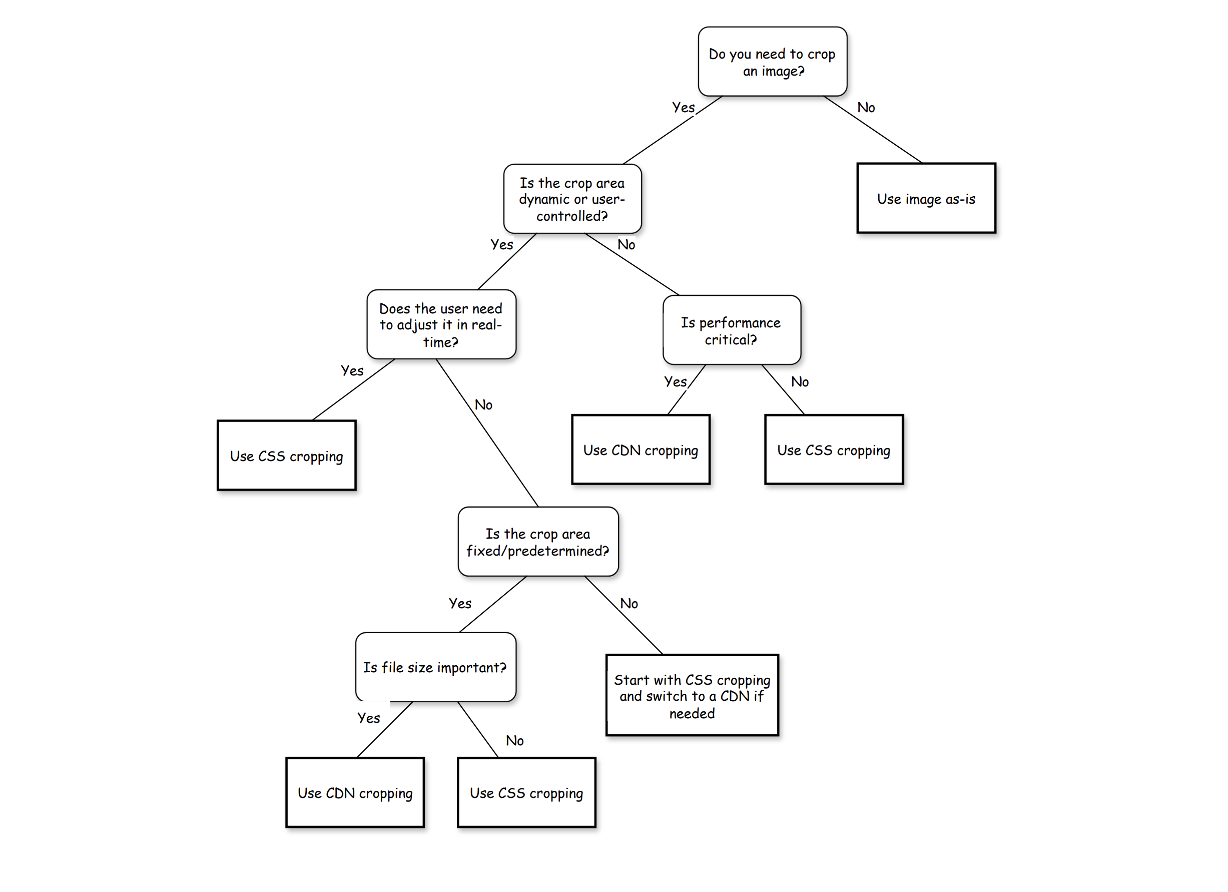
Here is a simple decision tree to help you choose the right method for cropping images:
Decision tree for choosing between CSS/HTML cropping and Server/CDN cropping
Performance and accessibility essentials
Cropping images with CSS and HTML can impact performance and accessibility if not done thoughtfully.
Here are some essential tips to keep in mind:
CSS cropping does not reduce the file size of the image,
so it is important to optimize the source image for performance.
If you are using large images and cropping them down with CSS, the full image is still being downloaded.
This can negatively impact load times and performance metrics like Largest Contentful Paint (LCP).
Always set explicit width and height attributes on images to prevent layout shifts,
which can contribute to Cumulative Layout Shift (CLS) issues.
Properly describe the cropped subject with alt text to ensure accessibility for screen readers.
Use srcset and sizes attributes to deliver responsive images based on the device’s screen size and resolution.
Pro tips and common pitfalls
Some additional tips and common pitfalls to be aware of when cropping images with HTML and CSS:
Don’t rely solely on CSS cropping for critical images; ensure the original image contains the necessary details.
Test cropping techniques across different browsers to ensure consistent behavior.
Avoid using cropping techniques for lazy loading scenarios; optimize the source image instead.
Test cropping on various devices and orientations (portrait vs. landscape)
to ensure the cropped focal points remain meaningful, especially for faces or products.
Conclusion
Cropping images with HTML and CSS provides a flexible way to control how images are displayed in your web applications.
By using techniques like object-fit, background images, clip-path, and aspect ratio,
you can create visually appealing layouts that focus on specific parts of an image.
However, it’s important to consider performance implications and accessibility best practices when implementing these techniques.
In scenarios where performance is critical, server-side or CDN-based cropping with solutions
like Uploadcare may be more suitable.
Trust Jamin Okpukoro is a Developer Advocate and Senior Technical Writer with a strong background in software engineering, community building, video creation, and public speaking. Over the past few years, he has consistently enhanced developer experiences across various tech products by creating impactful technical content and leading strategic initiatives. His work has helped increase product awareness, drive user engagement, boost sales, and position companies as thought leaders within their industries.