How to optimize images for the Web: Best practice guide
Last edited:
Images are a significant part of any webpage; optimizing them is important for improving website performance. According to the HTTP Archive report, the average sum of all resources requested by a web page is 2.64 MB while the average size of image resources requested is 1.02 MB. Based on this we can say that images account for about 38% of a webpage’s total weight. When not optimized, they’re often the culprit behind a sluggish website, leading to a poor user experience and lower search engine rankings.
In this article, you’ll learn about some of the best practices to follow when optimizing images for your website and various methods to help you achieve the best results.
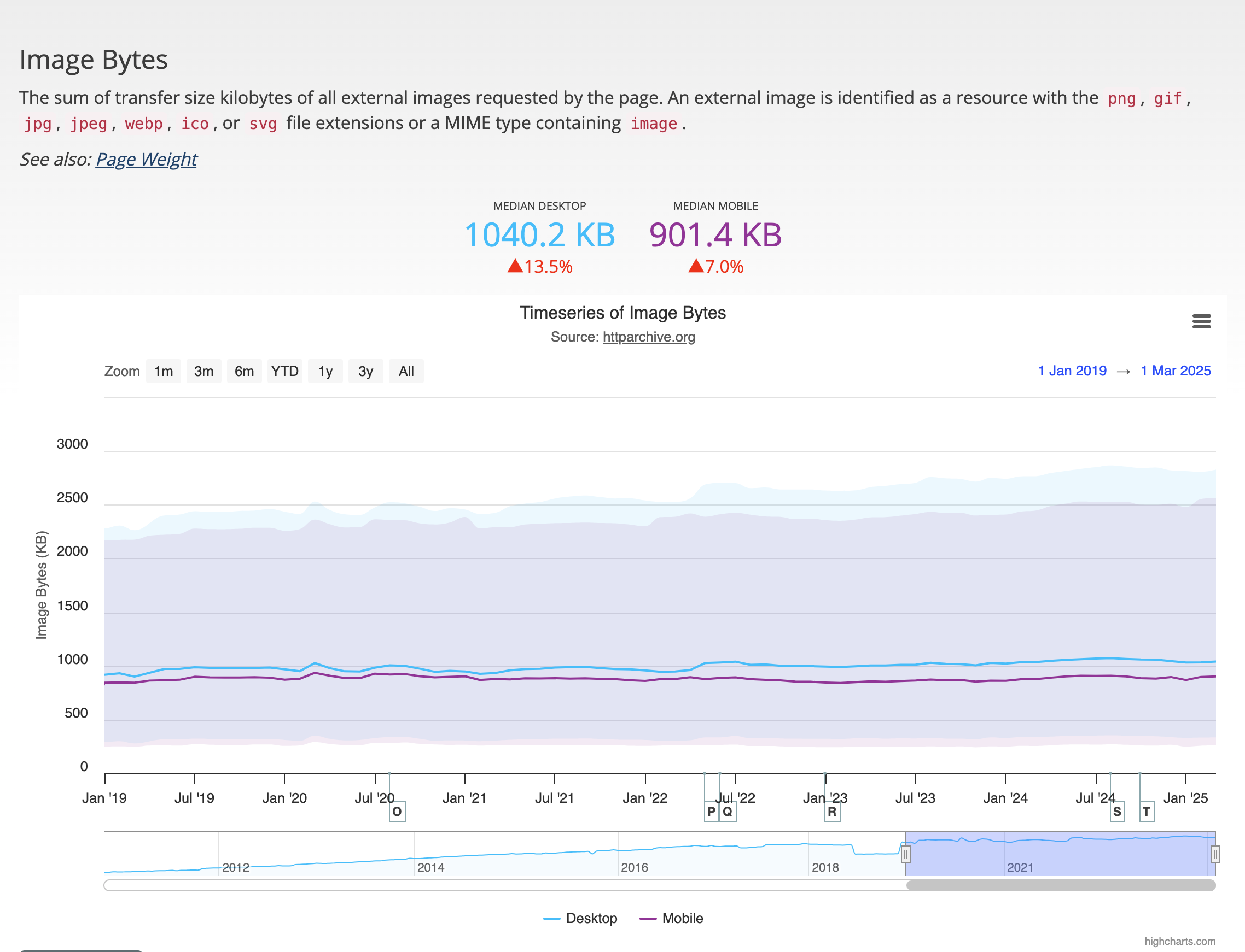 Median size of image resources requested by a web page by HTTP Archive
What is image optimization?
Image optimization is any process or technique you apply to deliver high-quality images in the right format, dimensions, and resolution, while keeping the file size as small as possible. It is about achieving the perfect balance between visual quality and performance.
Why does it matter? Well, images often make up a significant portion of a web page’s size. Optimizing them isn’t just about aesthetics — it directly affects various components that makes a good experience on your website like page speed, search engine optimization (SEO), user experience (UX), and accessibility.
Key benefits of image optimization
Whether you’re running a blog, an e-commerce site, or a portfolio, optimizing your images can significantly impact your website’s performance and the overall experience your users have.
Here are some benefits you gain by spending a bit of time (or automation) on image optimization:
-
Faster page load time: When the images on your website are optimized, they tend to load faster, thus improving the load time of your website in general,
This results in a lower bounce rate from your visitors. We live in a world where attention spans are relatively low. If your website is slower than the average website, it tends to drive away visitors. This article explains how fast loading times affect end user experience.
-
Better search engine rankings: Google and other search engines take site speed seriously. Optimizing images can also help you to improve important metrics for web performance like the Core Web Vitals, especially Largest Contentful Paint (LCP).
-
Improved user experience: Optimized images can help give your users a smooth, speedy experience, increasing engagement and satisfaction. By serving images in the best format and size for their device, you can ensure the images load quickly and look great.
This is especially important for mobile users, who may be on slower connections or have limited data plans — no one complains about a website that loads fast!
-
Accessibility: Optimized images with descriptive alt text improves accessibility and enhances contextual understanding. When someone visits your site using assistive technologies like screen readers, alt text becomes their window into your visual content.
A well-written alt description not only tells the user about what’s shown in the image but also provides context that helps them understand its purpose on the page and helps search engine crawlers for improved SEO.
-
Lower hosting and bandwidth costs: Smaller image files mean less data to store and transfer. This can lead to lower hosting costs and reduced bandwidth usage, especially for high-traffic sites.
-
Better conversion rates: Faster load times and improved user experience can lead to higher conversion rates. Users are more likely to complete a purchase or sign up for a newsletter if they aren’t waiting for images to load.
How to optimize images for the Web: Step-by-step guide
When optimizing images for your websites, you can take a few steps to ensure that your images are optimal and performing well.
Choose the right image format
First, you need to select the right image format you want to serve to your users. There are various image formats that you can use on your website such as JPEG, AVIF, WebP, PNG and SVGs. Choosing the right image format is important, as each image format has its own strengths and weaknesses.
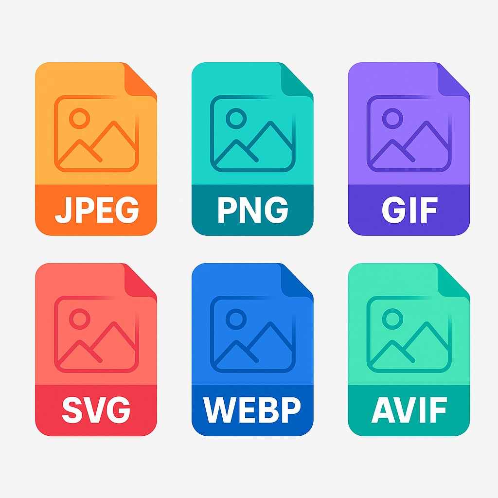 Image formats
The table below outlines the features of various image formats and the best scenarios for using each.
| Format | Compression | Transparency support | Browser support | Best use case | Notes |
|---|---|---|---|---|---|
| JPEG | Lossy | No | Widely supported | Photographs, eCommerce, blog images | Smaller file size with acceptable quality. No transparency. |
| PNG | Lossless | Yes | Widely supported | Icons, graphics with transparency, text overlays | Great for crisp edges and transparency, but larger than JPEG. |
| WebP | Lossy & lossless | Yes | Modern browsers | Photos, illustrations, mixed content | Excellent compression. Smaller than JPEG and PNG with quality intact. |
| AVIF | Lossy & lossless | Yes | Limited legacy support | High-quality photos, performance-focused sites | Better compression than WebP. Growing support, test fallbacks. |
| SVG | Vector (not raster) | Yes | Widely supported | Logos, icons, UI elements | Infinitely scalable. Editable with CSS/JS. Not for complex photos. |
👉 Pro tip: WebP and AVIF are supported by most modern browsers. Use them where possible, as they offer further reduction in file size while still retaining a good quality. Check out this article on AVIF images and the benefits they provide.
According to the HTTP Archive state of the web report, the chart below illustrates the adoption trend of image formats over the past two years.
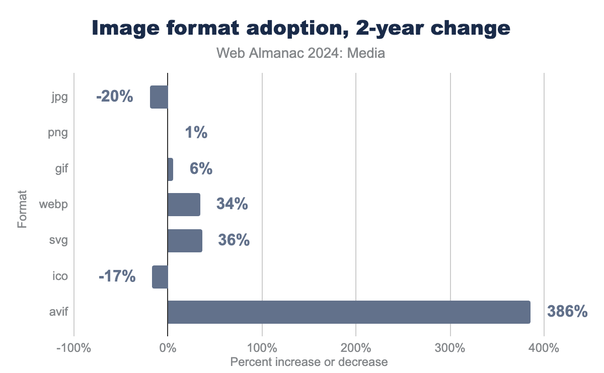 Image format adoption by HTTP Archive
It illustrates that AVIF adoption is rising quickly. Many performance-focused sites are already using it extensively. Other image types growing in adoption include SVG and WebP.
Resize images to fit display dimensions
Once you’ve decided on an image format, the next step is to adjust it to fit the display dimensions. Why? Because delivering larger images than required can result in longer load times and wasted bandwidth.
For example, if your website displays images at 600px wide, there’s no need to upload a 3000px-wide image. This is especially important for responsive designs, where images may be displayed at different sizes on different devices.
It would be overkill to serve an image five times larger than needed. So, resize images to match the container size they’ll be shown in. You’ll save bandwidth and improve load times.
Say you have an hero image that is displayed on desktop like this:
 Image resized for desktop
 The same image can be resized for mobile devices like this:
 Image resized for mobile
 Compress images: Lossless vs. lossy
Once you’ve resized your images, the next step is to compress them. Compressing an image reduces the file size without sacrificing too much quality.
There are two types of image compression:
-
Lossless compression: Reduces file size without losing any data. This is ideal for images where quality is paramount, like logos or graphics.
-
Lossy compression: Reduces file size by removing some data. This is great for photographs or images where a slight loss in quality is acceptable.
Lossy compression can significantly reduce file size, but be careful not to overdo it. If your images start looking like pixelated messes, you’ve gone too far.
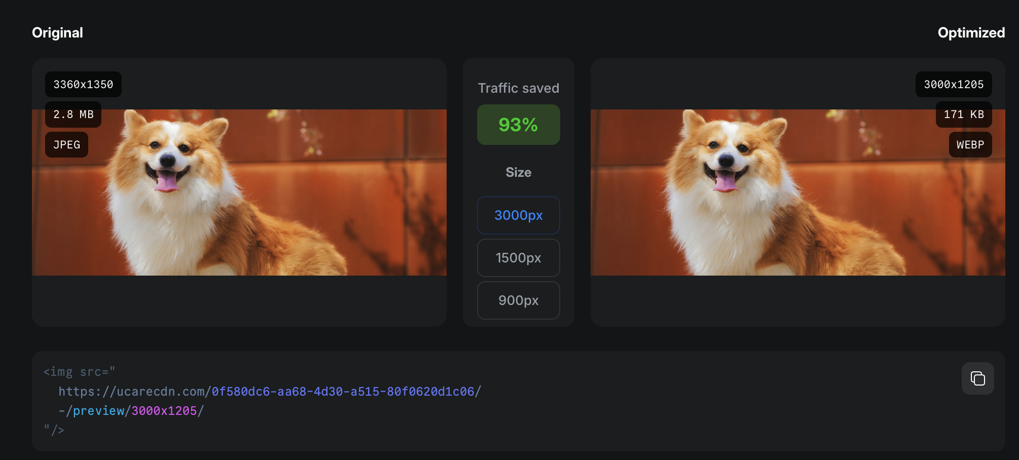
Using tools like Squoosh and ImageOptim can help you find the right balance. They offer both lossy and lossless options, so you can choose what works best for your images.
Tools like Uploadcare offer automatic image compression, so you don’t have to worry about it. You can set it to compress images automatically as you upload them.
Rename files with SEO-friendly keywords
When you upload images, use descriptive filenames that include relevant keywords. This helps search engines understand the image and can improve your SEO.
Instead of having an image with filename IMG_1234.jpg, rename it to something more readable like blue-running-shoes.jpg. Search engines can’t “see” images, but they read filenames. Having a good descriptive name helps them index your content better. this helps with accessibility, as screen readers can read the filenames and provide context to visually impaired users.
Add alt text and optimize metadata
Alt text (alternative text) is a description of the image that appears if the image fails to load. It is also read by screen readers, making it essential for accessibility. Use descriptive alt text that includes relevant keywords, but avoid keyword stuffing. This is important for both SEO and accessibility.
Alt text helps search engines understand the content of your images, and it also provides context for users who may not be able to see the images.
Use lazy loading and the “blur-up” technique
After optimizing your images, consider using a loading technique such as lazy loading.
This technique defers the loading of images until they’re in the viewport, reducing initial load time and improving performance.
This means that images below the page (not immediately visible) won’t load until the user scrolls down to them. Lazy loading can significantly improve page load times, especially for image-heavy pages.
The code below shows an example of how to implement lazy loading using the loading attribute in HTML:
The code below shows an example of how to implement lazy loading using the loading attribute in HTML:
<img src="high-res.jpg" loading="lazy" alt="A beautiful sunset">Be careful, as lazy loading can lead to poor user experience if not implemented correctly. You can learn more about it from Google’s lazy loading guide.
The “blur-up” technique is a popular method of lazy loading. It involves showing a low-resolution version of the image first and then swapping in the high-resolution version once it’s loaded. This gives users a quick preview while the full image loads in the background.
 Blur-up technique example
Uploadcare has a built-in feature for loading appealing placeholders, using blurhash, until the image you requested is ready. Check out this blurhash guide for more information on how to implement this in your website.
Tools for image optimization
There are various tools you could use for optimizing your images. Some are manual tools, some can be used for bulk services, and some are automated tools that can optimize images on the fly.
Manual tools
These tools are ideal if you’re trying to quickly optimize one image or a few images at a time. They are great for quick edits and compression:
-
Photoshop: Photoshop is a powerful image editing tool that allows you to resize, compress, and optimize images. It offers various export options, including WebP and AVIF formats.
-
Squoosh: Squoosh is a free online tool by Google that allows you to compress and resize images. It supports various formats, including WebP and AVIF, and offers both lossy and lossless compression options.
-
Ezgif: Ezgif is a free online tool that allows you to compress, crop, resize, and optimize images. It supports various formats, including GIF, PNG, and JPEG.
Bulk Tools
These tools are ideal for optimizing multiple images at once. They can help you save time and effort when dealing with large image libraries:
-
Uploadcare: Uploadcare offers image optimization that allows you to compress, resize, and convert images on the fly. It supports various formats, including WebP and AVIF, and offers automatic optimization on upload.
-
ShortPixel: ShortPixel is a popular image optimization tool that allows you to compress and resize images in bulk. It supports various formats, including WebP and AVIF, and offers both lossy and lossless compression options.
-
ImageOptim: ImageOptim is a macOS app that allows you to compress images in bulk. It supports image formats like JPEG, PNG, and GIF, and offers both lossy and lossless compression options.
Automating image optimization
When you’re dealing with a lot of images, manual optimization can be a painful and tedious task. Luckily, there are various tools and plugins that can help automate the process.
WordPress plugins for image optimization
-
WP Smush: Smush is a popular WordPress plugin that you can set to automatically compress and resize images on upload. It also offers lazy loading and bulk optimization features.
-
Imagify: Imagify is another WordPress plugin that offers automatic image optimization. It supports WebP conversion and can optimize images in bulk. It also has a feature that allows you to restore original images if needed.
-
Uploadcare plugin: Uploadcare offers a WordPress plugin that allows you to upload and optimize images directly from the WordPress dashboard and offers automatic optimization on upload.
Developer tools and APIs
There are also various developer tools and APIs that can help automate image optimization. These tools can be integrated into your development workflow, making it effortless to optimize images as part of your build process:
-
Uploadcare: Uploadcare offers a wide range of features, including automatic resizing, format conversion, and CDN delivery. Its robust API allows developers to easily integrate image optimization into their applications. It also provides a File Uploader that allows uploading images from various sources, including social media and cloud storage.
 Uploadcare image optimization
 -
TinyPNG API: TinyPNG offers an API for developers to integrate image compression into their applications. It supports both lossy and lossless compression and can handle bulk uploads.
-
ImageOptim: ImageOptim has an API that allows developers to integrate image optimization into their applications
CMS integrations
If you’re using a headless CMS or a static site generator, chances are it has a built in feature to optimize your images but also offers various integrations and plugins to help with image optimization:
-
Contentful: There are various plugins available for Contentful that can help with image optimization. These plugins can automatically resize and compress images as you upload them, making it easy to optimize images for your website. An example is Uploadcare’s plugin for Contentful for dynamic image delivery.
-
DecapCMS: DecapCMS is also a CMS that has a variety of plugins that you could use to optimize your images e.g. Uploadcare DecapCMS plugin
Advanced optimization techniques
Even with optimizing your images, how you serve them can impact how fast they load. There are a couple of options that ensure you are delivering optimized images to your users:
Responsive image delivery
Make sure to deliver images that are responsive to your users by considering their screen width and device
capabilities. You can achieve this using the HTML srcset attribute, which allows you to serve
different image sizes based on screen resolution and size.
To ensure that images are fully responsive and fluid, combine the srcset attribute with
the sizes attribute. This will help you determine which image to serve based on the user’s current screen size.
More on this topic: 👉 Creating responsive images with srcset
Using a tool like Uploadcare, you can easily generate responsive images with the right size and format for different devices. This ensures that users on mobile devices receive smaller images, while desktop users get high-resolution images.
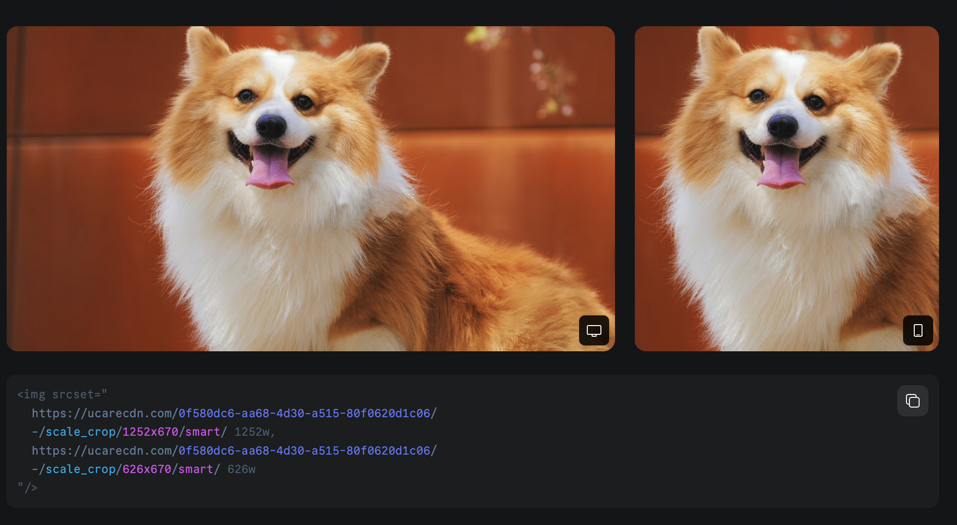 Responsive images example
Image CDN
Consider using an image CDN to serve your images, as CDNs make it easier to cache files for quick delivery and ensure images are served as fast as possible.
-
Uploadcare image CDN: As part of Uploadcare’s all-in-one platform solution for processing, and delivering high-quality images worldwide, Uploadcare provides a fast image CDN with an easy-to-use URL API to programmatically apply multiple image transformations on the fly before delivery.
-
Cloudflare: Cloudflare offers a CDN you can use for serving dynamic and static content like images for device, browser, and bandwidth needs.
-
Akamai: Akamai Akamai offers CDNs for various content delivery use cases to ensure your content gets to your users as quickly as possible.
Monitoring performance
How do you know if the optimizations you made to images on your website will impact its performance? To measure the impact of your optimization efforts, there are a couple of tools you could use that monitors the performance of your website:
-
Google’s PageSpeed Insights analyzes the content of a web page and generates suggestions to make that page faster. It provides insights into how images are impacting your page speed and offers recommendations for optimization.
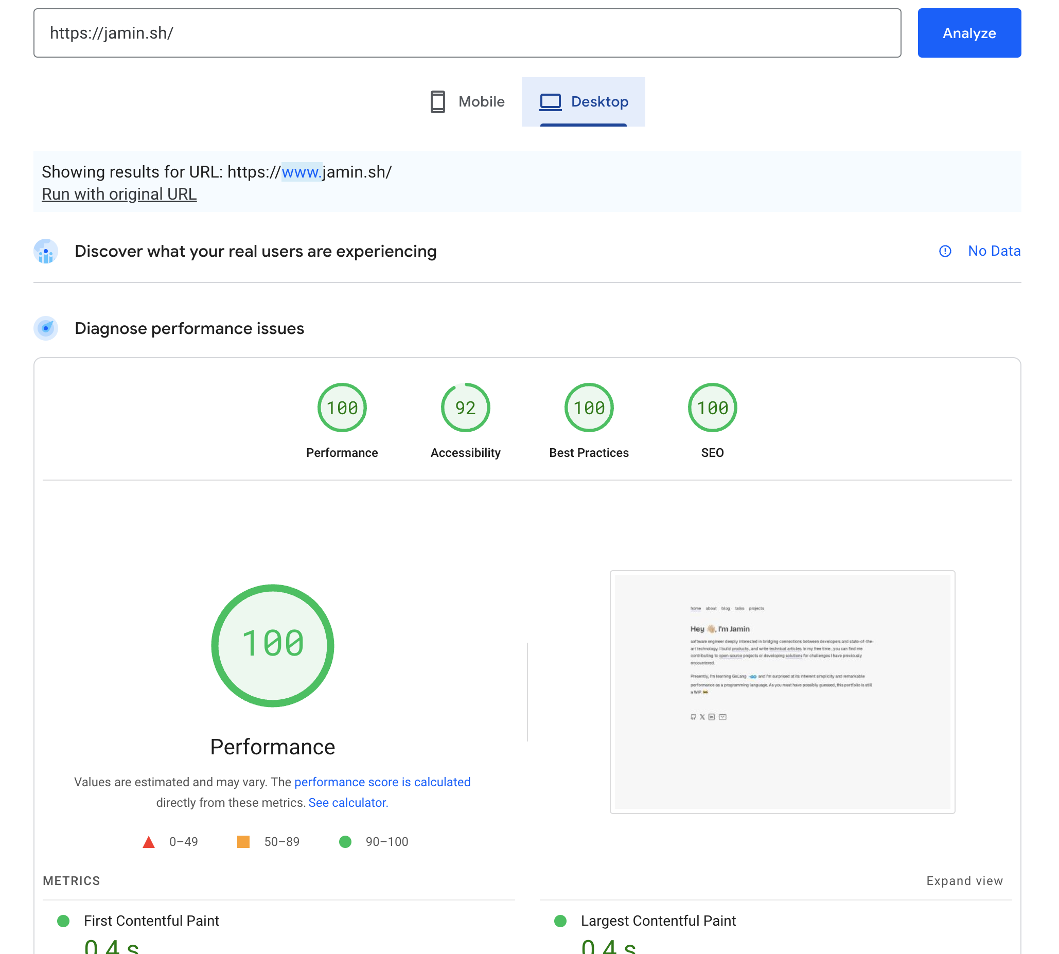 Google PageSpeed Insights
 -
This tool allows you to test your website’s performance from different locations and devices. It provides detailed reports on load times, including how images are affecting performance.
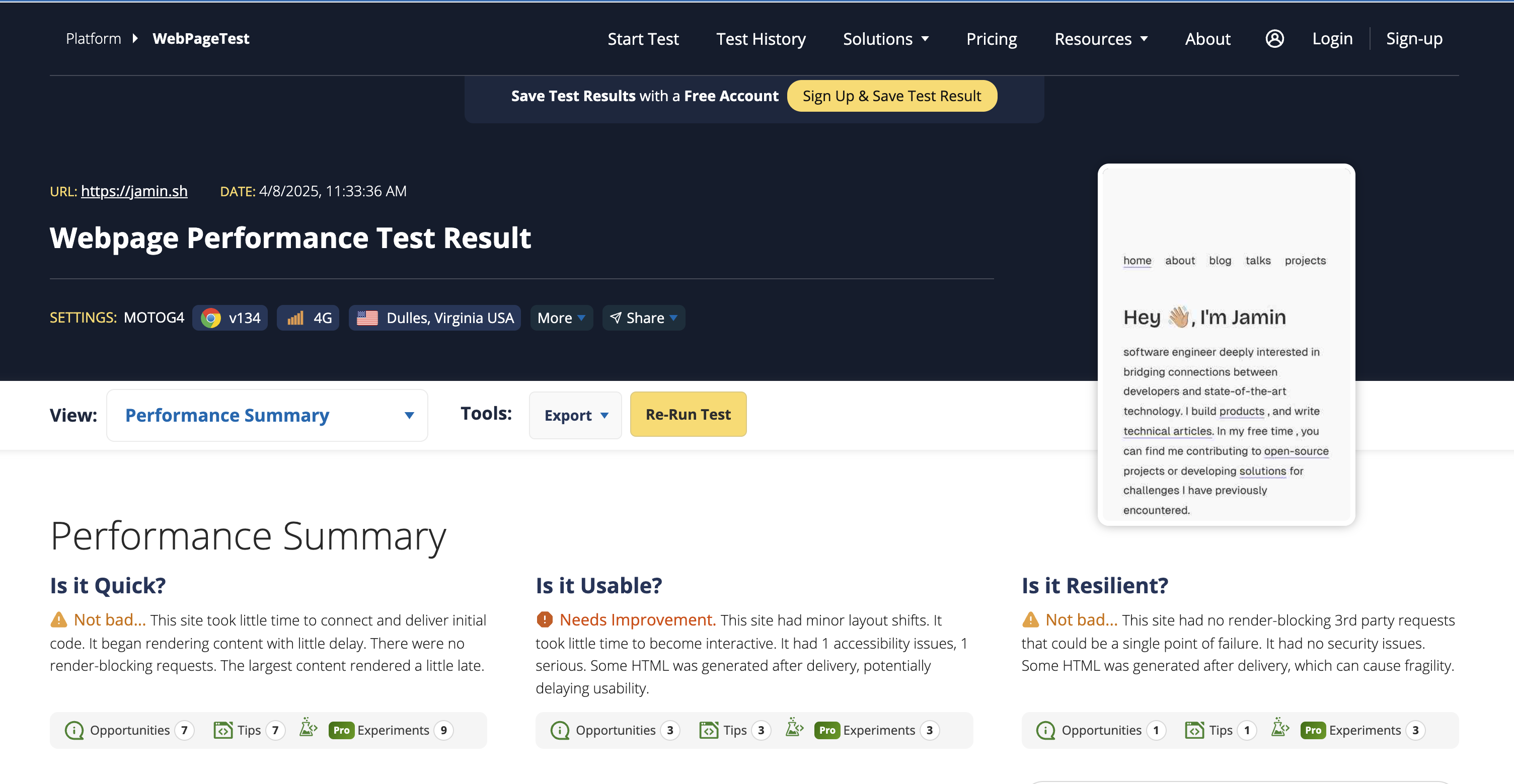 WebPageTest
 -
GTmetrix is a performance analysis tool that provides insights into how your website loads. It offers recommendations for optimizing images and other elements to improve load times including HTML structure of your webpage.
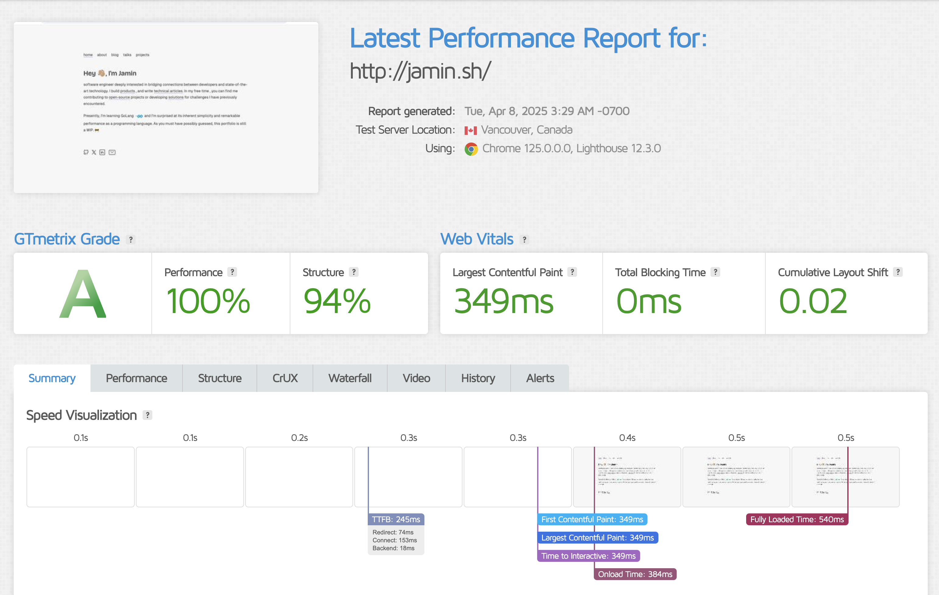 GTmetrix
 -
Lighthouse Audits in Chrome DevTools:
Lighthouse is a built-in tool in Chrome DevTools that audits your website for performance, accessibility, and SEO. It provides detailed reports on how images are impacting your site’s performance and offers suggestions for improvement.
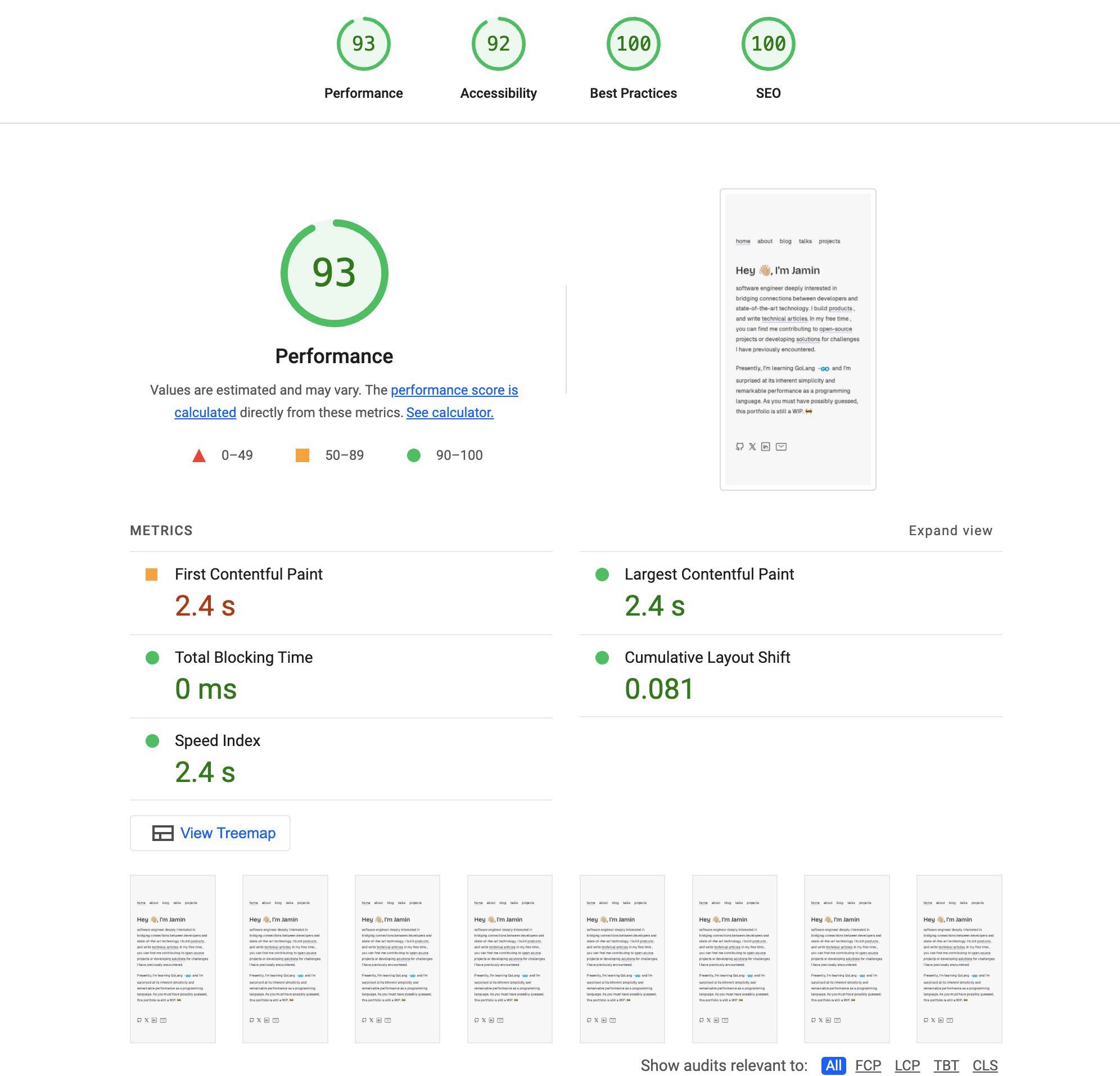 Lighthouse by Google
These tools highlight unoptimized images and suggest compression, format changes, or lazy loading.
Common Mistakes to Avoid
When optimizing images, it’s easy to make mistakes that can lead to poor performance or quality. Here are some common pitfalls to avoid:
-
Ignoring image formats: Not all formats are created equal. Choose wisely based on the content you want to serve and the context in which it will be displayed. For example, using JPEG for graphics with text or PNG for photographs can lead to larger file sizes without any benefits.
-
Uploading full-resolution images: Uploading images at their original size can be a waste of bandwidth. Use resizing tools so images will fit the display dimensions.
-
Not using responsive images: Failing to use the
srcsetattribute means users on smaller devices are downloading larger images than necessary, while using a small image for a large screen can lead to pixelation. -
Skipping alt text: Alt text is not for decoration. It’s essential for accessibility and SEO. Always include descriptive alt text for your images.
-
Relying only on� CSS for resizing: Using CSS to resize images can lead to larger file sizes being downloaded. This doesn’t reduce the file size that the user downloads, just the display size.
-
Over-compressing: Avoid over-compressing images to the point where they lose quality. If your images start looking like Minecraft — take a step back to evaluate the compression techniques you use.
Note: Don’t forget to test your images across devices when optimizing. Your images (and your users) will thank you.
Conclusion
Optimizing images is more than a checkbox — it’s a core part of building performant, accessible, and user-friendly websites.
Whether you’re fine-tuning a landing page or shipping a headless CMS setup, image optimization makes everything snappier, lighter, and more delightful.
With the right tools and techniques, you can ensure that your images are optimized for the web without sacrificing quality. By following these best practices, you can improve your website’s performance, enhance user experience, and boost your SEO.
So, roll up your sleeves, dive into those images, and give them the love they deserve. Your users will thank you for it.
Need an easy way to automate all of this? Grab a cup of tea, plug in Uploadcare, and let the pixels fall into place.