How to optimize a Shopify site by 6x
Last edited:
Have you seen Tesla's Cybertruck presentation? Yes, the one where the “armor glass” window was smashed right on the stage. Twice. The best professionals in the world work for Tesla; how on earth is it possible that they would miss something that important?
Sometimes we take for granted that industry giants will always have the best solutions for any problem. But nothing should be taken for granted — that’s why Max Makarochkin, head of Adaptive Delivery, challenged Shopify, one of the most popular eCommerce platforms in the world. By introducing a couple of lines in the code, he found a way to boost the UX, rescue developers from neverending image-by-image coding, and dramatically influence the PageSpeed Score both for Shopify users and the platform itself.
Why we chose Shopify for a test
Shopify is a platform that helps 1M+ businesses worldwide to create their online stores. We chose them for two reasons:
- We wanted to check how page optimization was organized on one of the world’s leading eCommerce platforms.
- We felt the need to challenge our abilities and find a way to make their already very good UX even better.
It may seem that Shopify's store templates are as perfect as its business in general. We expected the website to be fully optimized, but found a blind spot — graphics. And better than that, we knew how to improve it.
What is Adaptive Delivery?
In brief, it's an image optimization solution by Uploadcare featuring an advanced CDN API with a highly optimized JavaScript SDK. It's a lightweight 3 KB SDK which makes images responsive, optimized, lazy-loaded, and much more. What’s the main value? It speeds up page load time, which results in lower bounce rate, higher conversion, and generally better UX. The best part of it for developers is that once you install the Uploadcare SDK, you won’t need to modify anything in the backend.
Now, let’s see how to optimize a Shopify site using Adaptive Delivery technology, and what benefits the platform (and any other eCommerce solution) will gain from the integration.
An elegant way to use as many images as you need while boosting the load speed
The more time and data users save while browsing your website, the bigger the chances are that a purchase will be made. The number of images on a website is a key element that influences the load speed. At Uploadcare, we thought of something better than simply removing half of your images for the sake of a faster load speed.
Adaptive Delivery technology is a solution that shrinks image size while keeping the quality, so that you don’t need to sacrifice in order to boost your load speed. Let’s see how it works with a real-world example.
We created a sample online store page using a Shopify theme called Debut. Here it is:
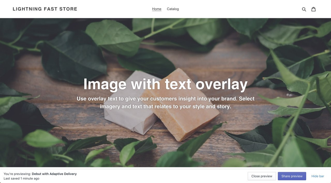 Debut
DebutAll the images are already optimized and converted into WebP format. Yet something feels weird: the overall size of images is 3.0 MB, which is quite a lot.
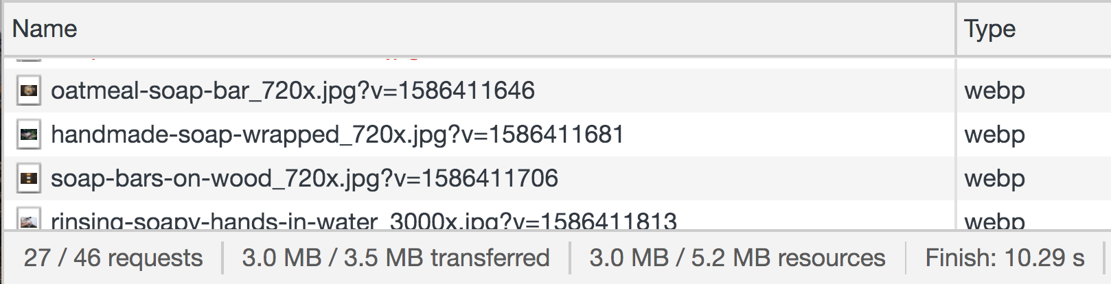 Shopify’s Debut theme before additional optimization
Can we do better than the Shopify optimization? Absolutely. Here’s how: we duplicated the Debut theme, added the Adaptive Delivery SDK, and got a 6x optimized image bandwidth: instead of 3.0 MB, the total size was reduced to only 334 KB. Even better, the image quality and page layout remained as they were, while the load speed of the page increased.
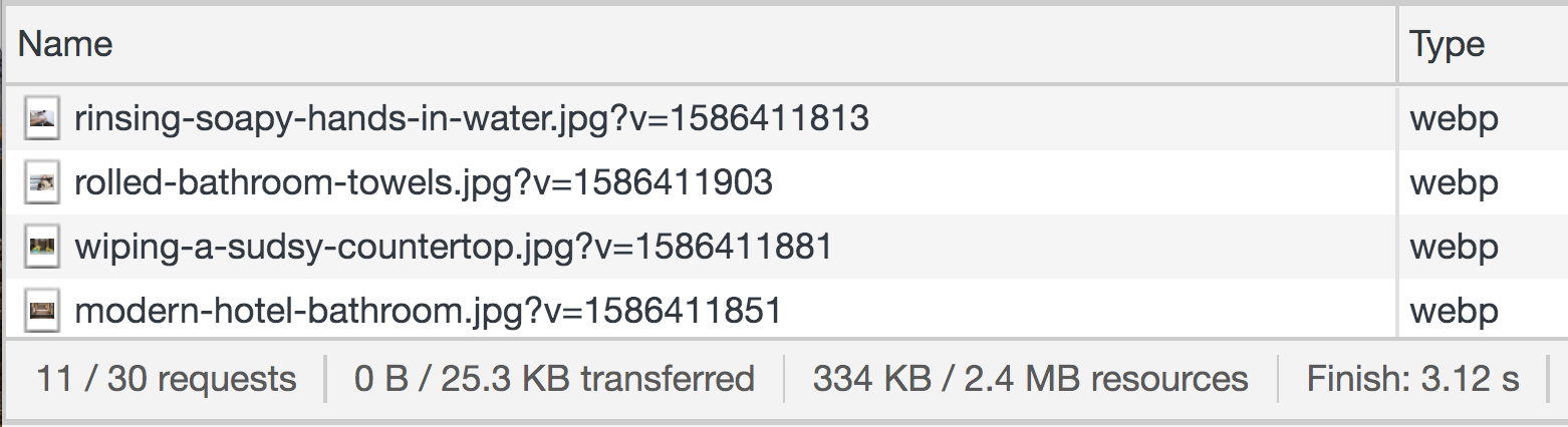 Shopify’s Debut theme after additional optimization
What did we gain in terms of benefits by applying this change?
- We decreased the bounce rate, since it’s directly connected to the page speed.
- We made users feel positive about the brand, since UX is the way to evaluate the quality of a brand at a glance.
- We increased the chances that our website will appear higher in search engine results.
- We made sure our customers would use less of their mobile traffic and be more satisfied with the overall experience.
All in all, we invested in an increased conversion rate, which translates to higher profits.
Cherry on the Shopify SEO pie: 25% potential rise in PageSpeed score
Before the end of the quarantine in many states, probably within one month, Google Lighthouse will introduce a new metric called Largest Contentful Paint (LCP) in its ver.6 (now available in beta). If you often ask yourself “How do I optimize my Shopify mobile or my Shopify SEO?”, then this metric is a crucial one for you.
Lighthouse helps improve UX. It's an audit tool by Google that evaluates the performance of any website and gives some hints to make it better.
The LCP metric is all about large image load time, and it will affect 25% of the final PageSpeed Score, which is more than any other metric. This can cause catastrophic consequences for those who are not aware of the coming news. Instead, for the well-prepared ones — and we really want you to be one of them — the update can bring tangible profit, since UX is the #1 criterion for search engines to decide on the page rankings.
The logic behind this metric is simple. Measuring a page’s load speed has always been quite a challenging task, because there are many ways to do it and none of them seem to be universally accurate. LCP introduces a minimalistic user-centric solution: it measures the rendering time of the largest visible element on the page. This element is often the most relevant one, so the metric provides us with a clue of how fast the page starts making sense to the user. Therefore, a fast LCP means that the page is useful for the customer. Take a look at how dramatically the overall score fluctuates with good and bad LCP:
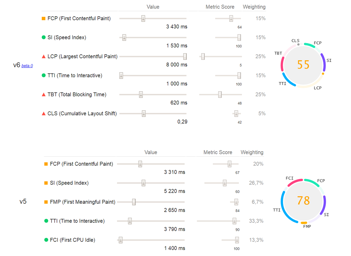 Lighthouse overall score with a high LCP ver.6 beta
What does LCP depend on? Graphic elements: images, GIFs, videos. By shrinking traffic and optimizing Shopify apps’ and webpages’ load speed and SEO, Adaptive Delivery may become a lifesaver in the new conditions. That’s how a half-a-second difference can translate to a half-a-million profit, or maybe even much more.
The idea of prioritizing load time over other metrics has been around for some time. The crucial influence of the load time on the mobile UX, and thus conversion rate, is no big secret: according to the 2019 ebook by Awwwards and Google, Speed Matters: Designing for mobile performance, 75% of successful UX depends on how fast the page is loaded. This makes the speed the most important aspect of the website.
Think how people make online purchases: it's often squeezed into compulsory idle moments, for example while riding the bus or train or waiting in line. In other words, when we get bored in our real life, we tend to make use of online stimuli. Since we shop on the go, mobile use is increasing dramatically. In fact, Google has been experimenting by giving priority to mobile performance in assigning page rankings since 2016.
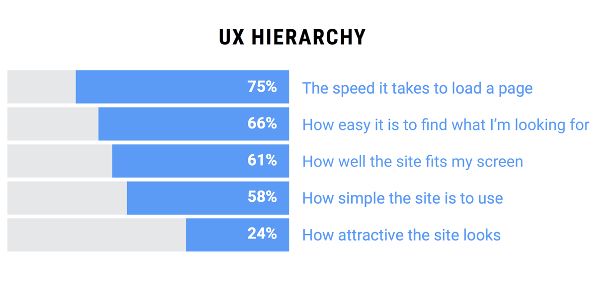 Load speed matters more than anything else in the UX hierarchy, according to Awwwards and Google
Shopify optimization: saves time for developers and money for businesses
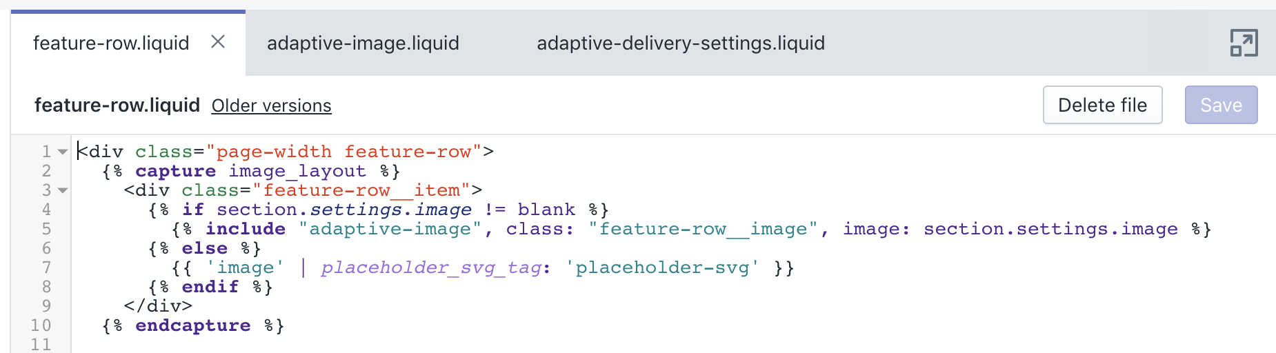
In Shopify, eShops who want to build their page or app on the platform can choose between using one of the existing themes (like the Debut theme mentioned above) or creating a new one from scratch. Whichever option you choose, it’s important to be aware how much coding effort is needed in order to add new images. You want the code to be universal so that every new image, theme or product page won’t result in hours of coding. Currently, though, the situation is different.
Let’s have a quick look. Here is the HTML used to describe every single image in Shopify:
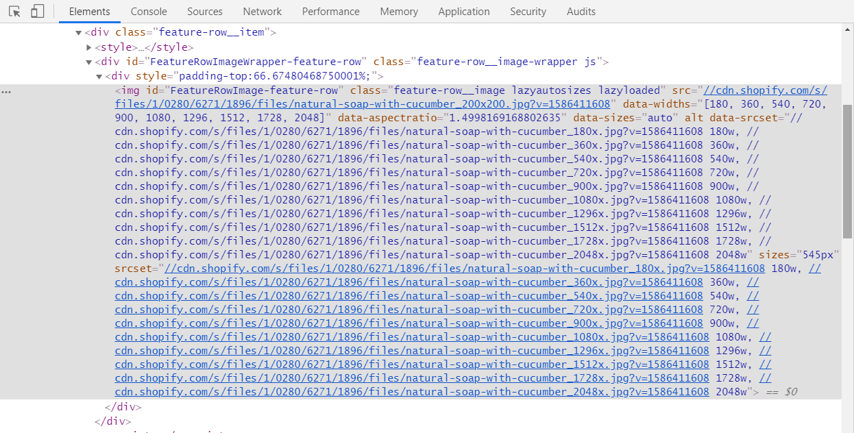 The HTML code needed for every single image at Shopify
Using various data attributes, the developer is expected to give a detailed description of every new image and custom theme. The process is long and tiresome. This is what the template for any image looks like in the Shopify code:
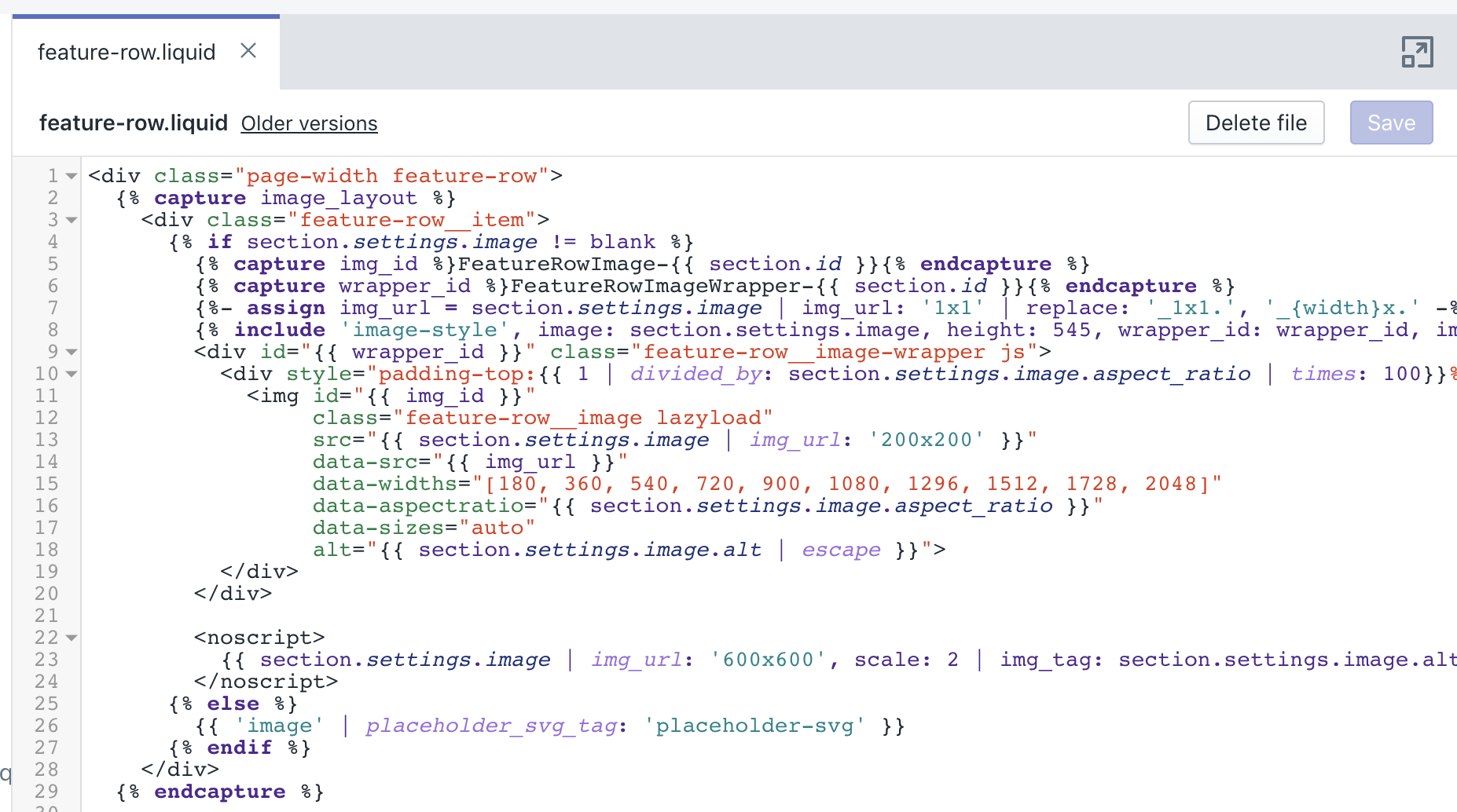 Image code template at Shopify
Imagine if every time you wanted to eat a cookie (or an apple, if you prefer) you’d be obliged to do 20 push-ups first. Would it prevent you from eating as many cookies or apples as you initially wanted? We bet it would.
Developers have the same issue when adding images for their eShops at Shopify. Every new image requires additional coding, so there are usually two outcomes:
- fewer pictures are added;
- more money is spent.
That looks like a problem, doesn’t it? Yet any problem should have a solution, and here’s ours: why not use a multitasking tool that removes coding barriers and automates the process? This solution saves money for business and time for developers in one shot.
Setting up Adaptive Delivery: a 3-step guide that couldn’t be simpler
Here’s how to integrate the technology in three easy steps, and totally forget about unnecessary coding.
Step 1
Add this line to the main theme template:
<script>
  (function(src, cb) {
    var s = document.createElement('script'); s.setAttribute('src', src);
    s.onload = cb; (document.head || document.body).appendChild(s);
  })('https://ucarecdn.com/libs/blinkloader/3.x/blinkloader.min.js', function() {
    window.Blinkloader.optimize({ pubkey: 'YOUR_PUBLIC_KEY', fadeIn: true });
  })
</script>
This line is actually a piece of code that makes sure our SDK is well-integrated:
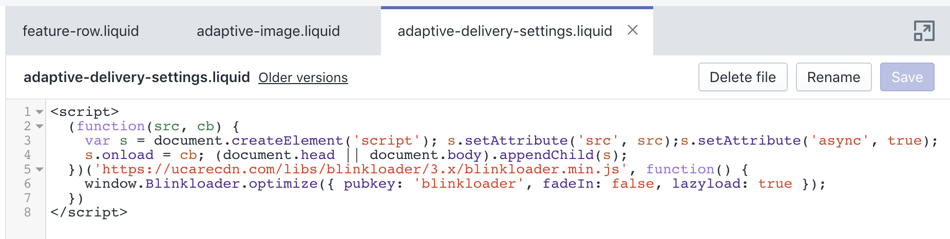 Adaptive Delivery Shopify integration code
Step 2
Create an “adaptive-image” component, a short code that makes the overall HTML clean and nice. The SDK is integrated through the theme and component. The added value of using the component is that it saves you from having to set up the SDK for every page in the future — from now on, you’ll only deal with the component. Then you can integrate any image like this:
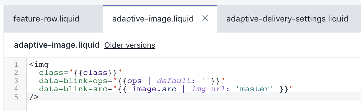 Code of the Adaptive Delivery component in Shopify integration
Step 3
Enjoy the result: now, in the template for image integration, you don’t need to think about anything else but one line that makes the website more user-friendly. Voilà!
 One line in the code for integrating Adaptive Delivery technology with Shopify
Get fully equipped for the eCommerce boom. It’s here to stay
In the year of the pandemic, the eCommerce sector is thriving: more and more people around the globe prefer staying home and making purchases online. And you know what? Consumers are starting to like it: according to a study from Kantar, 6 out 10 Europeans will continue shopping online even when COVID-19 is over. Hence, this trend is here to stay. On the other hand, it means that more businesses will turn to online platforms, and the competition will certainly increase.
In that case, it's more important than ever to do everything possible to improve your UX and make sure your search engine rankings are good. Adaptive Delivery technology will help your Shopify site to stay competitive by:
- optimizing image traffic up to 6x with no quality loss;
- automating the process of adding new graphic elements;
- improving the UX with faster load speed and by saving customers’ traffic & bandwidth;
- getting the PageSpeed Score 25% higher after the launch of Lighthouse ver.6.