This markup will help a browser calculate the image’s width to height ratio and reserve the space accordingly to avoid jumpy reflows. It will also eagerly load the small and blurred version of the original image and show it in place. But to get it, you need your image hosting to have a rich images processing API.
The width and height properties will ensure the responsiveness of the image while preserving its ratio. Setting the background-size to cover will make our blurred placeholder the size of the reserved space.
If you want a deeper dive into the topic and several live examples, please follow me further!🙂
Laziness gives you more than you can imagine
Software architecture is usually not a welcomed part of agile software development. And often, websites or web applications are born and grow within the agile processes. One can even think that everything we create for the web is architecture-free, but this is not true. There always exists an architecture like there always exists a process. One thing worth pointing is that both can be out of your control and thus form sporadically, leading you to the unexpected.
The topic of this article is the lazy loading of pictures on the web. Its mechanics are postponing the images loading until the moment of necessity: when the user scrolls to them. But why would we even need to talk about software architecture in this case? Isn’t it something from the very high and abstract level?
It turns out that no. The lazy loading of pictures affects your products’ qualitative attributes, which is mostly the goal of planned architectural activities.
So what do we affect by deferring several bulky requests? Performance, for sure! Doing less work requires fewer actions, and fewer actions take less of the computational time. What can surprise you is the following list of what else gets affected:
Web application discoverability. Google can put you higher because of how friendly it is for mobile devices. Utilizing less bandwidth and battery makes your application friendlier for mobile devices.
Cost-effectiveness. Reducing the number of loads from the Content Delivery Network results in lower costs.
Interactivity. Adding a 3-megabyte image to a page and opening it using the “Good 2G” Firefox throttling leads to 55 seconds of interactivity absence. Poor interactivity might leave you without visitors.
Usability. It’s tightly connected to the previous one but also has a negative side. Having pictures lazy-loaded might decrease the pleasure of working with the page by producing constant content jumps. I will demonstrate to you some techniques to overcome this downside.
Battery consumption. Utilizing a network might consume lots of battery power of visitors’ devices. This topic is extensive, and I highly recommend the “High Perform ance Browser Networking” book by Ilya Grigorik if you want to learn more. At least have a look at the following quote from there: “The best and fastest request is a request not made.”
Ecology. Wow, how far did we go! But if your brand claims to be environment-friendly, you might be interested in reducing excessive energy consumption. And you can consume quite a lot by doing tasks that do not look energy-intensive.
After such a comprehensive look at what happens when you switch to lazy loading, let’s dive into the details of its implementation.
When developing software, we usually face the instructions of two following types: describing the approach by looking at its different aspects and explaining what can be called the “industrial application” of it. The first type allows you to understand the motivation and structure of the solution. The second type describes how you can scale it to a project with many unknowns and CI/CD.
This article will go the first way and look at the lazy loading itself without creating the industrial-like application.
The point to start
Let’s start with the simple static website having a few images on it. I will use Google PageSpeed Insights to get its loading metrics. All the pictures in this article are from the Unsplash service. I’ve downloaded a few and uploaded them to Uploadcare. We will later see how handy API can save us lots of programming efforts.
Google PageSpeed Insights gave this page 80 as a score.
Two modern ways of being lazy
The great thing about the modern web is its absorption of the good practices created by the community and tested for many years. In 2021 we can even avoid scripting: use the loading="lazy" image tag attribute, and see everything working. I’ve modified the previous example so we can see this attribute in action. I’ve also added a substantial margin below the paragraph with text; please use scrolling. Now Google PageSpeed Insights give us 98. Great deal for five repetitions of 15 characters, isn’t it?!
However, there are still two obstacles to consider:
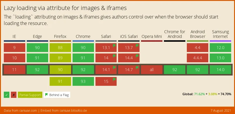
According to the “Can I Use” statistics, the global support of the loading HTML attribute is 74.7%. As time passes, this situation will change, but make sure you know your users if you still want to apply the native HTML lazy loading. Possibly the browsers not supporting this feature require it the most. JavaScript fallback will help you here. Also, you can use a polyfill.
Lazy loading via attribute for images and frames
According to the feature specification, native HTML lazy loading is disabled when there is no scripting on the device. Why is it so? The goal is to avoid tracking your position on the page. It looks that this obstacle will remain.
Google PageSpeed Insights statistics here are as good as for native lazy loading. What’s interesting here is that you can adjust the distance before the actual image where the load gets triggered. Use the rootMargin property for this:
The syntax of the rootMargin property is the significantly shortened syntax of the CSS margin property. Only pixels and percent are allowed at the moment of writing. Also, the work of this setting wasn’t consistent. Give it more thorough testing if you wish to use it in production.
It’s worth mentioning that you can’t set the rootMaring for images with native HTML lazy loading. When reading the specification of this HTML attribute, I fell into the fallacy that you can. Asking one of the authors of the specification helped a lot!
Furthermore, browsers tend to implement their sophisticated strategies of preliminary lazy loading, avoiding visible content reflow. They depend on network speed, speed of scrolling, and other factors. During examples preparation, I noticed that Firefox ignores lazy loading after I reload the page. Possibly, it remembers the scrolling and tries to apply speculative assets preloading.
Avoiding content reflows
Anyone interested in lazy loading might already know that my article is not the first one on the topic. In many other articles and videos, people demonstrate the behavior of image loading accompanied by poor internet connection. I’ve prepared the interactive example that allows you to feel the pain even if your bandwidth is enormous. Please scroll to the Lorem Ipsum paragraph starting with red and bold text and try to read it. You’ll soon become interrupted by several beautiful pictures. This side effect of lazy images loading is content reflow, and we want to avoid it for the sake of better UI.
There are many options to enhance the UI. Let’s look at what we have available.
Setting width and height explicitly
We will add the width and height properties to the <img>. By doing so, you’ll make a browser reserve the space required to render this picture. Furthermore, web browsers do not simply reserve what you’ve written in the named properties but calculate the aspect ratio and use it accordingly. Your width: 100% pictures are in good hands.
Don’t forget to add height: auto to your images styles to make browsers correctly calculate their height.
For this first attempt to avoid reflows, Google PageSpeed Insights gives us 98. Now we don’t see our content jumping, but these white rectangles do not look great. What else can we do?
Use a lower quality image as replacement
The title of this section looks strange. Do we indeed want to display images of bad quality? In some sense, yes. However, our users can even enjoy low-quality photos. At least, I do when I see this technique applied.
Also, it’s worth mentioning that this technique embraces the rich API of your images’ CDN. The idea is to blur pictures so that they are almost sizeless. When I first thought of it, I could almost feel the physical pain because of the necessity to set server-side image processing. What a relief I felt when it turned out to be unnecessary.
Look at this URL, the one for the first photo with a plane in our examples:
I’m happy about the 25 KB we have now. I am delighted that I do not have to write a line of image processing.
Let’s enhance our example and use the blurred pictures in the src properties at the start and then replace them with the desired ones.
Google PageSpeed Insights gives 98 for this variant. No points lost compared to the previous white rectangles, and what a beautiful effect!
More economy on requests
You can go even further in your attempts to avoid additional user-side HTTP requests. There is such a notion in web development known as Data URLs. You can encode the actual resource as Base64 and paste it into the src attribute. By doing so, all the lightweight blurred images arrive with the initial HTML without additional requests.
A tiny drop in our Google PageSpeed Insights occurred here: 94.
One important thing to consider is creating the Base64 representations of the pictures during the server-side rendering stage. This activity implies server-side coding, quickly scaling to an additional infrastructure: dedicated computational servers and storage. Such a minor update, and what enormous consequences!
How to implement placeholders using native laziness?
In the previous section of this article, all examples used the IntersectionObserver to implement lazy loading. There were two reasons for this: first, we could emulate a slow network, and second, we could demonstrate the placeholder technique. Can we have placeholders for native lazy loading? I couldn’t find anything related during the internet research. I thought of the <picture> tag, but it turned out to aim at sizes, not types of loading.
How can we combine eagerly loading low-quality image placeholders with lazily loading original pictures without a line of JavaScript? The background-image property would help us here!
Here we have the lazily loading image with width and height set so our browser can calculate the required space and prepare it to avoid content reflow. The src attribute contains the picture’s address. It will get loaded once the browser calculates the necessity according to its sophisticated algorithm. And here, we can also see the background-picture CSS property inside the style HTML attribute, helping us set the lightweight blurred placeholder.
The inlined styles are not considered a good practice, but this is the actual use case. Trying to move the placeholder to a CSS file will make your life harder without a clear positive outcome.
Google PageSpeed Insights score is good in this case: 98.
Some additional thoughts on your laziness strategy
I recommend sticking to the loading="lazy" native HTML attribute. It looks good enough to support basic lazy loading needs, and you know how to add placeholders. Also, make sure that your CDN allows images transformations on the fly. To increase browsers support, I suggest using polyfills. There is at least the loading-attribute-polyfill on the npm website.
I need to warn you that introducing the technique into a real project would be more challenging than described above. You rarely have a predefined set of well-known pictures except when you create a personal home page or write an article about lazy loading. Usually, your images appear dynamically in a system, and you need to extract their width and height on a server. The described solution needs scaling.
On the positive side, knowing what to scale is essential, and we did an excellent job on this here. Thank you for reading!
Software engineer with a front-end focus and experience in multiple fields, from browser games, business applications for hiring and trading, to industrial IoT. Read over a hundred books on programming in order to build an expansive view of the world of software development. Currently works in management and likes it there.