Creating responsive images with srcset
Optimizing images for different screen sizes and resolutions helps you to serve a responsive
and fast-loading website for your users.
A single high-resolution image can slow down your website on mobile devices,
while a low-resolution image may look blurry on large displays.
How do you ensure your images look great on any screen size or resolution without slowing down your website?
This is where the srcset attribute comes in — it enables browsers to select the best image
based on the user’s device and display capabilities.
In this article, we’ll go over the srcset attribute and how you can use it to deliver responsive images
that load efficiently without sacrificing quality.
By the end of this article, you’ll understand how to implement srcset
and how to use Uploadcare’s uc-img component for responsive images,
ensuring your images look great on any screen while keeping load times minimal.
What is the srcset attribute
The srcset attribute is an HTML attribute that allows you to provide multiple versions of an image to the browser.
This allows the browser to choose the most appropriate image based on the user’s device and screen size.
Using the srcset attribute, website users with high-resolution displays on desktops and laptops are served
high-quality images and those on smaller screens, like mobile phones and tablets, get fast-loading, appropriately sized images.
The syntax for using the srcset attribute in an img element is as follows:
<img src="image-default.jpeg"
     srcset="image-480w.jpeg 480w,
             image-800w.jpeg 800w,
             image-1200w.jpeg 1200w"
     alt="A responsive image example">
Where:
srcis the default image that will be displayed if the browser doesn’t support thesrcsetattribute.srcsetis a list of images with different resolutions.
In the list of images provided, each image has a width descriptor (e.g., 480w, 800w, 1200w)
that indicates the width of the user’s current viewport or screen size.
The browser will display the image that corresponds to that width. For instance, if the screen size is 480 pixels wide, the browser will render image-480w.jpeg. Similarly, for a width of 800 pixels, the browser will display image-800w.jpeg, and so on for larger sizes.
If the screen width doesn’t exactly match any of the specified sizes, the browser automatically picks the closest available option — often based on resolution and performance hints — or falls back to the default source if no good match is found.
How to use the srcset attribute
Since using the srcset attribute involves providing a list of images at different resolutions,
you can provide multiple versions of an image to the browser and let the browser decide which one to load.
Let’s consider some examples of how to use the srcset attribute:
Serving responsive images with different sizes
Say you have an image of 300 KB and 1200px wide on a web page and want the image displayed at 1200px on a desktop, but on mobile devices, the image should be 480px wide.
A way to handle this would be to have the original image at 1200px wide and then use CSS to reduce the image width when users view it on small screens like 480px.
While this would work as expected, the problem with this approach is that the browser would still download the complete 300 KB image even though it’s being displayed at 480px wide on mobile devices. This would result in unnecessary bandwidth usage and slower load times on mobile devices.
A better way to handle this is to use the srcset attribute to provide different image versions at various resolutions.
You can also combine the srcset attribute with the sizes attribute to inform the browser
about the image display width under different viewport conditions.
<img src="image-default.jpeg"
     srcset="image-480w.jpeg 480w,
             image-800w.jpeg 800w,
             image-1200w.jpeg 1200w"
     sizes="(max-width: 600px) 480px,
            (max-width: 1024px) 800px,
            1200px"
     alt="A responsive image example" />
The code above shows an image with three different versions: image-480w.jpeg, image-800w.jpeg, and image-1200w.jpeg.
The sizes attribute tells the browser to display the various images based on the screen size of the user:
- If the browser’s viewport is 600px or less, it loads the
480wimage. - If the viewport is between 600px and 1024px, it picks the
800wversion. - For viewports larger than 1024px, the browser serves the
1200wversion
For desktop devices, this is what the browser logs show when the image is loaded. Notice the image size is 336 KB:
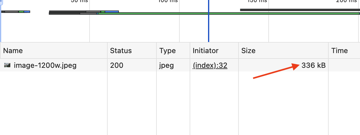 Responsive images with srcset on desktop (1200px)
This is what the browser logs show when the image is loaded for mobile devices. Notice the image size is 64.3 KB:
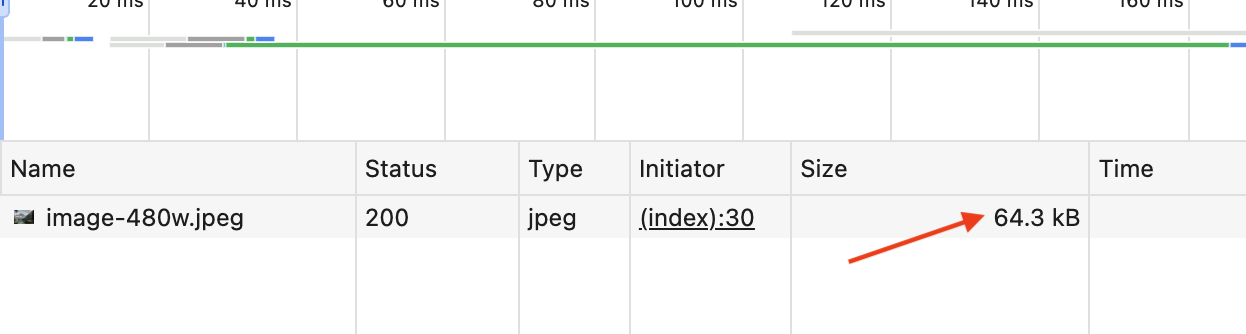 Responsive images with srcset on mobile (480px)
With this approach, the browser can choose the most appropriate image to load based on the user’s screen size and resolution, ensuring that images look great on any screen size while saving bandwidth and improving load times.
Serving responsive images with different resolutions
Another way to use the srcset attribute is to provide images with different resolutions for various displays. Some devices have high-resolution displays that require images with higher pixel density to look sharp. For example, Apple’s Retina displays usually have 2x the normal pixel density.
This means that images that look good on a regular screen will look blurry on Retina displays.
Using the srcset attribute, you can provide images with different resolutions to the browser
and let the browser choose the most appropriate image based on the user’s screen.
<img src="image-default.jpeg"
     srcset="image-480w.jpeg 1x,
             image-720w.jpeg 1.5x,
             image-960w.jpeg 2x"
     alt="A responsive image example" />
So if your users are accessing the webpage with a low-resolution display, with one pixel representing each CSS pixel, the image-480w.jpeg image will be loaded, but if the device has a high resolution of two pixels per CSS pixel or more, e.g., an Apple Retina display, the image-960w.jpeg image will be loaded.
Benefits of using srcset
Using the srcset attribute for serving images provides multiple benefits over relying solely
on the traditional src attribute.
Improved performance
By serving smaller images to devices with small screen sizes or slower network connections like mobile devices and tablets,
the srcset helps reduce your web page load times and bandwidth consumption.
As seen in the previous examples, the same image can be displayed with different sizes for different screen sizes.
The size of the 480w image was 64.3 KB and the 1200w image was 336 KB.
That saves 271.7 KB of bandwidth on mobile devices with small screen sizes compared to loading the full 336 KB image on all devices.
Serving images in this way helps to improve the overall performance of your website and improve your website’s core web vitals scores like Largest Contentful Paint (LCP) and First Contentful Paint.
Better user experience
By serving images with the right resolution for each device, your users get to see crisp and clear images on any device they are using.
Not only are these images more precise and sharper, but they also load faster, which helps to keep users engaged and on your website longer.
SEO & accessibility
Faster page load speeds improve SEO rankings, and properly scaled images help users access content more effectively on different devices.
This also helps to improve the accessibility of your website, as users on different devices can access your content more effectively.
Responsive design
Using the srcset attribute supports modern responsive design principles so that your websites can adapt to multiple devices and still offer a pleasant experience.
Best practices when using srcset attribute
-
Always include a default
srcimage: Some older browsers don’t supportsrcset, so having a fallback image is necessary to avoid images breaking on your website when accessed with an older browser. -
Optimize images: Consider using tools like Uploadcare or ImageOptim to reduce file sizes without compromising image quality.
-
Test across devices: Test across devices: Test and verify that images load correctly on mobile, tablet, and desktop screens.
-
Use descriptive
alttext: Provide meaningful descriptions for thealttext for your images for accessibility to help users with visual impairments understand the image’s content.
How Uploadcare helps optimize images with uc-img component
Uploadcare helps to simplify the entire process of serving responsive images through its uc-img image component.
The uc-img component is a custom HTML element that uses the srcset attribute behind the scenes
and combines it with Uploadcare’s image optimization features.
Uploadcare automatically optimizes your images by serving the best format possible and generating the right size for your target screen sizes.
You don’t have to worry about manually resizing, compressing, or creating separate screen size versions, thereby saving you time and effort while ensuring your images look great on any screen.
Additionally, the images you are optimizing don’t necessarily have to be stored on Uploadcare, so the uc-img
component can be used for any images on your website.
Here’s how the uc-img component works:
- It serves images via Uploadcare’s global CDN, improving load speeds.
- It then generates images at different resolutions based on the
--uc-img-breakpointsconfiguration you provide. - Using the
srcsetattribute, it serves the most appropriate image based on the user’s device and screen size.
To use the uc-img component, first include the uc-img library in the <head> tag of your project:
<script src="https://cdn.jsdelivr.net/npm/@uploadcare/file-uploader@v1/web/uc-img.min.js" type="module"></script>And also set up the configuration for the uc-img component by adding a custom CSS value,
where YOUR_PUBLIC_KEY is your Uploadcare public key
and --uc-img-breakpoints is a comma-separated list of the image sizes you want to generate for various screen sizes:
<style>
uc-img {
  --uc-img-pubkey: 'YOUR_PUBLIC_KEY';
  --uc-img-breakpoints: '480, 800, 1200';
}
</style>
So, instead of using the traditional img tag in your web page, use the uc-img tag in your HTML,
and Uploadcare will handle the rest.
If you already have an image stored on Uploadcare, you can use the uc-img component like this:
<uc-img
  uuid="YOUR_IMAGE_UUID"
  alt="An optimized image from Uploadcare"
/>
In a case where your images are stored elsewhere, you can use the uc-img component with a src attribute like this:
<uc-img
  src="https://images.unsplash.com/photo-1470770841072-f978cf4d019e"
  alt="Landscape image from Unsplash"
/>
If your images are not on Uploadcare, you need to set up a proxy for the domain the images are hosted on to be served through Uploadcare’s CDN.
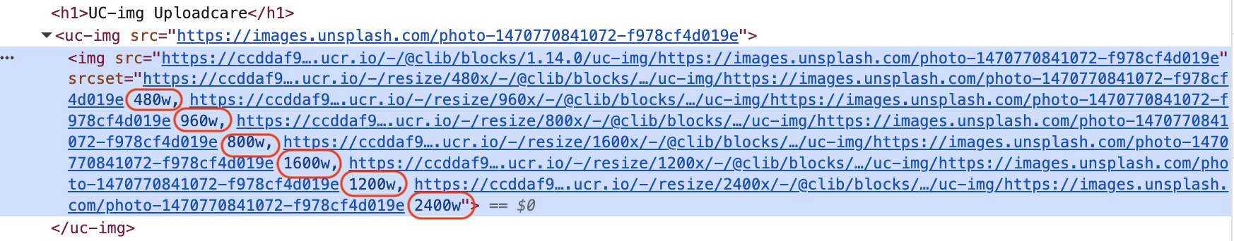 Responsive images with uc-img
Notice that the uc-img component is similar to the img tag
but with the added benefit of automatically generating images at different resolutions
based on the --uc-img-breakpoints configuration provide and serving the most appropriate image
based on the user’s device and screen size.
For a step-by-step guide on using the uc-img component, check out our image optimization guide with uc-img.
Conclusion
When it comes to serving responsive images, the srcset attribute is a great way to create responsive images
that load efficiently across devices.
Whether you are manually managing images or taking advantage of Uploadcare’s optimization features,
using srcset ensures your users always see the best-quality image for their screen size and resolution.