To infinity and beyond with Adaptive Image Delivery
Last edited:
How to stop manual image tweaking and focus on the job that matters most
Image optimization is an essential task for customer experience, SEO, and overall website performance. Still, just because it’s essential doesn’t mean it has to be troublesome. And it isn’t — with the Adaptive Delivery technology developed by Uploadcare. Let us explain.
What is adaptive delivery?
If you’ve ever been in a website developer’s shoes, you know that a picture is worth much more than a thousand words. The real cost of well-served optimized web images is hours of a developer’s hard work. Once you’ve managed to cope with file sizes and organizing items from various sources, a search engine rolls out new requirements, so you need to update. On top of all that, something often turns out to be broken, and a new round of edits begins.
That’s why Uploadcare came up with Adaptive Delivery.
Adaptive Delivery is a full-stack image optimization solution. The “stack” here is a combo of an advanced CDN API with a highly optimized JavaScript SDK that allows you to handle image processing for your websites easily.
With Adaptive Delivery integrated, you can, for example:
- Automatically provide properly-sized images for any screen
- Serve high-quality yet lightweight graphics
- Speed up page load times even more by using next-gen formats like WebP
- Render images at the right moment with a smart lazy-loading technique
All of that is done by a tiny code snippet and 3 KBs of the JavaScript SDK. You won’t need to migrate your assets, change image URLs, or modify your backend. Just install our plugin on your website and initialize it. Like this:
<script>
  (function(src, cb) {
    var s = document.createElement('script'); s.setAttribute('src', src);
    s.onload = cb; (document.head || document.body).appendChild(s);
  })('https://ucarecdn.com/libs/blinkloader/3.x/blinkloader.min.js', function() {
    window.Blinkloader.optimize({ pubkey: 'YOUR_PUBLIC_KEY', fadeIn: true });
  })
</script>
Then, you simply need to replace the images’ src with data-blink-src, and you’re all set:
<img data-blink-src="https://storage.example.com/logo.png"/>Done. From now on, your images are responsive, optimized, and lazy-loaded.
What can Adaptive Delivery do for your website?
In a nutshell, Adaptive Delivery aims to automate everything that relates to image processing and delivery so you can focus on the most critical tasks.
Optimizing image compression
Adaptive Delivery provides you with smart compression technology. The technology recognizes what is in the picture and automatically customizes the compression ratio. An infographic with a few colors is compressed more than a high-resolution photo.
_“Why not just use webpack for doing this?”_Glad you asked.
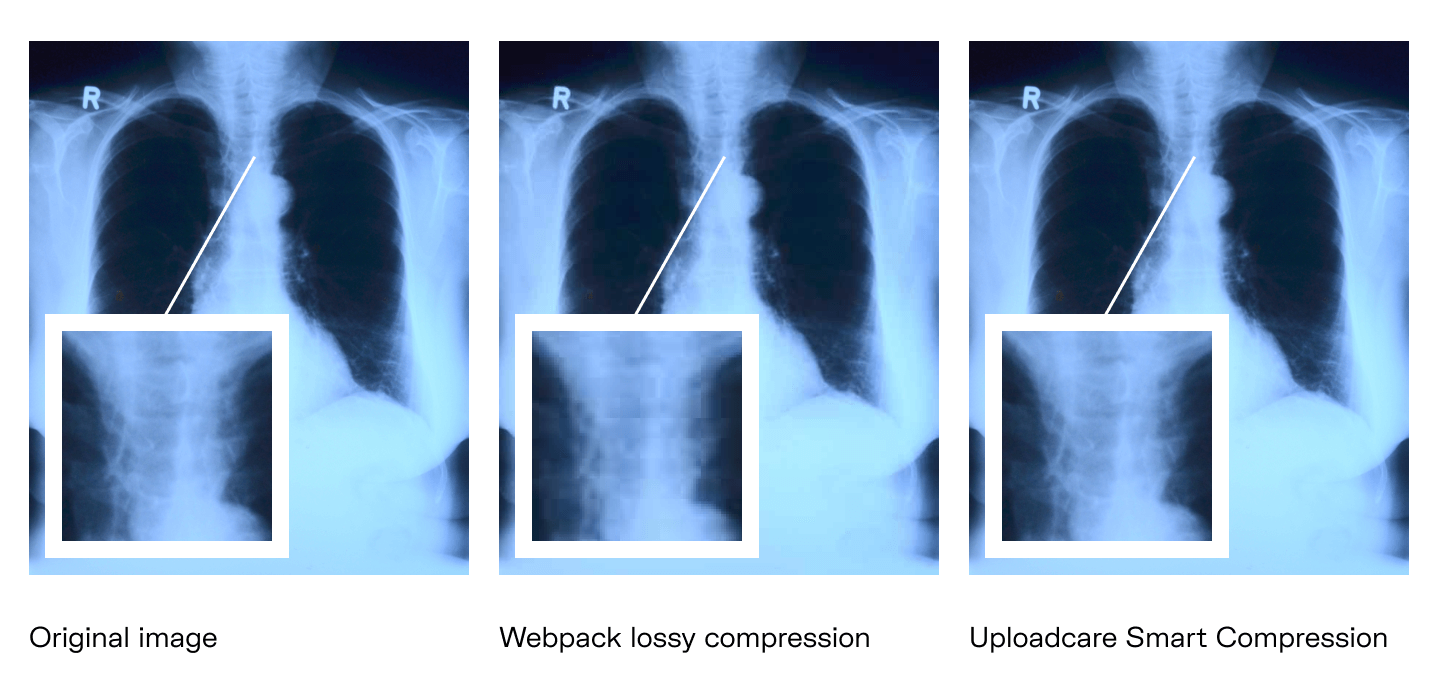
Being a primary tool for most frontend developers, webpack can do compression too. But unlike Adaptive Delivery, it sticks to a one-size-fits-all approach, so the compression parameters for both full-color photos and simplistic clip art are the same. As a result, we can expect various compression artifacts: dots, distortion, blocky degrading, or fuzz.
 Webpack utilizes lossy compression that throws away some information. But there are cases when you certainly don’t want to miss anything
Another concern regarding webpack is that it requires a lot of effort to set up and keep the code clean. Unfortunately, it’s common for companies to have to hire third-party consultants to brush up their webpack code.
In contrast, Adaptive Delivery, thanks to its deep backend integration, doesn’t uglify your code and doesn’t require you to invest in working out the kinks.
Managing images from various sources
Adaptive Delivery helps you keep images under one roof regardless of their location. You can store them in local folders, cloud platforms, or any combination of sources at the same time without the need to make ad-hoc adjustments for each case. How does that work, you ask? Let us show, not tell.
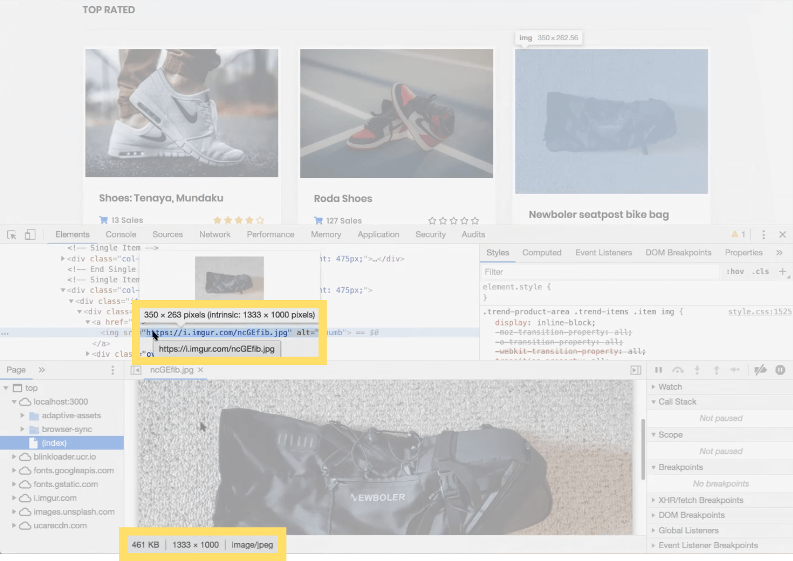
Say you need to deal with images on an online store that sells sportswear and has plenty of images demonstrating its goodies. This seatpost bike bag image, for instance, is almost 500 KB in size, is 350 pixels wide, and is hosted on Imgur.
 Can we make it lighter?
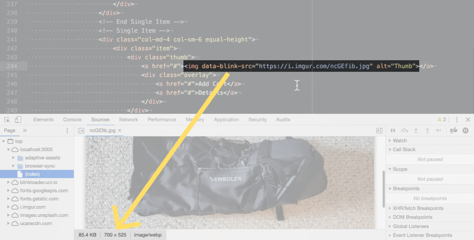
After you’ve implemented the Adaptive Delivery SDK (the snippet we showed earlier), all you need to do is to add data-blink to src, and that’s it. The image is optimized. Now it’s 700 pixels wide (because we’re viewing it on a retina screen) and is just 85 KB.
 The bag image looks the same, except for the fact that now it’s 375 KB smaller than before
As you can see, there’s no need to bother with reloading and moving files. Just leave them where they are, and Adaptive Delivery does the rest.
Making website responsiveness less of a headache
When you use Adaptive Delivery, it analyzes the context of your website visitors and serves images that would fit their screen size best — automatically and in real time.
Normally, you would have to manually resize (or ask a designer to resize) the original images in Photoshop so your website looks good on the majority of screens. From the experience of the Uploadcare team, you need about 20 variations of the same image to provide an optimal user experience on various devices. (We’re sure any designer would be delighted to do 20 resizes for every image on your site...right?)
With Adaptive Delivery, you neither have to do it on your own, nor wait for it for you. The process is fully automated. Once you’ve replaced src attributes with data-blink-src within your img HTML elements, your images instantly become responsive.
 Even if a brand-new model of smartphone is released, you don’t have to worry about it with Adaptive Delivery enabled
Enabling smart lazy loading
Lazy loading is a technique that allows you to load a website faster by deferring the loading of offscreen images. If a user doesn’t scroll down, the rest of the images aren’t loaded; that means bandwidth saving, better page speed performance, and better user experience in general. (More on that in this post, Get Moving with Image Lazy Loading.)
With Adaptive Delivery up and running, the lazy loading option is enabled by default, so there’s no need for open-source JS libraries. It works in a set-and-forget way, although you can always override the control to customize its behavior.
We call it “smart” because the technique used for Adaptive Delivery isn’t actually that lazy. Thanks to its deep backend integration, you provide users with faster page loads without reducing image quality or making them look at empty placeholders.
When the users start scrolling, Uploadcare starts fetching images in batches. You can configure both the number of images for a single fetch as well as the intervals between loading batches. And of course, you can turn lazy loading off if you wish.
Converting and delivering WebP images
The Adaptive delivery bundle includes a built-in solution for WebP image processing that converts and optimizes images in real time.
WebP is a next-gen format that, when supported, can supply you with the most lightweight images. The lighter the images, the shorter the page load time, the better the user experience (especially on mobiles).
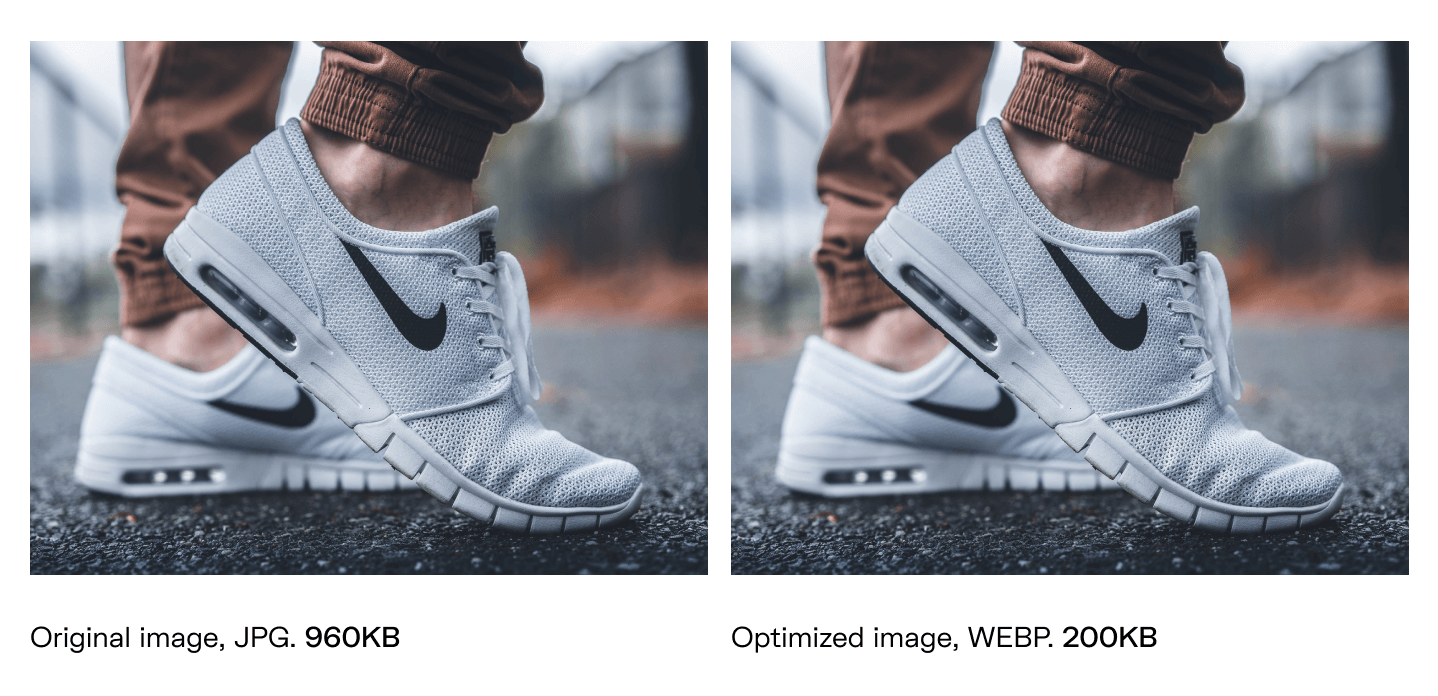
 JPG vs. WebP file size
On average, WebP file size is 25%-34% smaller than JPEG. Source: Google
However, there are two main challenges when setting up WebP delivery.
The first is letting your server know when to deliver WebP, since not all browsers support it yet. That’s why you’ll likely need to use CDN: it processes the end user’s browser requests and provides WebP images if the format is supported.
The only issue with most CDNs is that you have to invest some time in automating image uploading. Otherwise, you risk being buried under a pile of manual tweaking tasks, or even worse, end up with miscellaneous, unoptimized files across various folders and platforms.
The second is a natural extension of the first. You’ll need to have an additional set of images in other formats (JPG, PNG, or GIF) in case users access the website through a browser that doesn’t support it — Safari, for instance.
Adaptive Delivery saves you from both of these issues. The built-in Uploadcare CDN checks the Accept header and always delivers WebP images when possible. Uploading images to the CDN is also fully automated. You don’t have to manually replace links or write scripts, so managing files is easier and allows you to do more meaningful tasks instead. Plus, you save some disk space, as there’s no need to store several sets of images in different formats.
The result? Perfect image optimization — on autopilot
Images can plague performance for websites if they’re the wrong size or format, or take up too much space. But optimizing everything by hand can be a tough row to hoe. That’s why we came up with Adaptive Delivery, a comprehensive solution that takes care of all those tedious, time-consuming yet crucial routines.
Why not see how it works in practice?
When Adaptive Delivery is integrated with your website, minimum effort (and maintenance) from you to get the job done. It’s free to try, so you can just sign up and explore or have someone from the Uploadcare team arrange a live demo for you and help you get to know the solution.
If you aren’t ready to get in touch yet, that’s fine too. Feel free to explore our help docs or leave a comment or a question below.