How to upload files in Svelte
Last edited:
In this tutorial, you’ll learn how to upload files in your Svelte applications using Uploadcare’s File Uploader component, customize the File Uploader and apply transformation features on the fly.
Prerequisites
Before you begin, you need:
- A free Uploadcare account
- Node.js installed on your computer
- Basic knowledge of JavaScript and Svelte.js
Retrieve a Public API key
Head to your Uploadcare Project Dashboard -> API keys and copy the Public API key.
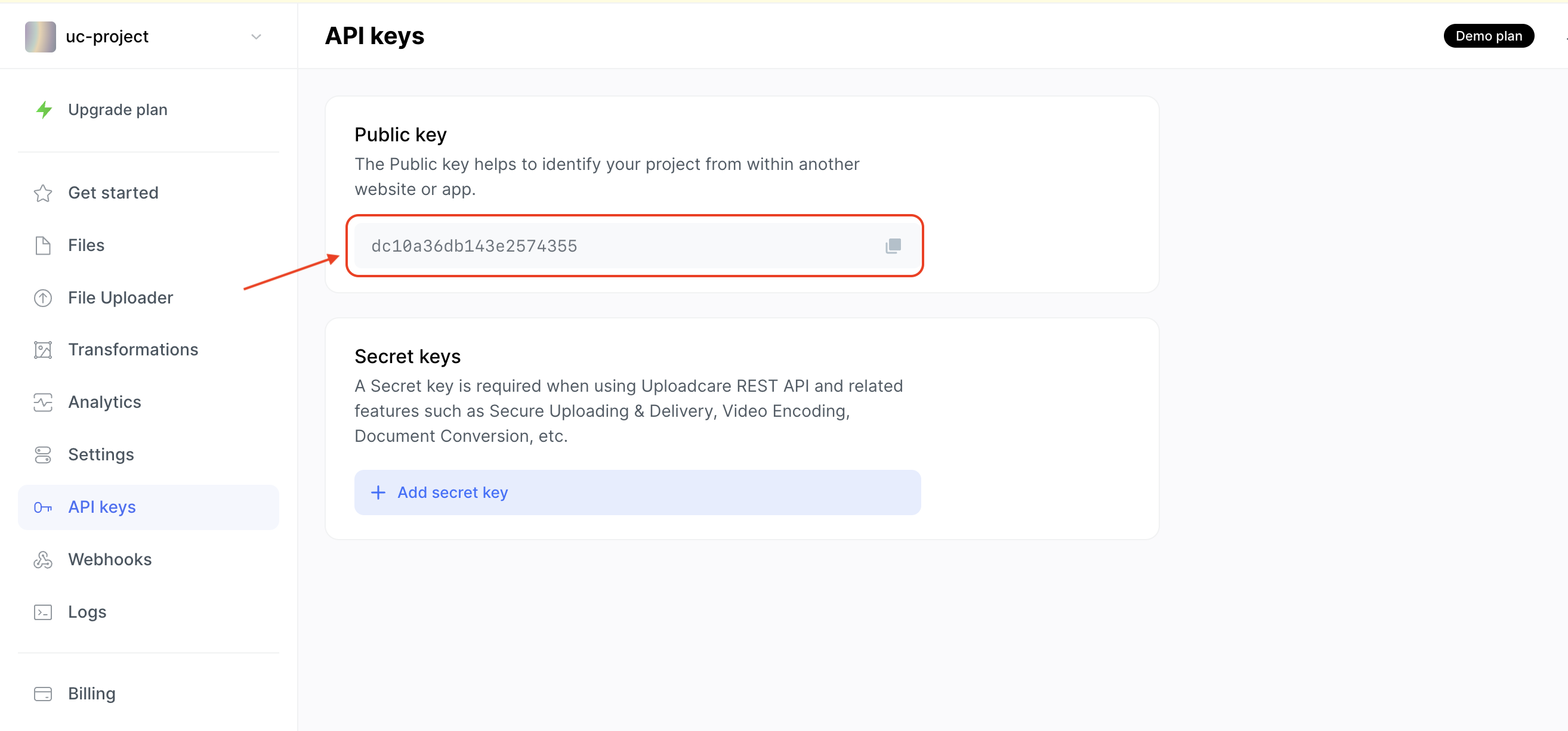 Uploadcare Public key
You will use this key to configure the File Uploader later in this tutorial.
Create a new Svelte.js application
Run the following command to create a new Svelte application using the SvelteKit CLI:
npm create svelte@6.3.10 uc-svelteDuring installation, when prompted, choose the following configurations:
During installation, when prompted, choose the following configurations:
◇  Which Svelte app template?
│  Skeleton project
│
◇  Add type checking with TypeScript?
│  No
│
◇  Select additional options (use arrow keys/space bar)
│  Add ESLint for code linting, Add Prettier for code formatting
Navigate to the newly created project directory and install all required dependencies:
cd uc-svelte
npm install
Install the File Uploader with the command:
npm install @uploadcare/file-uploaderAfter installation, in the root of your project, create an .env file and add the following environment variable for the Public Key:
VITE_UPLOADCARE_PUBLIC_KEY=YOUR_PUBLIC_KEYReplace YOUR_PUBLIC_KEY with the Public key from your Uploadcare dashboard.
Next, run the NPM command: npm run dev, and the application should be running on http://localhost:5173/
Create a file uploader component
In the src/routes/+page.svelte file, replace the content with:
<script>
	import { onMount } from 'svelte';
	import * as UC from '@uploadcare/file-uploader';
	import '@uploadcare/file-uploader/web/uc-file-uploader-regular.min.css';

	onMount(() => {
		UC.defineComponents(UC);
	});
	const publicKey = import.meta.env.VITE_UPLOADCARE_PUBLIC_KEY;
	let files = [];
	const handleChangeEvent = (e) => {
		if (e.detail) {
			const uploadedFiles = e.detail.allEntries.filter((file) => file.status === 'success');
			files = uploadedFiles;
			console.log(files);
		}
	};
</script>

<div>
	<h1>Hello from UC-Svelte File Uploader</h1>

	<!-- file uploader configuration -->
	<uc-config ctx-name="my-uploader" pubkey={publicKey}></uc-config>

	<!-- context provider for handling events for file uploader -->
	<uc-upload-ctx-provider
    ctx-name="my-uploader"
    on:change={handleChangeEvent}
  ></uc-upload-ctx-provider>

	<!-- file uploader component -->
	<uc-file-uploader-regular
    ctx-name="my-uploader"
    class="uc-uploader"
  ></uc-file-uploader-regular>

	{#if files.length > 0}
		<ul>
			{#each files as file (file.uuid)}
				<li>
					<img
						src={file.cdnUrl}
						alt={file.name}
						width="500"
					/>
				</li>
			{/each}
		</ul>
	{:else}
		<p>No files uploaded</p>
	{/if}
</div>
The code above:
- Imports the File Uploader component
UCand its styles - Registers the File Uploader component when the Svelte component mounts using the
onMountlifecycle function - Retrieves the Public key from the environment variable
VITE_UPLOADCARE_PUBLIC_KEY - Creates a
filesvariable to store the uploaded files - Creates an
handleChangeEventfunction to handle thechangeevents when a file is uploaded, and its status issuccess - Uses the
uc-configblock to configure the File Uploader with thepublicKey - Renders the File Uploader component using
uc-file-uploader-regularblock and configures the actions of the File Uploader usinguc-file-uploader-regularblock - Listens for the
changeevent when a file is uploaded and calls thehandleChangeEventfunction to handle the event - Loops through the
filesvariable and displays the files uploaded via thecdnUrlfield.
The different blocks for the File Uploader component uc-config, uc-upload-ctx-provider, and uc-file-uploader-regular are all linked together using the ctx-name attribute.
Clicking on the “Upload files” button will open the File Uploader modal to upload a file. After uploading a file, the image will be displayed on the page.
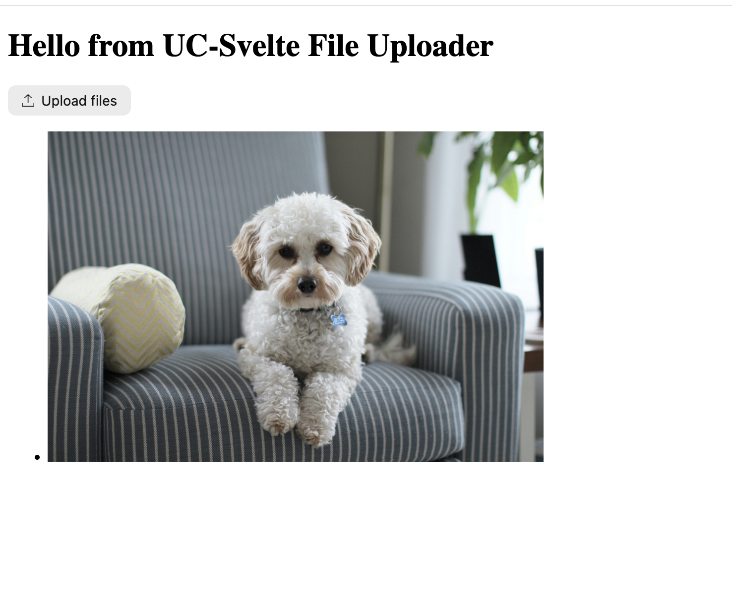 File Uploader in Svelte
Error handling
The file uploader also emits a file-upload-failed events to tell you when an upload fails. You can listen for this event and handle the error accordingly.
For example, say you want users to upload files with a maximum size of 2 MB. First, you can use the max-local-file-size-bytes property to restrict file uploads. If a user tries to upload a file larger than 2 MB, the file upload will fail, and the file-upload-failed event will be emitted.
To implement this, modify the uc-config block to include the max-local-file-size-bytes property:
<uc-config
  ctx-name="my-uploader"
  pubkey={publicKey}
  max-local-file-size-bytes="2000000"
></uc-config>
Next, update the uc-upload-ctx-provider block to listen for the file-upload-failed event:
<uc-upload-ctx-provider
  ctx-name="my-uploader"
  on:change={handleChangeEvent}
  on:file-upload-failed={handleUploadFailed}
></uc-upload-ctx-provider>
Then create a handleUploadFailed function in the <script> of the component for handling the event:
const handleUploadFailed = (e) => {
  console.log(e.detail.error);
};
When you try to upload a file larger than 2 MB, you should see the error message in the browser console.
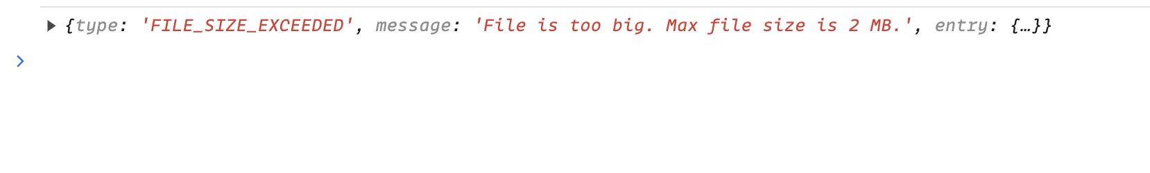 File size exceeds the limit of 2 MB error
Image transformation on the fly
Aside from providing a ready-to-use File Uploader component for your Svelte applications, Uploadcare also offers image transformation features that allow you to transform images on the fly.
These transformations can help you optimize images, reduce file sizes, and improve loading times.
Transforming images in Uploadcare is done by appending transformation properties to the image URL:
https://{unique-subdomain}/.ucarecd.net//{fileUUID}/-/{transformProperty}/{value}/Where:
{unique-subdomain}is the unique subdomain for your Uploadcare project found in your Delivery settings.{fileUUID}is the unique identifier of the file.{transformProperty}is the transformation you want to apply to the image.{value}is the value of the transform property you want.
Let’s apply some transformations to the images uploaded previously.
<img
  src={`${file.cdnUrl}-/preview/-/crop/face/1:1/-/filter/carris/`}
  alt={file.name}
  width="500">
This applies a face crop ratio of 1:1 to the image and a filter value of carris to it.
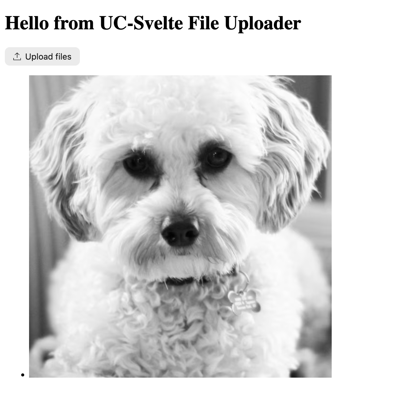 Transformed image using Uploadcare transformation in Svelte
For a list of all the transformations you can apply to images, check out the Uploadcare Image Transformations documentation.
Customizing the File Uploader component
You can customize the File Uploader component to fit your application’s design and branding. To do so, apply a class to the uc-file-uploader-regular block and style it using CSS.
For example, let’s change the background color of the File Uploader to light mode using OKLCH color space. Inside the component, create a <style> section with the CSS code:
<style>
  .uc-uploader {
    --uc-background-light: oklch(80% 0.1 158);
  }
</style>
This will change the background of the modal of the File Uploader to green.
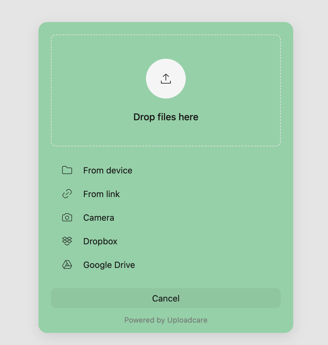 Custom CSS applied to the File Uploader using OKLCH color space
Check out the File Uploader styling documentation to learn about all the possible customizations you can apply to the File Uploader component.
Conclusion
In this article, you’ve learned how to upload files in your Svelte applications using Uploadcare’s File Uploader component, customize the File Uploader, and apply transformation features to images on the fly.
To further improve your users’ experience, you can explore more features that Uploadcare provides, such as a fast CDN for storing your files, image optimization, and adaptive delivery.