Five steps to better responsive images
Last edited:
Adaptive web designs are trendy, look hip, and help you get visual information easier. But how do you build them exactly? What is required to construct a working system powered by responsive images?
Practically speaking, there are five steps to upgrade your images. We want to optimize image size, adaptability, delivery, and workflow. However, to determine the specific requirements of a particular website, a quick analysis is necessary.
Step 1. Measure
What gets measured gets managed. Chrome DevTools is a great tool to estimate how much traffic is taken up by images, and much else besides. There is also an easier way of doing it: PageDetox, a tool powered by Uploadcare that allows you to analyze how images affect the page load times of any site. Let’s run some tests.
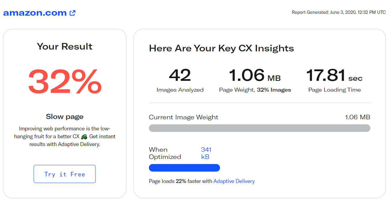 PageDetox estimation of Amazon.com image data footprint
As you can see from the picture above, images take up as much as 32% of the page-loading traffic on the Amazon.com mobile page, and the share of images is even larger for desktop (50%).
A large share of the traffic of the leading eCommerce websites is related to images. For Aliexpress mobile and desktop, it is 28% and 42% of page-loading traffic, respectively. For eBay, it is 24% and 39%, and Alibaba scores 26% and 29%. The situation is not very different outside of eCommerce: 23% and 26% of Netflix page-loading traffic consists of images; 24% and 38% for The Guardian, and 27% and 41% for Samsung.
The standard way of addressing the issue of data-heavy images impacting page load times is compression. But a good image isn’t just a compressed one, it should also be optimized for viewing and printing purposes. Optimizing these pages with Uploadcare Adaptive Delivery could reduce page load time by as much as 22% for Amazon, and 37% in the case of Samsung.
One of the key image optimizations to improve load times would be implementing Responsive Delivery. With this in mind, let’s head over to Step 2.
Step 2. Build responsive images, not flexible ones
Flexible and responsive images are often confused. Here’s what we mean by calling an image flexible:
<img src="myimage.jpg">
<style>
  img {
    width: 100%;
  }
</style>
No doubt, this image is adjustable. But in this example, it’s going to be rescaled each time we need to adapt the layout to the viewing environment. Moreover, the original size of the image is used every time, which is often excessive for smartphones. Loading large images takes time and traffic, and traffic quite often simply means money.
Step 3. Stick with responsive designs
An image becomes responsive when it at least fits the viewing environment, screen size, and screen resolution (pixels per inch) of the device used.
A common image adaptation method was devised with input from communities like RICG. Adaptive images are achieved by preparing many versions of the images you’d like to be responsive, and then it’s the web browser that should decide which of the versions to load. Such decisions depend on different conditions, such as device pixel ratio, screen size, and orientation.
To do that, you can use the srcset attribute of the <img> HTML element. Here’s how:
<img src="myimage.jpg"
     srcset="myimage@400.jpg 400w,
             myimage@500.jpg 500w,
             myimage@1000.jpg 1000w"
     sizes="(max-width: 500px) calc(100vw - 30px), 500px">
The approach can both decrease image traffic and increase the visual quality of images. But there’s even more, if we’d like to go more responsive.
Step 4. Think about the big picture
There’s another HTML container that is often preferable when building responsive layouts: <picture>. It appeared as a result of a years-long debate on building adaptive layouts. This container is used to specify multiple sources and parameters for a specific image. It’s done to make images friendly to pixel ratio, adaptive resize, content altering, and more. Here’s what a <picture> might look like:
<picture>
  <source srcset="myimage@1000.jpg 1000w, myimage@2000.jpg 2000w"
          sizes="(min-width: 1000px) 60vw, 100vw"
          media="(orientation: landscape)">
  <source srcset="myimage@450.jpg 1x, myimage@900.jpg 2x"
          sizes="(min-width: 450px) 450px, 100vw"
          media="(orientation: landscape)">
  <source srcset="myimage@320-400.jpg 1x, myimage@640-800.jpg 2x"
          media="(orientation: portrait)">
  <img src="fallback.jpg">
</picture>
We don’t intend to dig too deeply into <picture> descriptions and use cases; we just want to talk about how you can further optimize your workflow. If you’re interested in reading further about responsive images, please check out this series of articles by Jason Grigsby.
The layout design built with <picture> is fluid and responsive, and it makes website content easily accessible. But it’s quite clear there are at least two drawbacks of using this approach:
- Creating many versions of images is time consuming.
- The volume of needed storage increases severalfold.
Step 5. Use image CDNs
Using an image CDN like Uploadcare overcomes these drawbacks. We designed Uploadcare to be responsive-friendly. The uploaded images are stored in the cloud, which guarantees their uptime. No time is wasted creating different versions of images, because our CDN supports on-the-fly image processing. And caching of the processing outputs speeds up the delivery even further.
No matter which approach is applied, <img> with srcset, or <picture>, the only difference when using Uploadcare is in the URLs.
 The image uploaded from a CDN
This image was loaded directly from our CDN
Take a look at its URL to see how it’s constructed:
http://6ca2u7ybx5.ucarecd.net/:uuid/-/:operation/:params/:img_nameHere:
-
6ca2u7ybx5.ucarecd.netis the project URL which can be gotten from a project’s Delivery settings. -
:uuidis a unique image identifier. The dash between the two forward slashes/-/is used to separate the ID and the possible operations. -
:operationis the name of an operation that is used to process an image (resize is used in the example). Operation parameters are separated by forward slashes. The example URL ends with:img_name, which can stand for almost any string of characters based on your preference, but is commonly represented by a filename. These, for instance, might be in yoursrcset:-/22240276-2f06-41f8-9411-755c8ce926ed/-/resize/1000x/pic1x.jpg
-/22240276-2f06-41f8-9411-755c8ce926ed/-/resize/2000x/pic2x.jpg
The workflow with Uploadcare’s CDN is pretty straightforward. You create the needed images in hi-res and upload them to the CDN. Resizing, cropping, or even enhancing the images is then performed on the fly. The CDN operations are controlled by what you put into the URLs.
Using an image CDN lets you deploy responsive websites in a fast and efficient manner. For instance, you can control JPEG quality to reduce generated traffic, or convert your images to WebP format. Uploadcare supports WebP and many others, and image formats can also be specified when using the <picture> container. A live example of <picture> containing images which are transformed on the fly with our CDN can be found on this Codepen page.
A brief conclusion
With Uploadcare, your path to responsive images might take just about five steps, from testing to implementing CDN solutions to deliver your images with quality, speed, and reliability.
Both users and developers can benefit from using an image CDN:
- Less traffic is generated. You and your users pay less and don’t waste your bandwidth.
- Developers and designers spend less time and resources when working with images and creating different versions.
We care about the concept of Responsive Web Design, so we don’t charge our users extra for image transformations on any plan. That means you’re free to build responsive layouts with Uploadcare.
We’re excited about what you might build! We’d love to answer any questions you might have on the way, so feel free to leave your comments below.