Cumulative Layout Shift explained
Last edited:
Nowadays it’s extremely common to find a website that has dynamically inserted content. Usually it appears in response to a user input. A good example would be a so-called “accordion dropdown,” where hidden content reveals itself after a visitor clicks on the section title.
Another example would be cases when some elements appear on the page during the loading process, unexpectedly moving page content down. This is an unwanted behavior. To track the issue and reflect it in numbers, Google came up with a metric called Cumulative Layout Shift.
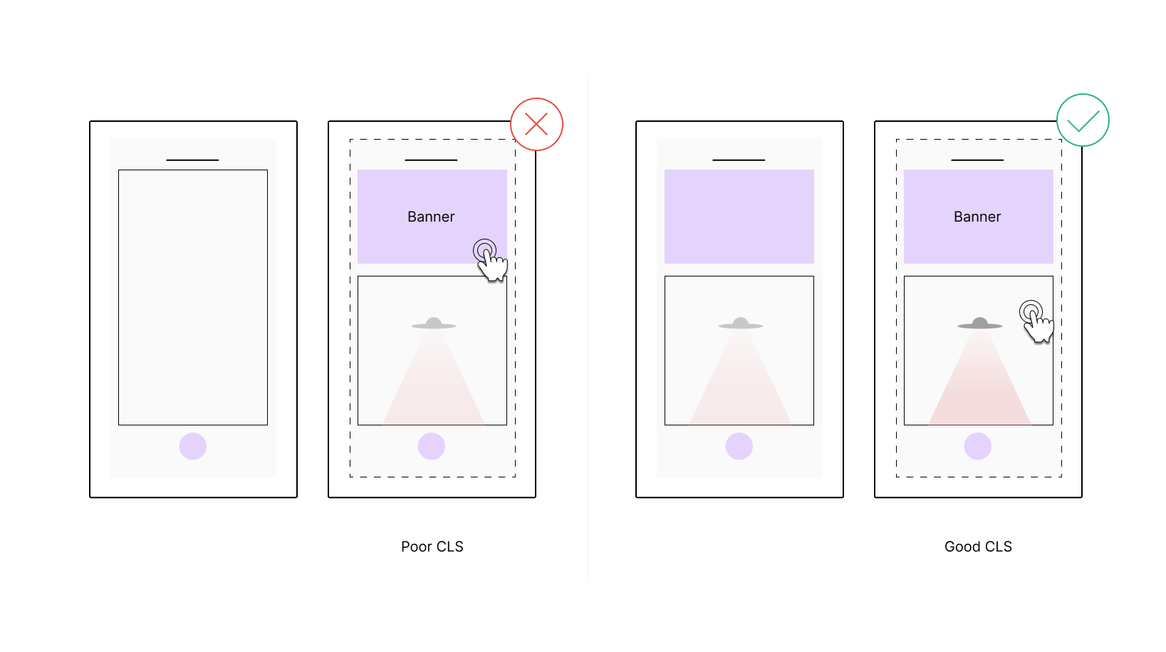 Poor and good CLS compared visually.
What is Cumulative Layout Shift?
Cumulative Layout Shift (CLS) is a metric that shows how “stable” your content is. It monitors layout shifts that happen later than 500 ms after user input and sums them using a certain formula that we will get to down the road. As a result you get a dimensionless value that can be considered as follows:
- Less than or equal to 0.1 — Good
- Between 0.1 and 0.25 inclusively — Needs improvement
- More than 0.25 — Poor
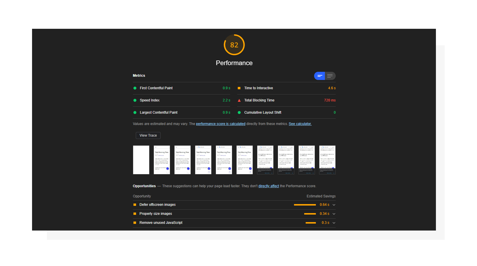 Lighthouse performance report including Cumulative Layout Shift.
When you break everything down by the numbers, the impact of CLS is quite small compared to other Lighthouse metrics. It affects 5% of the total Performance Score in the most recent Lighthouse version (v7). While that number may look small, I’d recommend you don’t neglect this metric to ensure that users don’t accidentally open the wrong thing simply because an image or ad loads just a moment before they tap or click a desired element.
Importance for UX and SEO
In May 2021, Google rolls out its page experience update. That means the search engine will update its ranking system and re-evaluate websites using page experience signals. Page experience is a set of signals that report how comfortable a page appears to a visitor beyond just getting pure information value. When talking about UX-related signals, Core Web Vitals comes to the rescue.
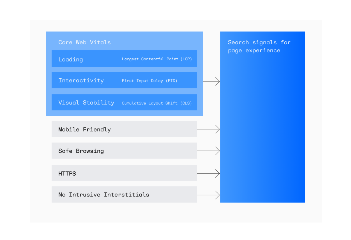 The new Core Web Vitals show whether your website is stable and fast, and are a part of a broader set of page experience signals.
As of May 2021, it has three core user-centric metrics to track the main aspects of user interactions with a page. Cumulative Layout Shift is one of them, which means that improving CLS may almost directly affect how Google favors your page.
Note: Google rescheduled its page experience update to June 2021 and is planning a gradual rollout until the end of August. The search engine is also introducing a new Page Experience report in Search Console which will help evaluate Core Web Vitals and overall website performance.
How to measure Cumulative Layout Shift
CLS can be measured in the lab (via synthetic tests) or in the field (using real user data).
| Lab tools | Field tools |
|
|
Lab tools are often used during the development stage to make sure new features/improvements comply with the threshold set for CLS, whereas field tools report RUM (Real User Monitoring) data.
Results provided by these two methods may differ due to their nature. As for CLS, values reported by lab tools for a given page may be less than field data. That’s because tools like Lighthouse measure layout shifts only during the page loading process, and field tools can continuously report user values.
Why do layout shifts happen?
Technically speaking, a layout shift happens when an element that is visible within the viewport changes its start position in the timespan of two consecutive frames. Simply put, a sudden movement of a page element without any user input triggering it is considered a layout shift.
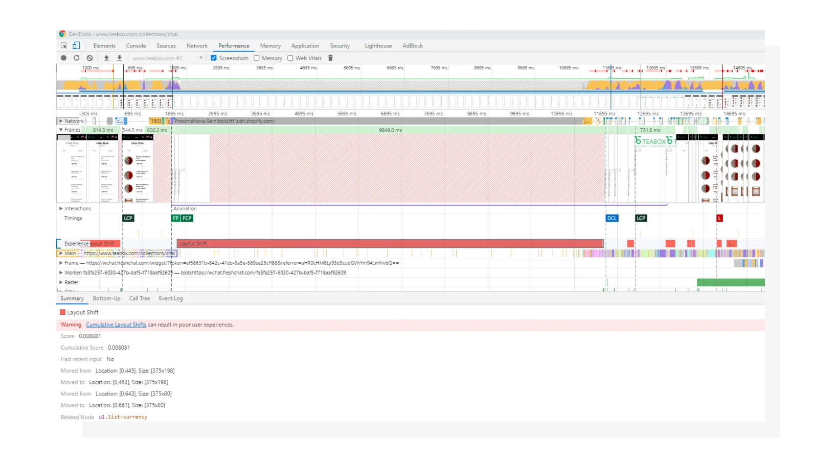 Layout shifts in Chrome DevTools.
While any dynamically added element may potentially cause content to change its starting position, here are some common reasons:
- Images without dimensions
- Ads and/or third-party widgets
- Web fonts that change text height
- DOM insertions that depend on the network
How to fix CLS
Now that we’ve defined the possible reasons, let’s walk through them and see the solutions.
1. Specify image dimensions
To fix this issue, include width and height attributes inside the <img> tag. Alternatively, or in conjunction with this, you can utilize aspect ratio padding trick to keep element proportions intact. The latter approach is also proven to be suitable for other types of media such as dynamically embedded videos.
2. Reserve space for ads and/or third party widgets
I intentionally combined these into one section since most ads are in fact third-party code embedded to the page via various means. While you can’t control the size of content placed inside an ad, it is possible to track down how big the whole ad/widget is or how potentially large it may become.
Using Chrome DevTools, you can find the ad dimensions and style the ad container upfront with those values.
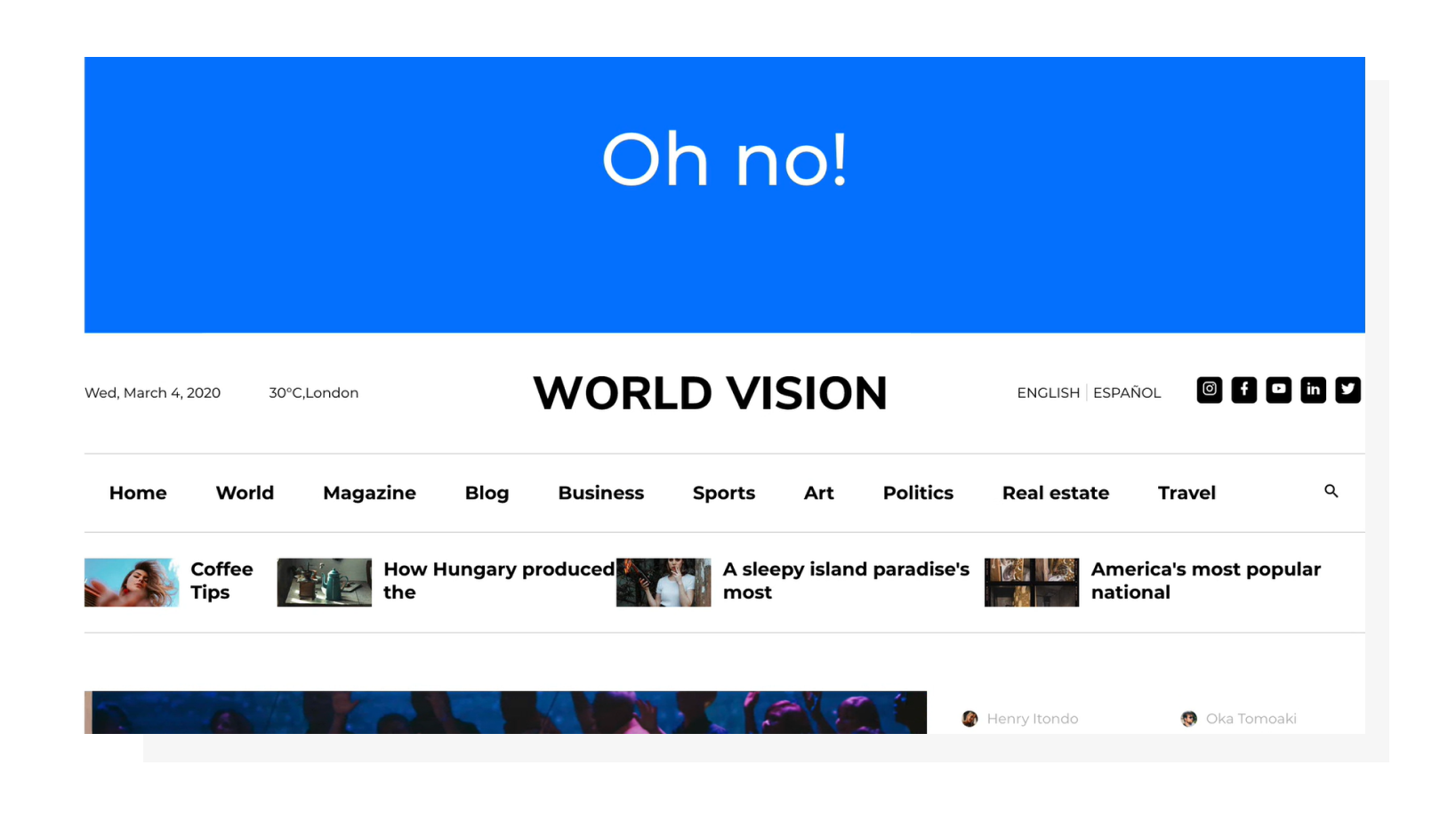 A severe example of an ad placed above the page container.
It’s also worth mentioning that ads placed at the very beginning of the page (even higher than website navigation) may cause bigger perceived layout shifts than those that are placed in the middle of the page.
3. Optimize custom font delivery and swapping options
If a custom font is used on the website, the browser will need to download it in order to use it on the page if the font is not already present in the system. When a font is being downloaded, a fallback font is used in the meantime. This may be defined in CSS by the developer or provided as a default browser property. The takeaway here is that the target font and fallback font may be different in terms of the space a text is occupying.
To prevent layout shifts caused by font-related problems, you can utilize the following:
- Use the
font-displayCSS property. There’s a lot to talk about here: you can refer to this page for a deep dive. - Preload key web fonts using the
<link rel=preload>HTML tag instead of remotely fetching them from CSS.
These two methods may be used separately or jointly. You can use the font-display property to determine the font swapping behavior, and preload the font to increase the chances that it will be downloaded and ready to be rendered even before the page is outputted visually. No visible font change = no layout shift.
4. Consider using placeholders for dependent DOM elements
If you have AJAX-dependent DOM changes on your website, consider reserving a space for results coming from the server. This solution is very similar to reserving space for ads and widgets, but in this case you may have more control over how big the upcoming content will be.
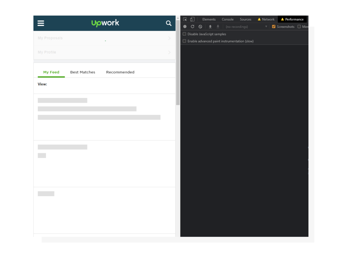 Using grey placeholders when content is being loaded is a widely used solution nowadays both from a UX and aesthetics perspective.
From my experience: I once had dynamic JS forms rendered on a website on demand. When a user opened a modal, the form configuration started downloading and was then displayed on the page. However, sometimes this may be longer than the 500-millisecond window, breaking the cause-effect chain and triggering layout shifts. Since the forms were pre-defined on the back end, it was possible to define container height upfront and eliminate layout shifts.
How is the Cumulative Layout Shift calculated?
I intentionally didn’t bring this up at the very beginning of the article for a simple reason: from my experience, you don’t need to know all the details of the way the metric is measured to make some initial improvements.
However, knowing the theory puts you ahead of the competition (even if you’re just competing with yourself), so let’s find out.
Unstable elements
First, the browser searches for unstable elements, the elements that change their starting position during the page loading process (when talking about lab tools).
Impact fraction
Then, the browser determines the impact fraction. Take the height of the area that’s been affected by unstable elements and divide it by the whole viewport height, and you’ll get the impact fraction.
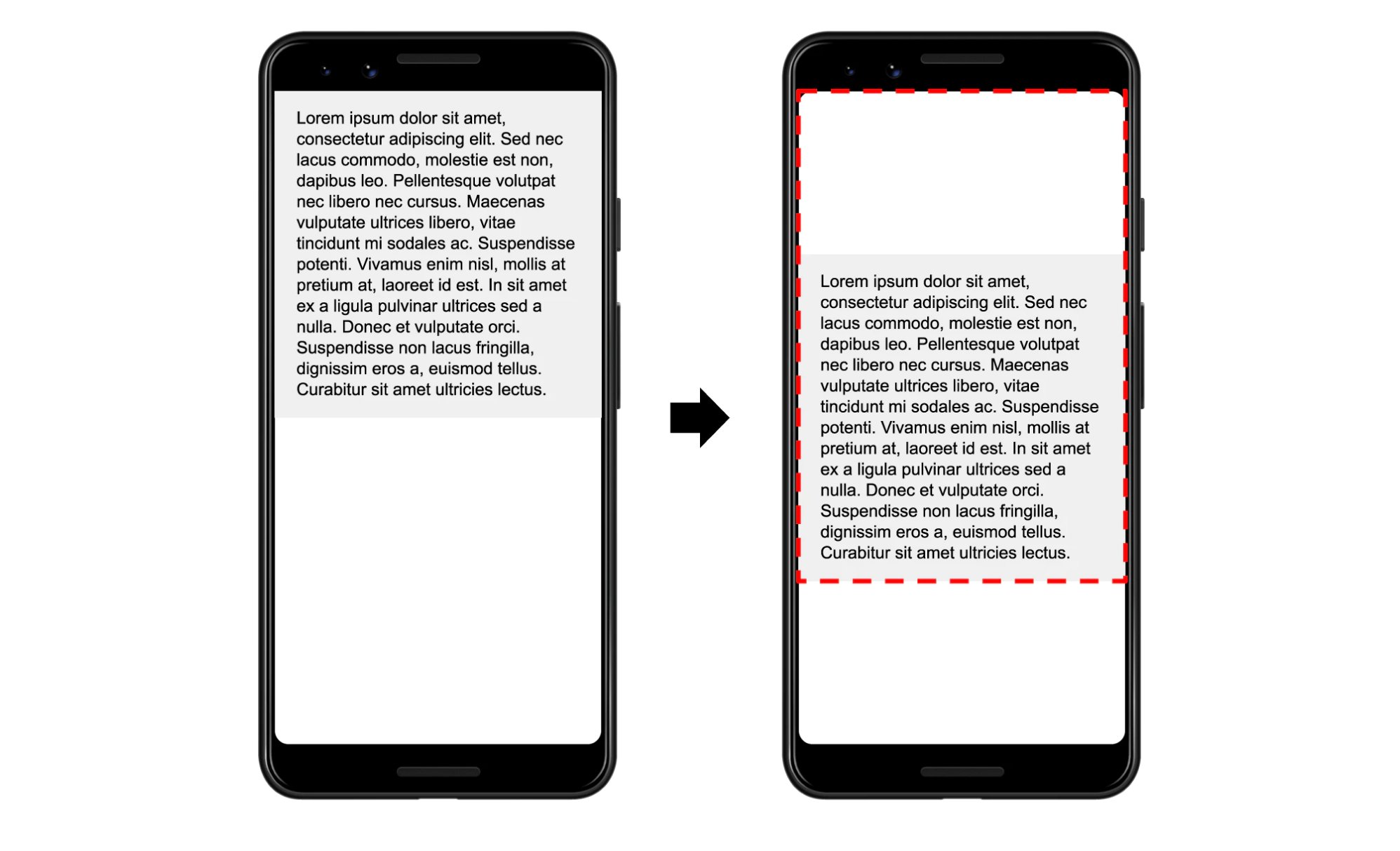 The element has been shifted down, creating a new blank space above it and extending the bottom border.
In the example above, the text block has been shifted down by 25% of the viewport. However, this has affected 75% of the viewport, so the impact fraction is 0.75. To put this in more mathematical language, the impact fraction is the union of the space occupied by the element before and after the layout shift.
Distance fraction
This monitors how far an unstable element moves related to the viewport. The distance fraction is the distance the element has traveled divided by the viewport’s width or height, whichever is greater.
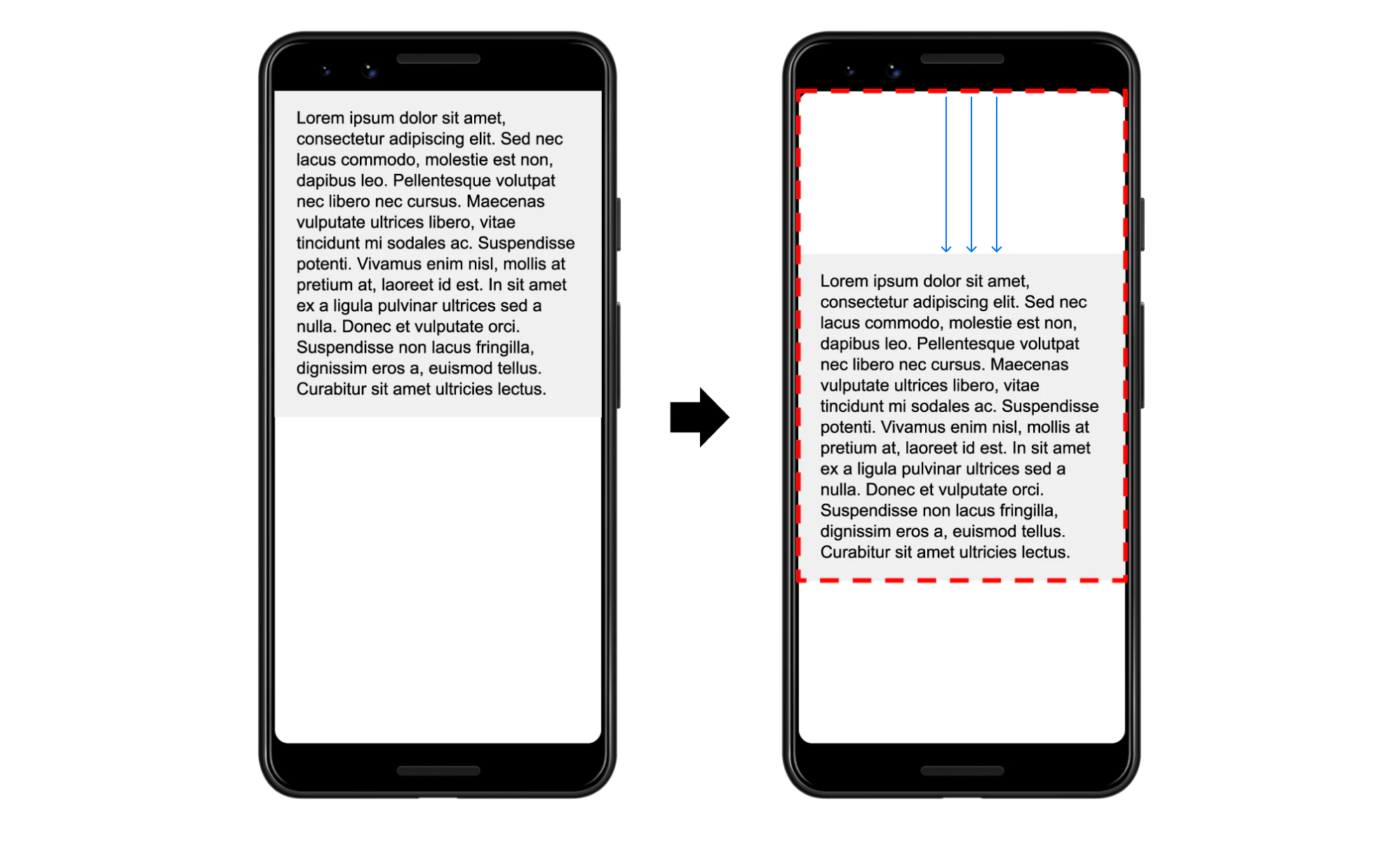 In this example, the blank space marked with the arrow represents the distance fraction.
The element has moved by 25% of the viewport height (because it is greater than the width), so the distance fraction is 0.25.
Layout Shift Calculation
Layout shift is a product of the impact fraction and distance fraction. In our case it is 0.75 x 0.25, which is 0.1875.
Interestingly, CLS used to be calculated only according to impact fraction. Distance fraction was introduced to avoid penalizing cases where big elements were shifted by a small amount.
How can image size affect your Core Web Vitals?
It’s important to optimize all your Core Web Vitals — not only LCP and FID, but also CLS). As you optimize them, keep in mind that they all may be more or less dependent on the actual website loading speed (in bytes per second).
I’m mentioning images in this article for a reason. The thing is that images load in a non-blocking fashion, meaning that they won’t block the page from rendering, but they will occupy bandwidth, leaving less space for scripts, fonts and external ads to be loaded, which can cause delays. By optimizing images, you can increase performance in all three core metrics.
To accomplish this in a convenient automated way, Uploadcare created a tool called Adaptive Delivery. It allows you to:
- Defer image loading (aka “lazy loading”). Images load automatically once they enter the viewport.
- Apply image transformations.
- Optimize parameters like size, format, quality, and dimensions automatically based on the user’s device configuration.
With the last one, you won’t need to manually prepare different image versions. The tool is content-aware and AI-driven, so the optimal quality will be determined based on the image content.
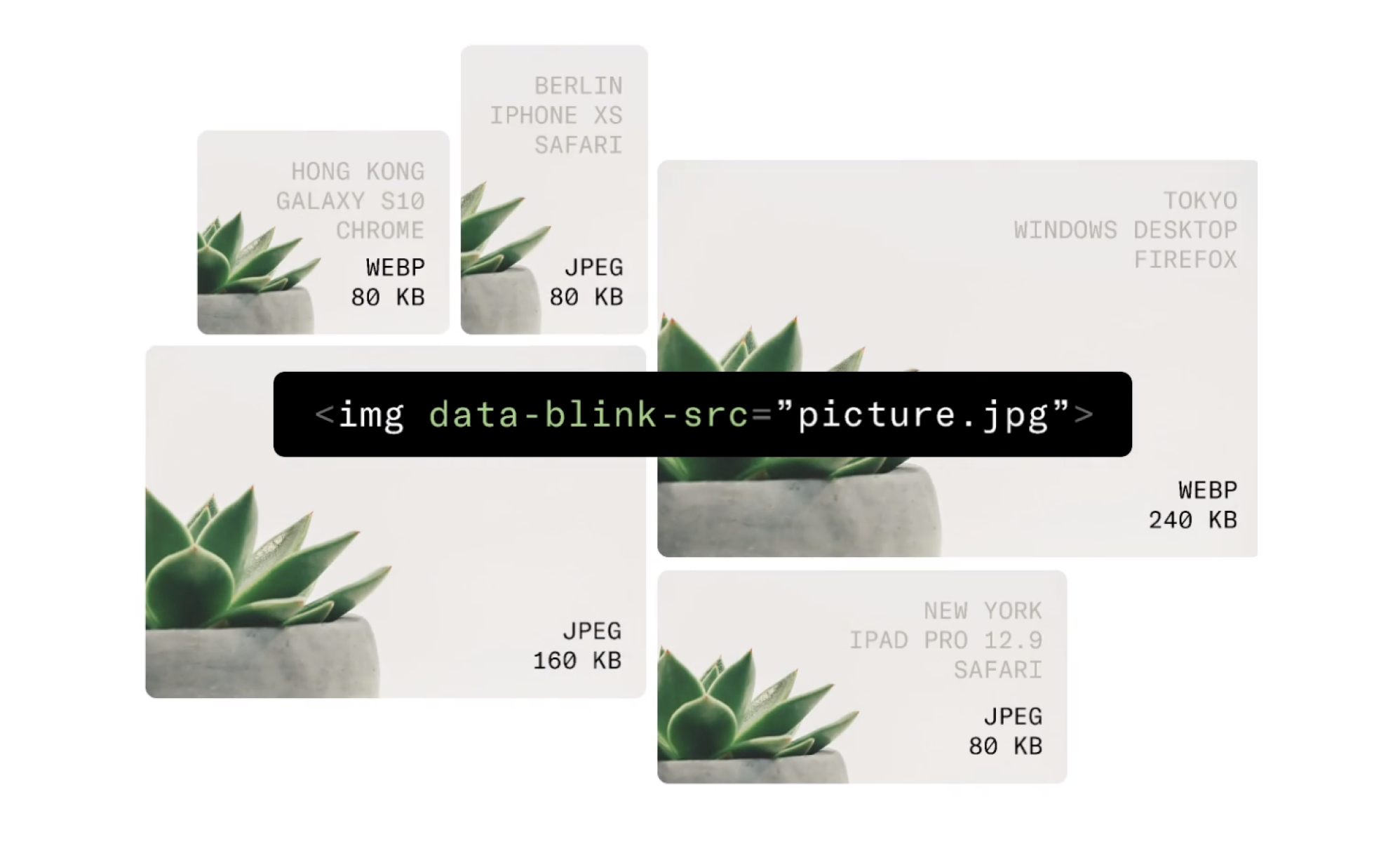 The solution delivers the most optimal image based on several conditions.
Also, it’s a tiny (3.7 KB) compressed script, which can save you megabytes of image data and do all the heavy lifting on the front end.
If you want to look at the potential results Adaptive Delivery can provide in your particular case, test your website with PageDetox, another service from Uploadcare that can generate reports based on image size data.
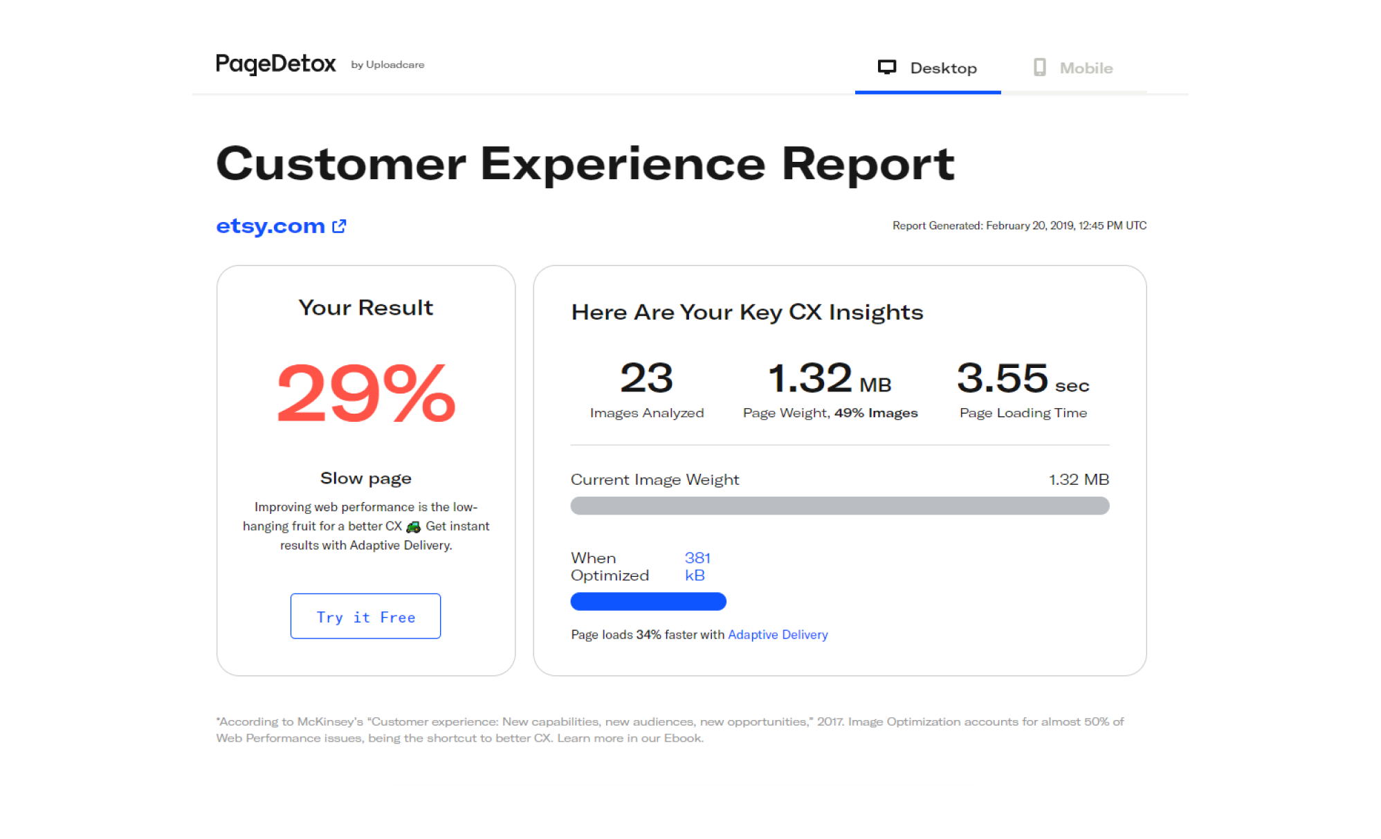 PageDetox tells you how fast your website can be if you use Adaptive Delivery.
In conclusion
In order to help you in the race for perfect performance results, in this Lighthouse-related article series I always encourage you to stick to a fundamental user-centric approach, and CLS is not an exception. Modern web standards make it harder to trick search engines, and this naturally forces website owners to care about users more.