Responsive images vs Adaptive Delivery
Last edited:
With the huge variety of screens nowadays, there’s no one-size-fits-all resolution for images. Fortunately, the evolution of web standards has brought us responsive images.
We at Uploadcare went further with our Adaptive Delivery technology. Driven by device-detection algorithms and smart resizing, it handles all the tedious image preparation work for you, so you can focus on more important tasks.
First, let’s learn more about the concept of responsive images and then compare it to Adaptive Delivery.
How to make an image responsive
Implementing responsive images, also called adaptive images, means adapting them to a visitor’s device’s screen width and browser. Instead of providing just one URL, we can send a set of image URLs to the visitor’s device and provide additional image descriptors in the <img> tag. The method can also be used to make responsive background images. Let’s go over what responsive images can offer.
Regular image
Here’s the general method of embedding an image into a document:
<img src="https://6ca2u7ybx5.ucarecd.net/5876c100-2a41-442a-93b0-db493607e799/-/resize/1920x/"
     alt="Chameleon">
It’s just an <img> tag with the image URL provided. The image itself is a photo of a chameleon converted to have a width of 1920px with a size of 321KB.
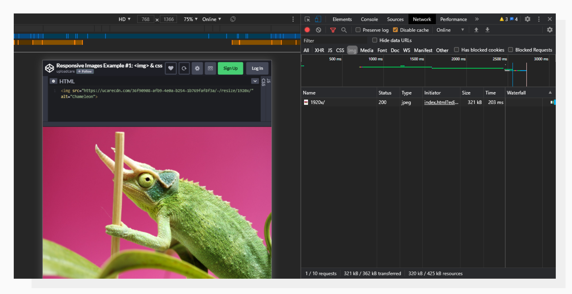 Here, the image is loaded in Chrome Developer Tools.
Pixel density
The idea of a pixel may sound simple, but in the modern web development world, it can have different meanings:
- A physical pixel is a single dot of light in a display. Also referred to as a hardware pixel.
- A CSS pixel, also called a software pixel, is a unit of measurement in the web world.
They are not always equal. For example, Apple Retina displays have 4 physical pixels per CSS pixel (2 for width and 2 for height). Hence, if we want to provide the best experience for those displays, we need to use an image with a width twice as big. Does that mean that we always need to serve upscaled images even for regular displays? No.
srcset tag: a сore component of responsive images
To let a browser choose from a set of images, we can provide them in a srcset attribute with an “x-descriptor.” Here is an example of the attribute in action, related to pixel density:
<img src="https://6ca2u7ybx5.ucarecd.net/5876c100-2a41-442a-93b0-db493607e799/-/resize/1000x/1.jpg"
     srcset="https://6ca2u7ybx5.ucarecd.net/5876c100-2a41-442a-93b0-db493607e799/-/resize/1000x/1.jpg 1x,
             https://6ca2u7ybx5.ucarecd.net/5876c100-2a41-442a-93b0-db493607e799/-/resize/2000x/2.jpg 2x"
     alt="Chameleon">
In this case, we provide the regular image URL followed by 1x — this will be used if the visitor has a regular display on which the device pixel ratio is equal to 1. After the comma, we provide a second URL — a two-times wider image for retina devices, where the device pixel ratio is 2.
To support older browsers, we also set a regular src attribute.
The browser doesn’t load all the images at once. Instead, it “decides” which one is the best fit for the particular situation.
Let’s open the page with a regular screen. Please note that we’re on the Network tab.
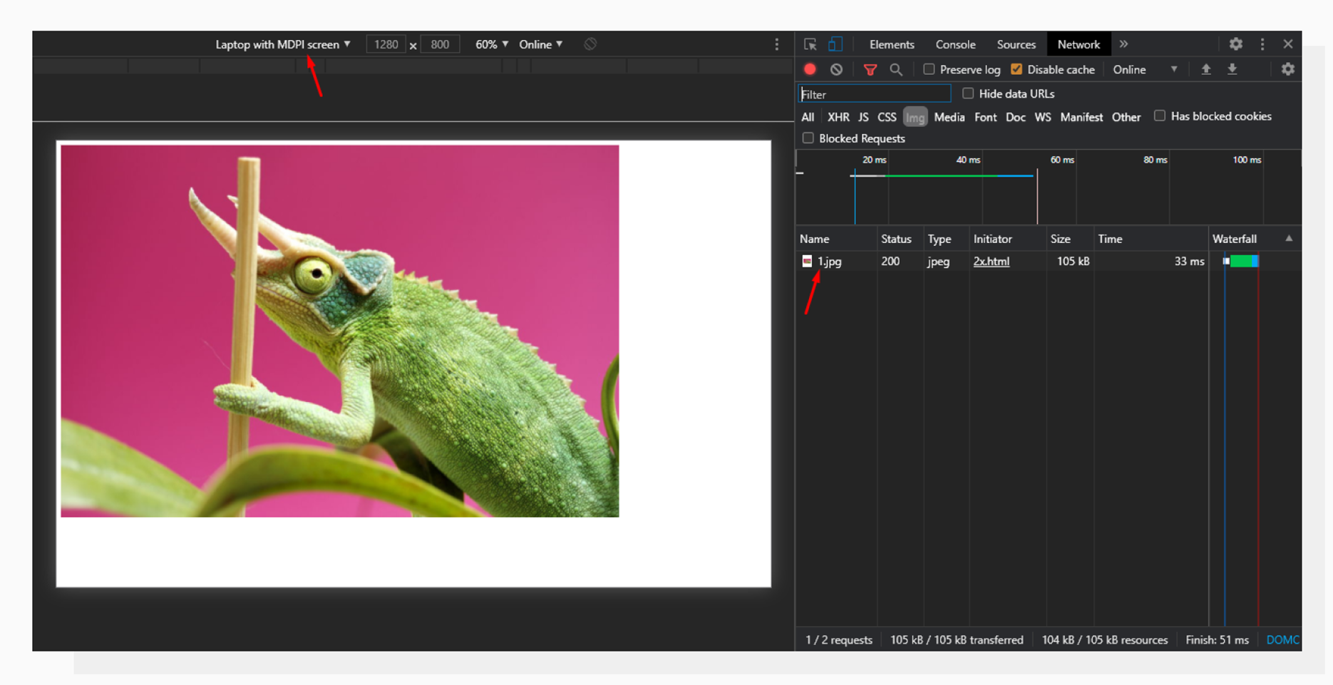 For a regular screen (MDPI, device pixel ratio = 1), the browser loads only the regular image, 1.jpg.
Now, let’s switch to a higher-density configuration and see the Network tab again:
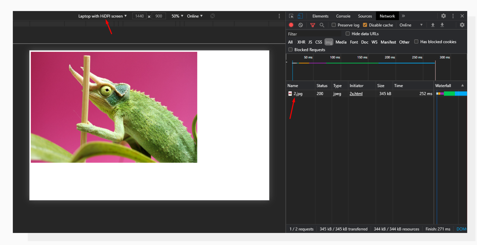 For a pixel density of 2, the browser loads only the higher-resolution image that we’ve provided in “srcset”.
The key point here is that we provide only the images which are the most optimal for a given pixel ratio. This allows us to save bandwidth on devices with regular screens (105kb for a regular image vs 345kb for a 2x image).
But pixel density is not the only thing that sets devices apart. Can we extrapolate this approach and provide different images for different screen sizes in the same fashion? Yes, we can.
Variable image widths
To provide support for different image widths, a “w-descriptor” is used. Similar to the previous example, it allows a browser to choose an image from a given set, but this time based on the pixel density AND the width the image is going to occupy.
Here’s the code:
<img src="https://6ca2u7ybx5.ucarecd.net/5876c100-2a41-442a-93b0-db493607e799/-/resize/1000x/fallback.jpg"
     srcset="https://6ca2u7ybx5.ucarecd.net/5876c100-2a41-442a-93b0-db493607e799/-/resize/320x/320.jpg 320w,
             https://6ca2u7ybx5.ucarecd.net/5876c100-2a41-442a-93b0-db493607e799/-/resize/450x/450.jpg 450w,
             https://6ca2u7ybx5.ucarecd.net/5876c100-2a41-442a-93b0-db493607e799/-/resize/640x/640.jpg 640w,
             https://6ca2u7ybx5.ucarecd.net/5876c100-2a41-442a-93b0-db493607e799/-/resize/750x/750.jpg 750w,
             https://6ca2u7ybx5.ucarecd.net/5876c100-2a41-442a-93b0-db493607e799/-/resize/800x/800.jpg 800w,
             https://6ca2u7ybx5.ucarecd.net/5876c100-2a41-442a-93b0-db493607e799/-/resize/900x/900.jpg 900w,
             https://6ca2u7ybx5.ucarecd.net/5876c100-2a41-442a-93b0-db493607e799/-/resize/1000x/1000.jpg 1000w,
             https://6ca2u7ybx5.ucarecd.net/5876c100-2a41-442a-93b0-db493607e799/-/resize/1200x/1200.jpg 1200w,
             https://6ca2u7ybx5.ucarecd.net/5876c100-2a41-442a-93b0-db493607e799/-/resize/1500x/1500.jpg 1500w,
             https://6ca2u7ybx5.ucarecd.net/5876c100-2a41-442a-93b0-db493607e799/-/resize/1600x/1600.jpg 1600w,
             https://6ca2u7ybx5.ucarecd.net/5876c100-2a41-442a-93b0-db493607e799/-/resize/2000x/2000.jpg 2000w"
     sizes="(min-width: 800px) 50vw,  100vw"
     alt="Chameleon">
In this case, we’re providing images and info about their widths at the same time. Additionally, we declare that if the viewport width is 800px or more, our image takes up 50 percent of the viewport. Otherwise, it takes all the width available, for example, on mobiles.
Let’s see how it works:
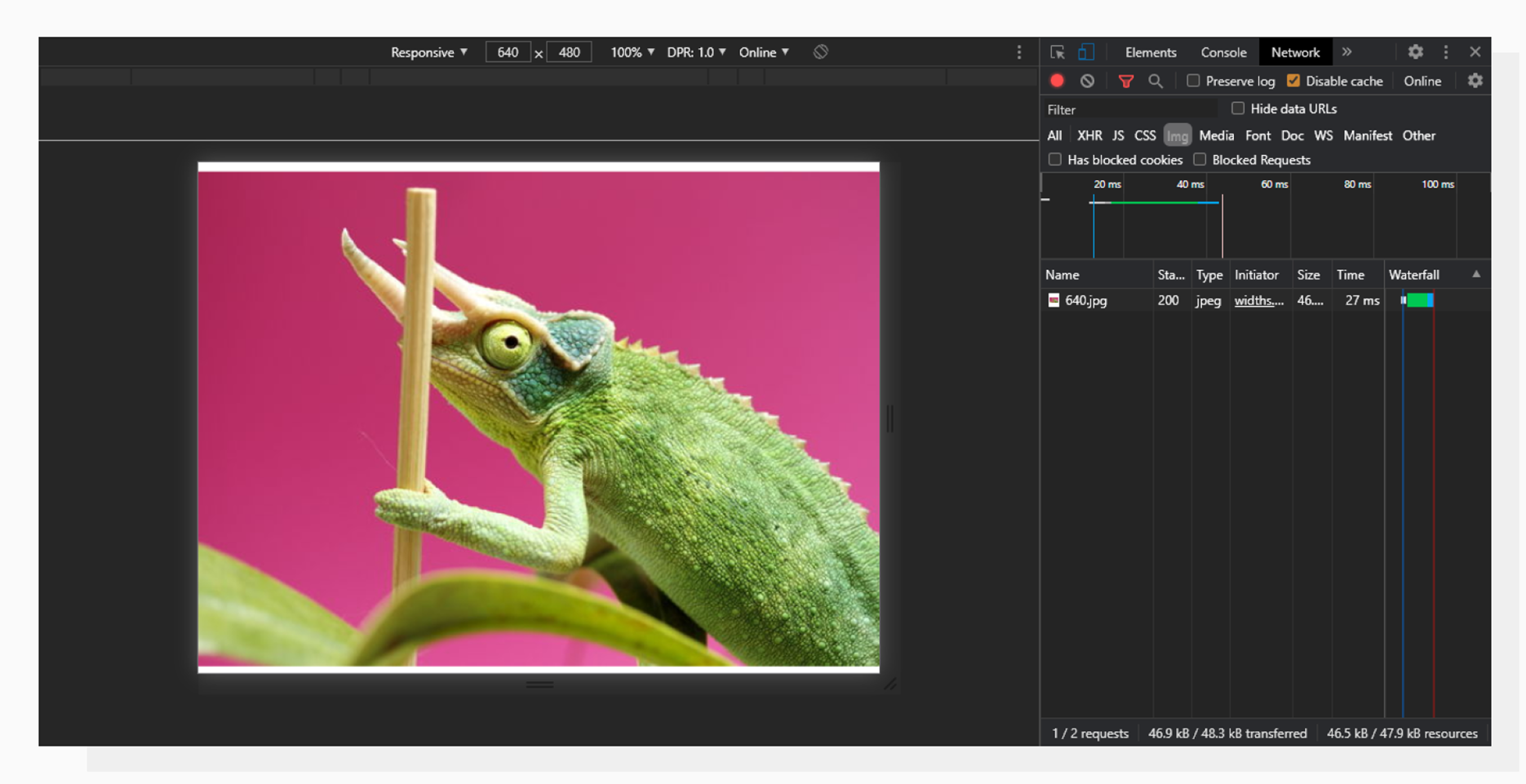 DPI = 1, Viewport width: 640px.
640px is less than the 800px provided in the sizes attribute, so the image takes up all the width. Since the DPI is 1 and the device width is 640, the browser decides to download the 640.jpg file.
Now, let’s switch our setup to something more complex:
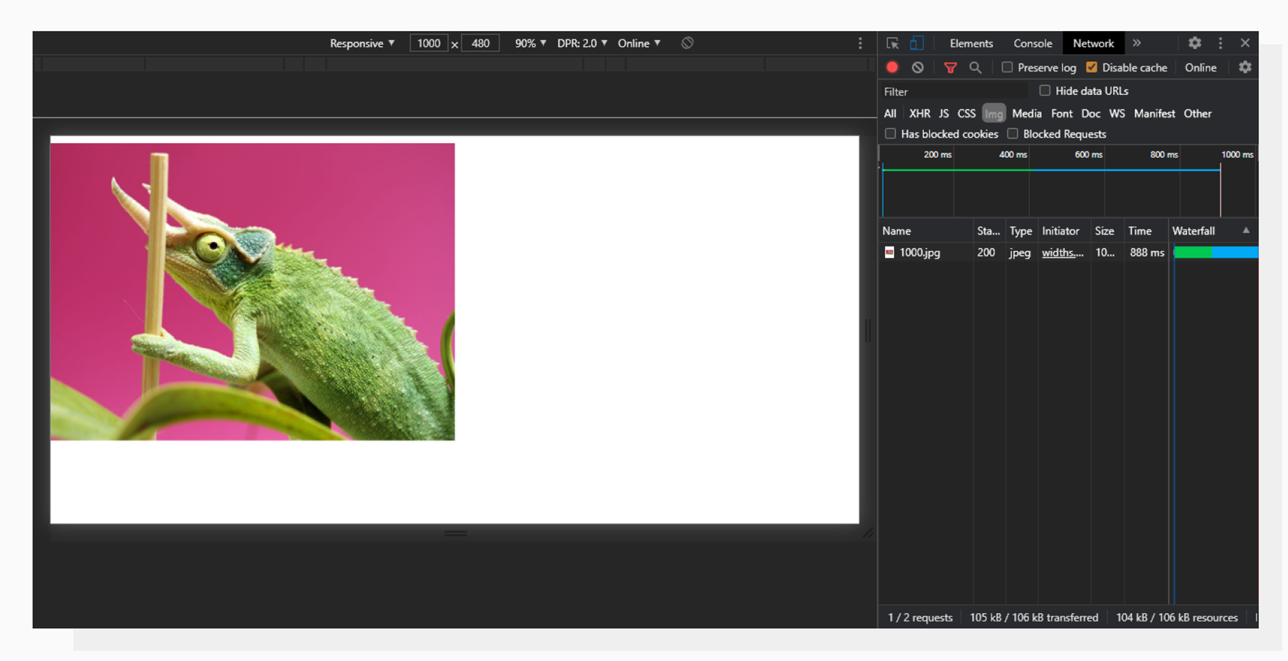 DPI = 2, Viewport width: 1000px
A DPI with a value of 2 means that we would need a 2000px-wide image to display it in a viewport width of 1000px. But, since our query in sizes returns true for the given viewport width, the required image width goes back to 1000px, and this is what we see in the Network tab.
This technique allows us to provide different images for small and big screens and reduce the amount of traffic, which is especially crucial for mobile users with a limited and/or slow connection.
“Why not stop here and start using it?”
Glad you asked. Here’s the answer: the more images you want to include, the more variants of each image you need to prepare. That means you'll likely have to manually cut, resize, and compress them. Plus, you'll need to upload each asset to your hosting. But wait, there’s more! Each URL needs to be put into the code as we demonstrated earlier. This needs to be done for every single image on your website.
To solve this, Uploadcare developed a solution: Adaptive Delivery.
Uploadcare Adaptive Delivery
We’ve already discussed how important it is to have optimized images. But is there any way to get all the benefits of responsive images (and even more) without writing tons of new HTML? Yes.
Here’s what you can do automatically after integrating Adaptive Delivery:
- Provide images with the right sizes;
- Compress images the smart way thanks to the content-aware technology;
- Serve modern image formats like WebP if the visitor’s device supports it;
- Defer image loading with a lazy-loading approach to improve UX and page load speed;
- Automatically crop images by focusing on faces, objects, or contrast corners.
This is done by adding a tiny Javascript snippet to your page and 3KB of Javascript SDK that doesn’t modify the source image files, so you can change the settings manually if necessary.
Let’s see how image responsiveness and optimization can be easily achieved by using Adaptive Delivery.
Different image sizes
When talking about responsive images in the first part of the article, we discussed the srcset and sizes attributes. With Adaptive Delivery, there’s no need to manually prepare different image versions and add URLs to the page’s source code.
Instead, the only thing you need to do is replace the src attribute with data-blink-src, like this:
<img data-blink-src="https://storage.example.com/logo.png"/>This will automatically make your images responsive. Uploadcare detects the visitor’s device’s parameters and capabilities on its end and serves optimized images. Please note that the link still points to the original image — there’s no need to re-upload it to our servers.
Smart compression
The regular srcset approach doesn’t compress your images. You can do it manually or by using automated batch compression tools like Webpack. But not all images are created equal: what’s good for a simple logo may be harmful for a detailed image.
Adaptive Delivery chooses the right compression settings based on the content of an image. Here’s a comparison:
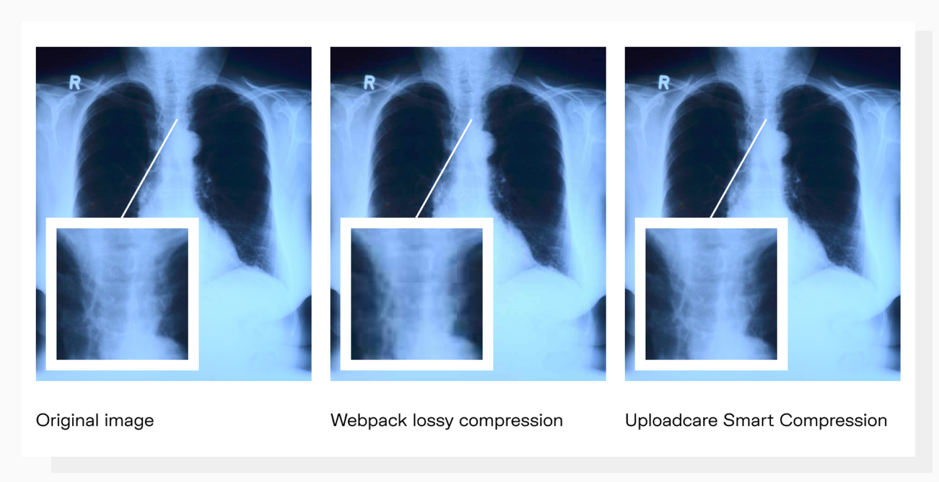 Smart Compression doesn’t wash out the details.
How-To: optimizing images from various sources
Let’s say you already have a website with lots of images. Moving and reorganizing them would be a tedious task if you decided to stick with the traditional “srcset” approach. For example, let’s build a page and put a cat there from the Imgur website.
First, embed a snippet to your page to enable Adaptive Delivery:
<script>
  (function (src, cb) {
    var s = document.createElement('script'); s.setAttribute('src', src);
    s.onload = cb; (document.head || document.body).appendChild(s);
  })('https://ucarecdn.com/libs/blinkloader/3.x/blinkloader.min.js', function() {
    window.Blinkloader.optimize({ pubkey: 'your_public_key', fadeIn: true });
  })
</script>
Now let’s proceed to the image itself:
<img src="https://i.imgur.com/CUtpdQo.jpeg" alt="Sleeping cat">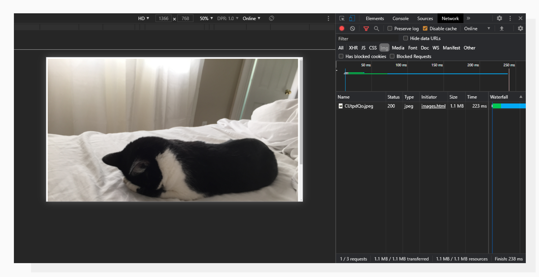 An image hosted on Imgur. 1.3MB.
Most of the time, 1.3MB is too much for a single image on a page. Now let’s apply Adaptive Delivery and see where it leads us:
<img data-blink-src="https://i.imgur.com/CUtpdQo.jpeg" alt="Sleeping cat">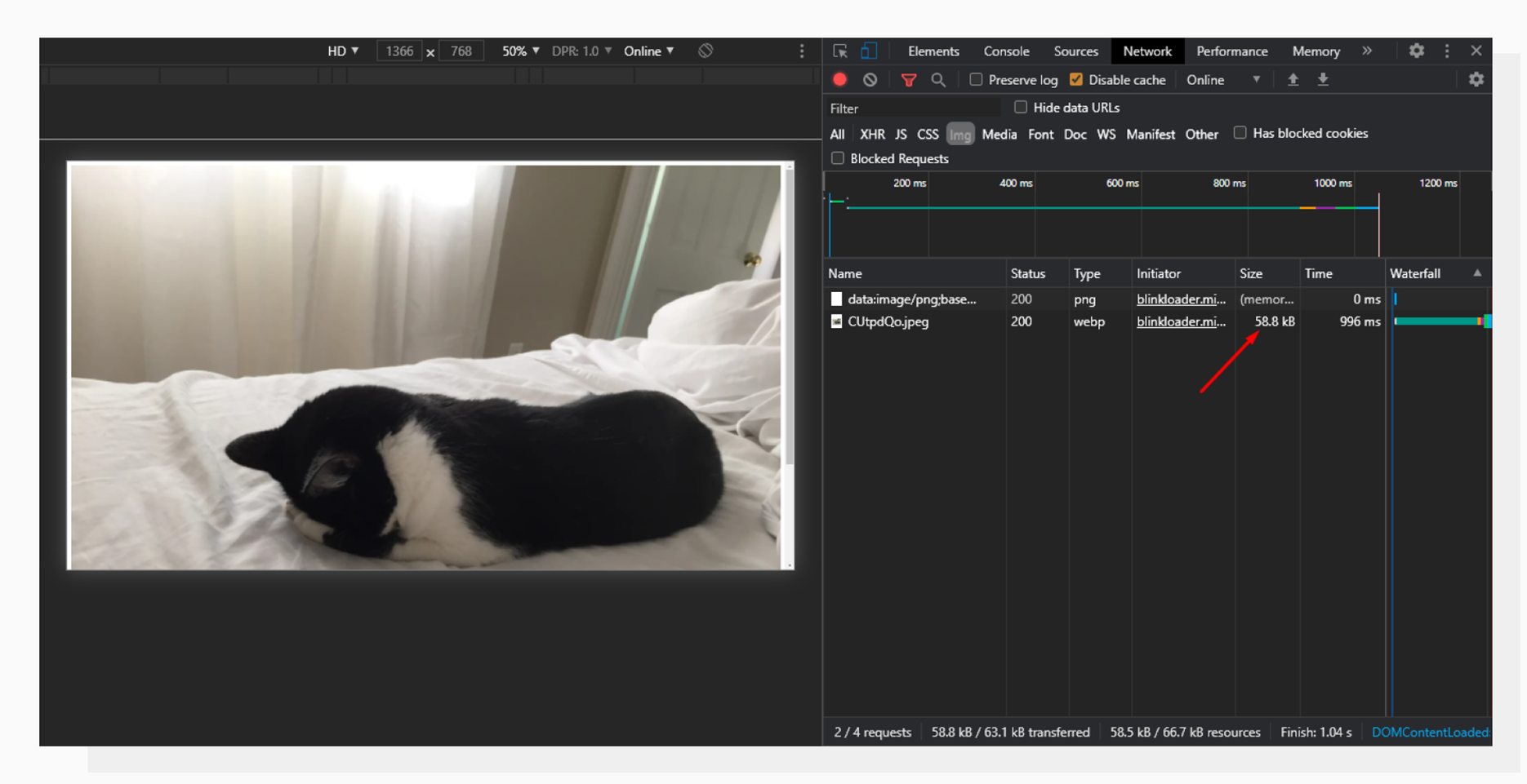 Now the image is 56.8KB, 23 times lighter than the original in this case without quality loss.
The example above is a great demonstration of how you can benefit from using the technology. The image has been compressed to modern WebP format because the browser supports it, and is lazy-loaded with a beautiful fade-in effect. All without sacrificing quality and rewriting URLs.
What’s next?
Adaptive Delivery requires minimum effort from your side to get good responsiveness and optimization for your images. You can sign up and try the feature for free.
Have questions? Feel free to leave a comment below or explore our help docs.