The future of image optimization: Webinar highlights
Last edited:
On May 7th, Uploadcare engineers Max Makarochkin and Nicholas Mullen conducted a webinar on the future of image optimization, as well as the benefits it brings to the eCommerce field, using Adaptive Delivery, part of Uploadcare’s full-stack image CDN as an example. More specifically, the webinar covered the following topics:
- Why does image performance matter?
- How to measure image performance
- The future of image optimization
- Adaptive Delivery: how Uploadcare implements modern image optimization
But don’t worry if you missed out — we’ve prepared a detailed report below. Read on to learn more!
The business value of better website performance
Why does image performance matter for online businesses, and what benefits does image optimization bring to eCommerce? The basic idea is like this: optimizing images improves website performance which, in turn, improves business outcomes. This latter improvement ultimately becomes visible in your business metrics.
There are several well-known case studies that testify to this pattern. For instance, in 2007, Google ran a test to see how delays in loading of search results affects the number of searches, proving that a half-second delay reduces the number of searches by as much as 20% — users tend to search less if they have to wait. Likewise, a 100-millisecond lag in page-load time gave Amazon a 1% drop in sales. Website performance matters for major offline businesses too: in the case of Walmart, 1 second of page-load time equals 2% of conversion rate.
In other words, improvements flow uphill: higher website performance means better user engagement, and user engagement translates directly into business metrics — session duration, number of pages clicked, conversion rates, etc. Thus, improvements that make your website more usable ultimately increase its value as a business tool.
Image optimization in website performance
In today’s media-intensive online environment, images are increasingly becoming a priority in website performance. Images take up approximately 50% of the total data on most websites, and the trend of the last decade has been moving upward: websites are becoming increasingly more image-heavy across the board. You can have a look at the data for yourself. In turn, image optimization determines an increasingly large part of site performance.
As the saying goes, what gets measured gets managed. To manage image performance, it’s important to keep track of its metrics. There are several ways of measuring image performance, using different tools whose choice depends on the context:
- Google Lighthouse: open-source solution, a great fit for continuous website monitoring, and nowadays it can even be added to one’s continuous integration workflows (e.g., Github Actions or Circle CI);
- Pagespeed Insights: also uses Lighthouse to collect and analyze lab data about the webpage, and determine the speed score, which is very sensitive to the amount of JavaScript used on the page;
- Chrome DevTools: gives detailed information on your image assets along with website performance data, which gives you a pretty accurate estimation of the website bandwidth per month;
- PageDetox.com: a tool for analyzing customer experience (CX) powered by Uploadcare. PageDetox was built with CX metrics in mind, and helps you measure image performance, as well as understand how image performance optimization can reduce the bounce rate and increase engagement rate on the pages and average page views per session.
The ‘Big Four’ of image optimization
When we talk about image optimization, we really are talking about four specific techniques: the so-called ‘Big Four’ of image optimization.
1. Compression
Compression has always been and continues to be the primary method for managing the tradeoff between speed versus quality: smaller images don’t look great, but are easier to upload.
2. Responsiveness
Responsive images allow dynamic resizing and adjusting to users’ device sizes, pixel density, and page layout. These user attributes are taken into account in order to tailor images and image optimizations to individual website visitors so that they receive optimized images.
3. Reformatting
Reformatting means converting all images to the web-friendly JPEG format, or a next-generation format like WebP. WebP is the primary next-generation format developed by Google in 2010 to automate images for the web. It's supported by Chrome and, since mid-2019, also by the latest version of Firefox. The point is to offer visitors WebP when their browsers support it, or fall back to JPEG if they don’t.
4. Lazy loading
Strictly speaking, lazy loading is not an image optimization technique, because it doesn’t act upon images and makes no changes to their source files. Rather, it's a sophisticated technique of managing page-load times: instead of loading all images at once, initially, it only loads images into the visitor’s viewpoint, and then, as the visitor scrolls down, loads the rest.
This tactic allows significant economization page-load times and bandwidth costs for both website visitors and hosts. It doesn’t reduce image data on the webpage, but improves UX and site performance, which is especially effective on image-heavy sites like eCommerce sites.
The evolution of image optimization
To scope out the future of image optimization on the web, it's worth looking back and seeing how it’s evolved over the last two decades. In the long run, a simple linear extrapolation allows us to conclude that image optimization will be completely integrated into the infrastructure of the web. In other words, optimization will be performed directly by the infrastructure, and anyone who develops or manages a website will be spared this work. How do we get there? Let’s look into the history of image optimization on the web.
DIY and early optimization
It all began with the en-masse development of the Internet in the 1990s. Image optimization used to be done on a DIY basis, and there was very little optimization anyway. Some image compression was occasionally applied, but that was it.
Static CDNs
In the early 2000s, static CDNs emerged. The idea was that rather than serving images yourself, you could let someone else do it for you in a faster way. This decade was the beginning of routine use of image optimization techniques, primarily compression and resizing. These tools were mostly used for the purposes of increasing website performance, but their implementation required a lot of work.
To optimize individual images, one had to rely on specialized software like Photoshop, and use Imagemagick to work with dozens of images (up to 10 thousand). However, in order to scale up, one had to build a self-managed processing cluster, which requires a lot of effort on the backend.
Dynamic CDNs
Dynamic CDNs were the next step of this evolution. Like the static ones, dynamic CDNs improve image performance. But the emergence of dynamic CDNs meant complete integration of an image processing backend, which drastically simplified the implementation of complex optimizations like responsive images.
Instead of building a self-managed processing cluster, one could simply use a simple image CDN API (often a webpage) to specify what needed to be done with the images and let the CDN do it. Dynamic CDNs thus offloaded much of the coding work from the backend, but there was still a lot to do on the frontend.
Full-stack CDNs
Full-stack CDNs solved the latter problem. They completed the evolution of integrated solutions. If dynamic image CDNs automated the backend, a full-stack CDN brings that same optimization to the frontend. Currently, full-stack CDNs are the state-of-the-art technology for image optimization. With a full-stack CDN, you add a frontend SDK which you load onto your website, it performs image optimization for you, and is integrated with a dynamic image CDN on the backend.
Even with dynamic CDNs reducing the amount of backend work, advanced image optimization techniques like responsive images still required a lot of effort on the frontend. For every image, one had to specify parameters, different image variants, where to find images, and to what viewport sizes they should be served. Doing this for every image means that the frontend becomes very heavy, and frontend engineers spend a lot of their time doing these specifications. This is what traditional responsive image optimization looks like:
<picture>
  <source srcset="https://ucarecdn.com/:uuid/-/resize/1000x/1000.jpg 100w,
                  https://ucarecdn.com/:uuid/-/resize/2000x/-/quality/lightest/2000.jpg 2000w"
          sizes="(min-width: 1000px) 60vw, 100vw"
          media="(min-width: 750px)">
  <source srcset="https://ucarecdn.com/:uuid/-/resize/750x/750.jpg 1x,
                  https://ucarecdn.com/:uuid/-/resize/1500x/-/quality/lightest/900.jpg 2x"
          media="(min-width: 450px)">
  <source srcset="https://ucarecdn.com/:uuid/-/resize/450x/450.jpg 1x,
                  https://ucarecdn.com/:uuid/-/resize/900x/-/quality/lightest/900.jpg 2x"
          media="(orientation: landscape)">
  <source srcset="https://ucarecdn.com/:uuid/-/scale_crop/450x800/center/450-800.jpg 1x,
                  https://ucarecdn.com/:uuid/-/scale_crop/900x1600/center/-/quality/lightest/900-1600.jpg 2x"
          media="(orientation: portrait)">
  <img src="https://ucarecdn.com/:uuid/-/resize/1000x/fallback.jpg">
</picture>
Uploadcare’s Adaptive Delivery is a good example of full-stack CDN: it reduces all the code shown above to just one single line — no need to specify responsive images:
<img data-blink-src="https://storage.example.com/logo.png"/>Thus, the idea is that image optimization has slowly become integrated into the infrastructure of the web: from DIY, to static CDNs, to dynamic image CDNs, to full-stack solutions. DIY meant serving one’s images oneself, while static CDNs allowed web developers to offload the actual serving of images, as well as caching, etc. to an external service. Dynamic image CDNs were the next step, automating backend image processing. Finally, full-stack CDNs automate frontend image specifications. Uploadcare’s Adaptive Delivery is a good example of this state-of-the-art technology.
Putting it to work. a hands-on guide to adaptive delivery implementation
First of all, Adaptive Delivery will be getting increasingly widespread, thanks to Uploadcare’s collaboration with Google. Adaptive Delivery was designed to be minimalistic and easy to integrate, and this was not missed by the Google Chrome developers, who reached out to Uploadcare to learn more about our approach, and invited the team behind Adaptive Delivery to participate in their CDN adoption initiative.
Google wants to integrate a technology similar to Uploadcare’s Adaptive Delivery into every Chrome browser! And that’s really exciting. Now let’s look at what Adaptive Delivery is capable of, using examples of vanilla HTML with single and multiple images, and how to integrate it with an external platform like Shopify.
Adaptive Delivery & vanilla HTML: single image
To demonstrate the capabilities of Uploadcare’s Adaptive Delivery, let’s look at a webpage created specifically for demonstration purposes. This demo page is image-heavy and represents a fictional online store. A screenshot of the page is shown below (on the left), along with its HTML code (on the right).
Now let’s look at a specific image: those white sneakers on the left. It's a JPEG, has a resolution of 1300 x 867, and its weight is 162 kB. To use Adaptive Delivery, you need to implement its SDK: it's just a script tag that can be added to the head of the page and it will pull down the library, which allows you to perform image optimization techniques.
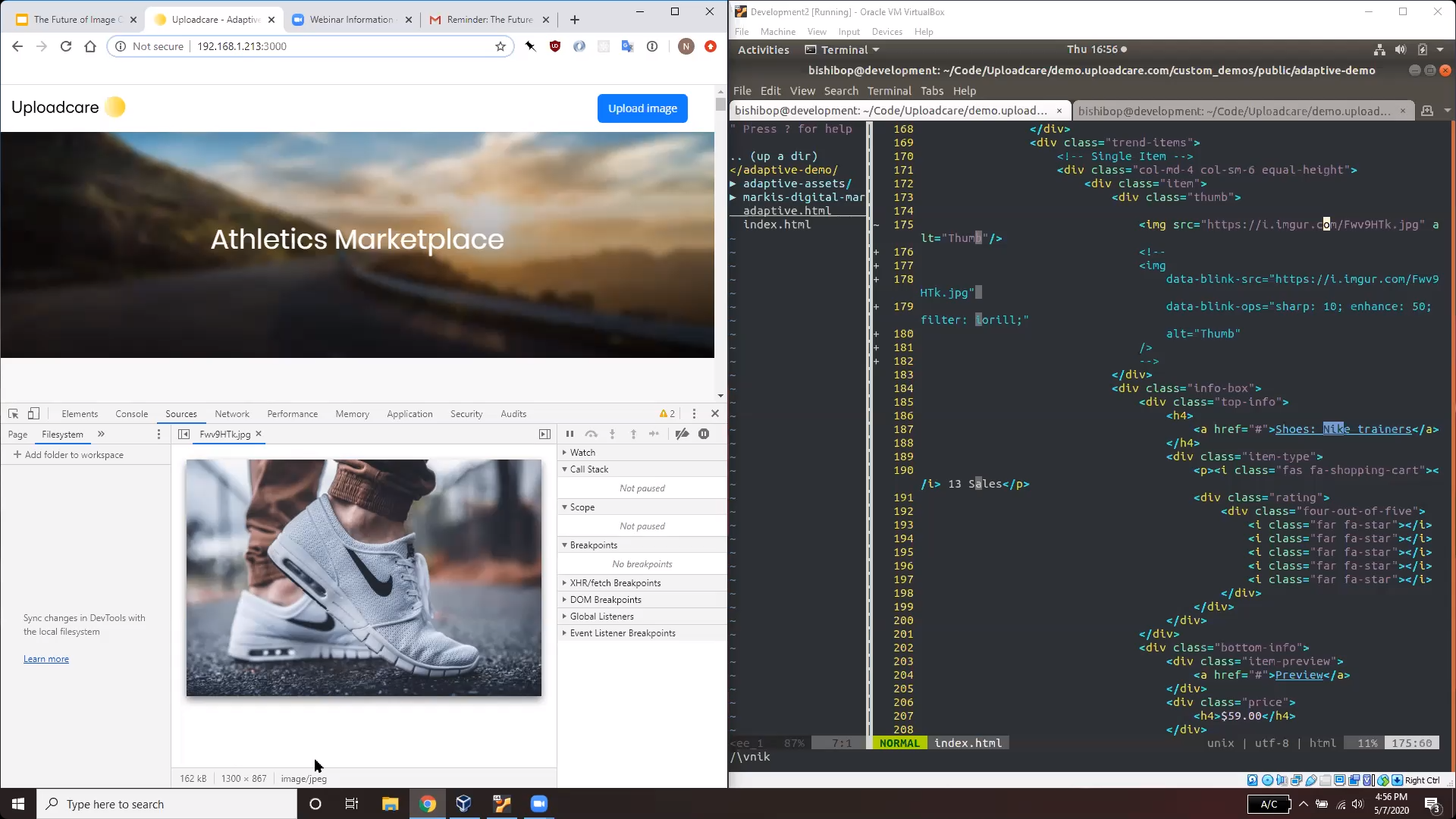 Screenshot with single image and HTML code
The sneakers image is represented by the HTML code displayed on the right side of the screen (look at lines 174-175):
<img scr="https://i.imgur.com/Fwv8HTk.jpg" alt="Thumb"/>Adaptive Delivery is going to dynamically optimize this image on the fly, implementing the image optimization techniques discussed above: it’ll compress the image, reformat it, and make it responsive. Once the Adaptive Delivery SDK is implemented, all it takes is just changing the source attribute: from img src to data-blink-src, as shown below:
<img data-blink-scr="https://i.imgur.com/Fwv8HTk.jpg" alt="Thumb"/>As a result, this sneakers image will go down in size from 160 kB to just 10 kB, it will be dynamically resized to the exact size that it's displayed in the viewport of the device (in this case, 335 x 223), and reformatted from a JPEG to a WebP image. All of this is done by a simple change in the source tag.
Adaptive Delivery & vanilla HTML: many images
Lazy loading, the fourth image optimization technique we discussed above, can be implemented to work with many images. If you change the source attribute from img src to data-blink-src for all the images on the page, Adaptive Delivery SDK will implement lazy loading so that images will load gradually as you scroll down the page:
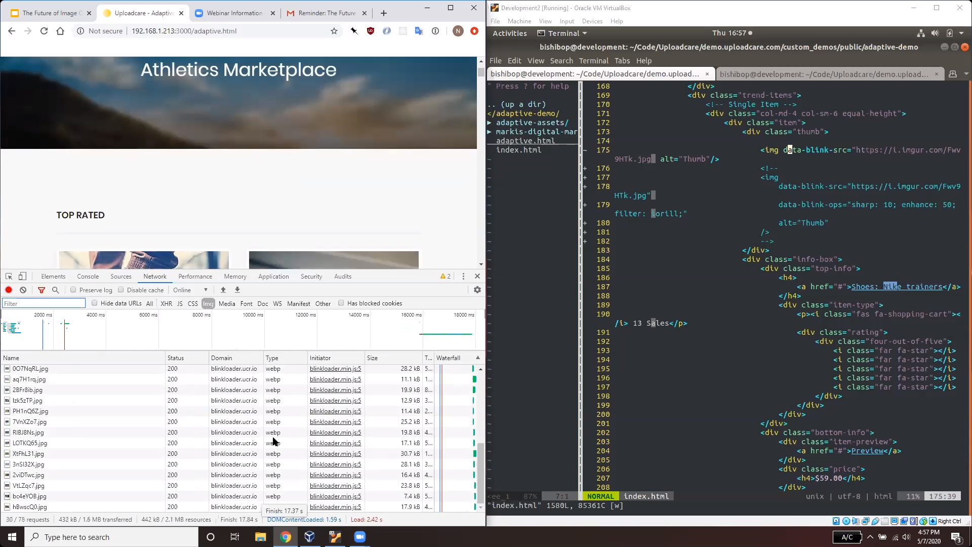 Screenshot with multiple images and HTML code
The images are now hosted on Uploadcare’s CDN. Moreover, they all get reformatted to WebP and their size goes down to below 100 kB. As a result, the size of the whole webpage has also been reduced: its image data has gone down from 5 MB to just 500 KB. In general, Uploadcare’s Adaptive Delivery allows you to save as much as 60% of the total website image weight, for pages that already have some image optimization in place.
In addition to Adaptive Delivery, Uploadcare’s CDN also supports a whole range of image transformations on top of optimization. All this functionality is also available and integrated with Adaptive Delivery. If you add another attribute — data-blink-ops — any additional transformations can be implemented on top of image optimization. The code is shown below:
<img data-blink-scr="https://i.imgur.com/Fwv8HTk.jpg"
     alt="Thumb"
     data-blink-ops="sharp: 10; enhance: 50; filter: ioril;"/>
With the data-blink-ops attribute you can sharpen, enhance, and filter the image using a CSS-style syntax. Image transformations come on top image optimization, so the transformed image remains optimized, reformatted, and responsive. Now let’s look at how the image has changed as a result of these operations:
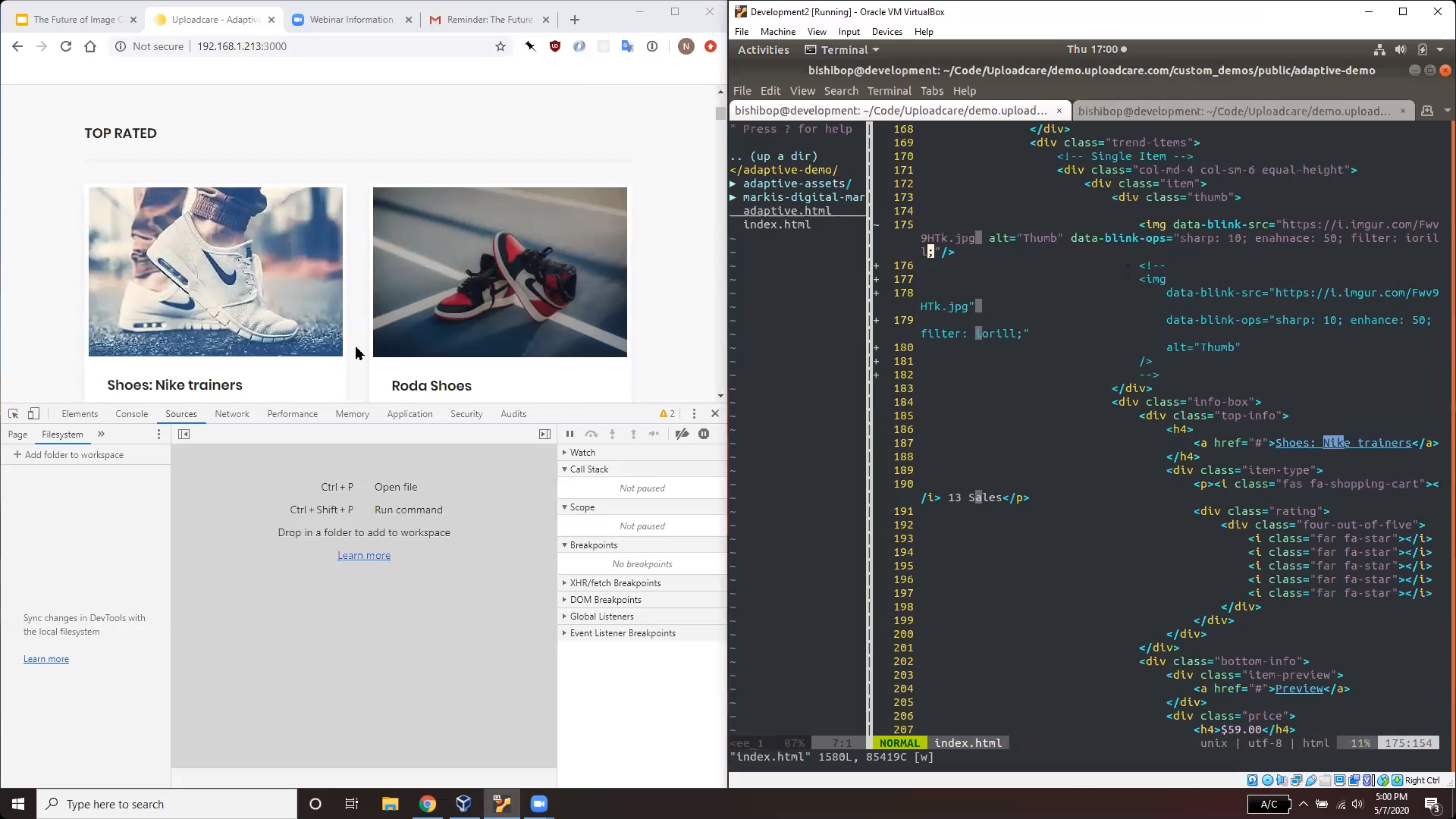 Screenshot with the results of changes
Adaptive Delivery in the wild: Shopify
As you can see from the screenshot below, initially the total page data is almost 2 MB.
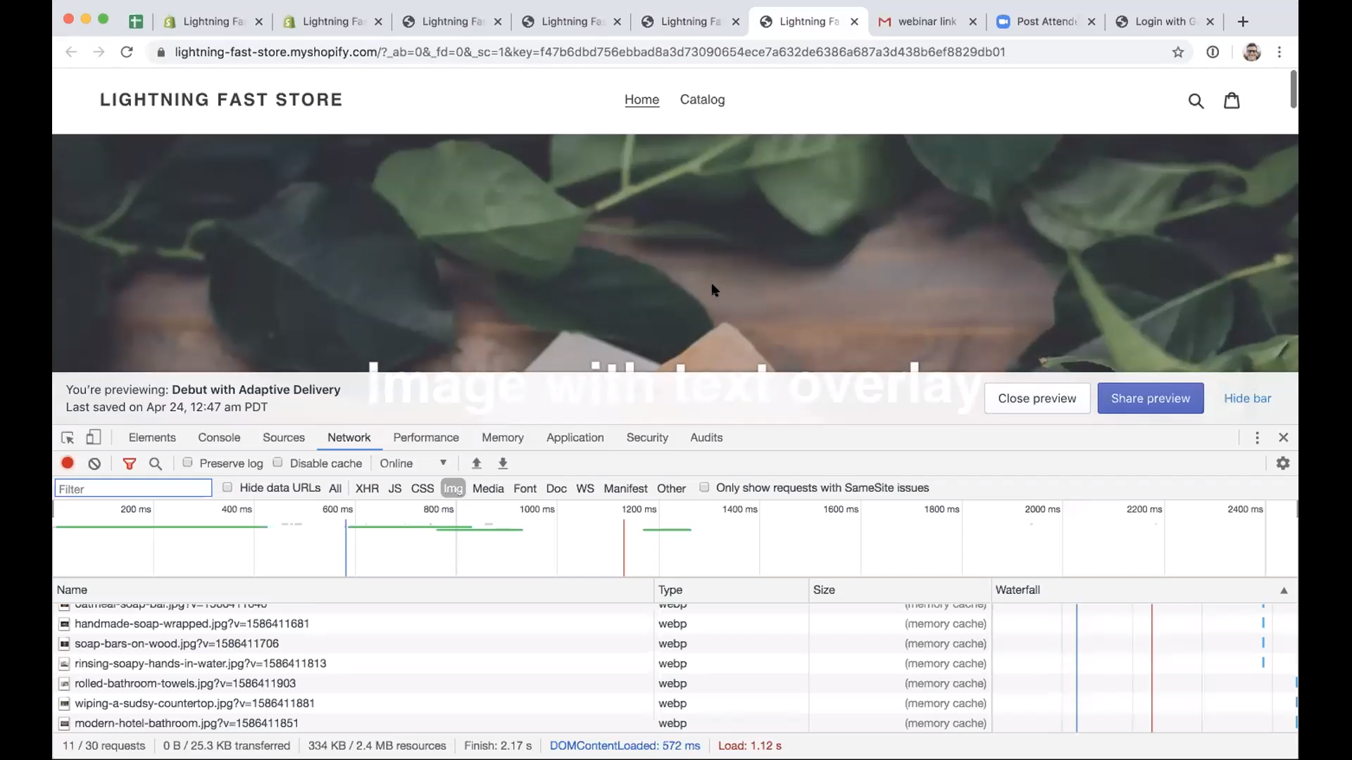 Image with text overlay
Shopify integrates image responsiveness and optimization, but it takes a dozen lines of code and requires you to specify a lot of parameters. This is a rather tedious process which you will have to repeat for every image used on the website:
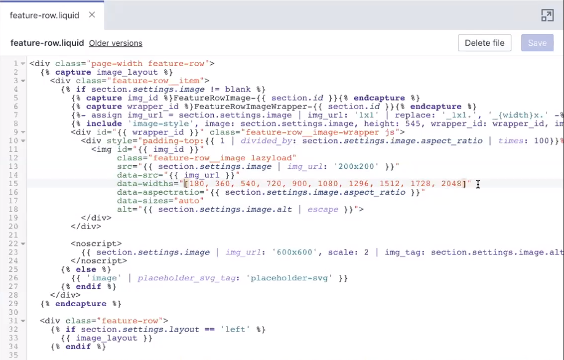 Shopify code and requirements
To implement Adaptive Delivery on an external platform — in this case, Shopify — you just need to add a code snippet to the layout as shown below:
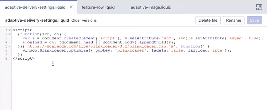 Code snippet
Then, create a special component (here called Adaptive-image) where you provide the image source using Shopify’s liquid templates syntax:
 Special component
Afterwards, if you need to use this image, just include this template in the exact same place where it was…and enjoy just how much simpler it is to integrate responsive images with Adaptive Delivery!
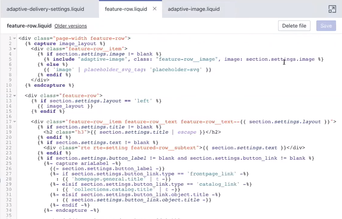 Code template
The effects are also immediately visible on the webpage: its data size is down from 2 MB to 300 KB, because the piece of the pie taken up by images was drastically reduced.
Adaptive Delivery can save a lot of time on integration, and is especially useful if you have a lot of complex layouts and legacy content on your webpage. And there’s also no need to upload anything manually: Uploadcare uses an image proxy that goes through all the images and replaces the old versions with optimized ones.
Conclusion
Uploadcare’s Adaptive Delivery is a state-of-the-art full-stack image CDN which improves image performance and can be integrated with a variety of external platforms, as well as easily implemented with vanilla HTML. It supports all four of the image optimization techniques discussed above, including image compression, responsiveness, reformatting, and lazy loading.
Moreover, a range of image transformation tools are also available on top of image optimization, and neither optimization nor transformation will affect the visibility of the images for web crawlers. Thus, you can reduce your website’s total image data weight by 40% with just a few lines of code and boost your image performance with no hurdles at all!