Optimizing images in your React applications can help enhance their web performance,
Core Web Vitals metrics, and overall user experience.
In this article, we will explore some of the best techniques for optimizing images in a React application,
ranging from browser built-in methods to third-party libraries and solutions, as well as best practices to follow.
Why image optimization matters in React projects
Images make up a significant portion of the total weight of most React applications.
Having large and unoptimized images in your React applications can negatively impact the performance of your application
and affect important Core Web Vitals metrics, such as Largest Contentful Paint (LCP) and Cumulative Layout Shift (CLS).
Another reason why image optimization is important is that its poor performance can also impact
how search engines like Google crawl it.
How to optimize images in React: Key considerations
When optimizing images in React, there are a few considerations you must keep in mind to know which optimization methods
would work best for you.
Ask yourself the following questions:
What image formats should I serve?
There are various image formats, including JPEG, PNG, WebP, and AVIF.
Deciding which to serve in your application depends on the users you’re serving, what browser they use,
and if their devices support these image formats.
What are the responsive requirements I need to meet?
What devices would users use to access the images in your application?
Do you need images that fit mobile, tablets, and desktops?
The type of application you’re building is also a contributing factor when planning to make your application responsive.
For example, if you’re building a business-oriented application, especially one used in office environments,
there’s a strong likelihood that many users will access it from desktop devices rather than mobile.
What optimization methods are enough?
Do you need to optimize just a few static images in your application?
Then, using a simple image optimization tool is enough.
How about when you need to load images dynamically and optimize them when a user requests them?
If the application you are building will display images frequently in a gallery format,
would lazy loading be the best method to use?
Considering all of these questions will help you choose the best image optimization techniques that would work for you
while also providing users with a pleasant user experience.
Check out this article on how to upload files in React to learn more
about how to handle file uploads in your React applications, if you need to handle user-uploaded images in your application.
Top React image optimization techniques
There are various techniques you can employ to optimize images in your React applications,
ranging from built-in browser features to third-party tools and libraries. Let’s have a look at each one.
Use next-gen formats like WebP and AVIF
The first step is to convert your image to a format that allows for the smallest size possible while retaining its quality.
While there are various image formats, such as JPEG and PNG,
next-generation formats like WebP and AVIF tend to offer a more optimal file size with good quality compared to other formats.
Therefore, consider using them.
WebP is an image format specifically designed for the web by Google to serve smaller images with good quality,
comparable to JPEG.
AVIF, on the other hand, offers even better compression file sizes and retains the same quality as WebP images,
so consider using it where possible.
You can use a tool like Squoosh for converting your images manually or Uploadcare for automatic conversion.
Note: Most browsers already support AVIF and WebP images,
but it’s a good practice to provide a fallback format in case your user’s device doesn’t support these modern formats.
For example, the code below uses the picture element to provide support for AVIF and WebP images
and falls back to JPEG if none of those images are supported on the user’s device:
import React from'react';exportdefaultfunctionApp(){return(<picture><sourcesrcSet="/images/sample.avif"type="image/avif"/><sourcesrcSet="/images/sample.webp"type="image/webp"/><imgsrc="/images/sample.jpg"alt="Descriptive alt text"/></picture>);}
Responsive images with srcset and sizes attributes
Using the HTML srcset and sizes attributes, you can load responsive images in situations
where you need to display different versions of the same image for different screen sizes.
To implement this in a React application, you can use the snippet:
The code above shows an image with three different versions: image-480w.avif,image-800w.avif, and image-1200w.avif.
The sizes attribute tells the browser to display the various images based on the screen size of the user:
If the browser’s viewport is 600px or less, it loads the 480w image
If the viewport is between 600px and 1024px, it picks the 800w version
For viewports larger than 1024px, the browser serves the 1200w version
The downside of using the srcset attribute is that
you must provide multiple versions of the same image for the browser to choose from.
Still, with already existing image optimization tools and libraries, you can automate this process.
You’ll learn about that in the later parts of this tutorial.
Lazy load images using loading="lazy" or Intersection Observer
Lazy loading is another HTML optimization technique that loads images when they are needed rather than loading all images at once.
Because not all images on the webpage are loaded at the same time,
the time it takes to display the images in the user’s current viewport is reduced,
thereby giving the user the perception that the page loads faster.
When the user scrolls down to other parts of the page, the remaining images are then loaded.
To use lazy loading, set the loading attribute of the image to lazy:
Note: Be careful when using the lazy loading technique; when not correctly implemented, it can lead to layout shifts,
especially if the images are not properly sized, leading to a negative impact on Core Web Vitals scores
like Cumulative Layout Shift (CLS)
Use React image optimization libraries
Some React packages can help you optimize and serve images in your React applications without having to write a lot of code.
Let’s look at some of them.
react-image
react-image is a replacement for the <img> tag in React,
featuring fallback support, a loading indicator, and a React hooks API for loading multiple images.
To use the package, first install it in your project:
npminstall react-image
Then, when rendering images, you can use the react-image component instead of the usual <img> element:
The code above wraps the img element in the LazyLoad component
and provides a placeholder that will be rendered while the browser is fetching the image.
The once property signifies that the component should only be rendered once when it is first loaded.
You can also use the offset property to specify how far from the viewport the image should start loading,
which can help improve the user experience by preloading images before they come into view.
react-intersection-observer package
Another way to implement Lazy loading is to use the browser’s Intersection Observer API
to detect the user’s current viewport and show the image.
To implement this, you need a package like react-intersection-observer,
which is a React wrapper for the Intersection Observer API.
While the above methods are browser-built-in methods for optimizing images,
there are a couple of React packages that do a great job of helping you optimize images during build time,
just before bundling and building the production version of your application.
These packages can help you perform multiple things, like:
Convert your images to a different format, e.g., from JPEG to WebP or AVIF
Compress images using lossless or lossy mode
Resize the width and height of images
Let’s look at some of them.
Webpack plugin
If you use webpack in your project, you can use the image-minimizer-webpack-plugin package to optimize images during build time.
This package supports various image optimization tools, such as imagemin, Sharp, and SVGO.
To use the plugin for lossless compression, update the webpack.config.js file:
const ImageMinimizerPlugin =require('image-minimizer-webpack-plugin');
module.exports ={module:{rules:[// You need this, if you are using `import file from 'file.ext'`, for `new URL(...)` syntax you don't need it{test:/\.(jpe?g|png)$/i,type:"asset",},],},optimization:{minimizer:[newImageMinimizerPlugin({generator:[{// You can apply generator using `?as=avif`, you can use any name and provide more optionspreset:"avif",implementation: ImageMinimizerPlugin.sharpGenerate,options:{encodeOptions:{avif:{quality:90,},},},},{// You can apply generator using `?as=webp`, you can use any name and provide more optionspreset:"webp",implementation: ImageMinimizerPlugin.sharpGenerate,options:{encodeOptions:{webp:{quality:90,},},},},],minimizer:{implementation: ImageMinimizerPlugin.sharpMinify,options:{encodeOptions:{jpeg:{// https://sharp.pixelplumbing.com/api-output#jpegquality:100,},webp:{// https://sharp.pixelplumbing.com/api-output#webplossless:true,},avif:{// https://sharp.pixelplumbing.com/api-output#aviflossless:true,},// png by default sets the quality to 100%, which is same as lossless// https://sharp.pixelplumbing.com/api-output#pngpng:{},// gif does not support lossless compression at all// https://sharp.pixelplumbing.com/api-output#gifgif:{},},},},}),],},};
Notice that you can also set the image quality levels when using lossless compression.
For lossy compression, replace the content of the webpack.config.js file as follows:
const ImageMinimizerPlugin =require('image-minimizer-webpack-plugin');
module.exports ={module:{rules:[// You need this, if you are using `import file from "file.ext"`, for `new URL(...)` syntax you don't need it{test:/\.(jpe?g|png)$/i,type:"asset",},],},optimization:{minimizer:[// ...newImageMinimizerPlugin({minimizer:{implementation: ImageMinimizerPlugin.sharpMinify,options:{encodeOptions:{// Your options for Sharp// https://sharp.pixelplumbing.com/api-output},},},}),],},};
When using images in your applications, you can call them with some parameters to convert and optimize them, e.g:
Image CDNs are a great way to drastically improve the load time of your images,
as CDNs make it easier to cache files for quick delivery and ensure images are served as fast as possible.
Uploadcare image CDN provides you with a fast image CDN that comes with a
built-in image processing URL API to programmatically apply multiple
image transformations on the fly before delivery.
For example, when your images are hosted on Uploadcare’s image CDN, you can apply optimizations
and transformations to images as you see fit using the URL API.
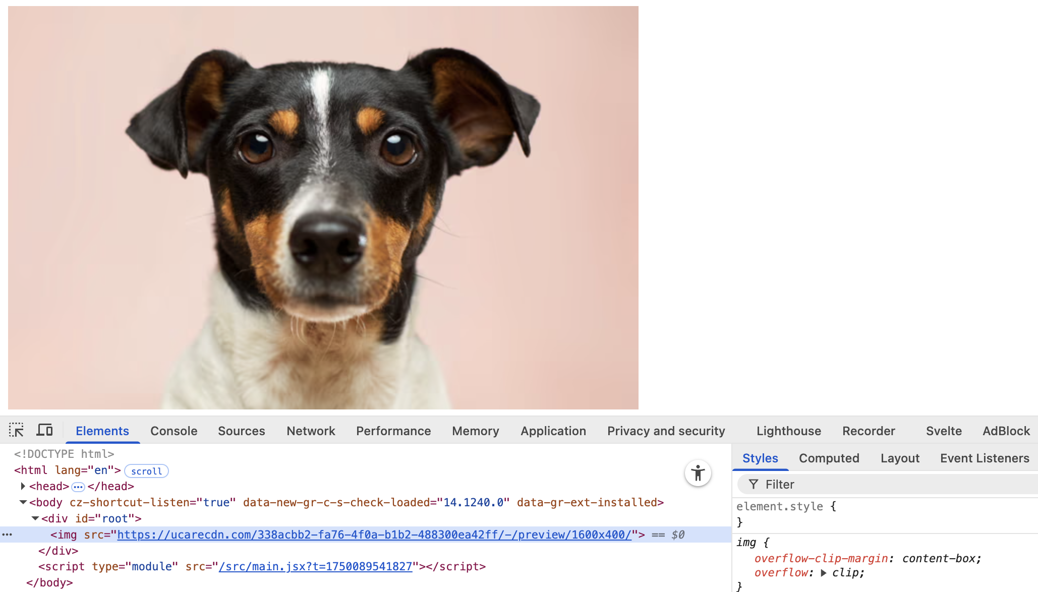
The URL-based API for optimization can be used like this:
https://6ca2u7ybx5.ucarecd.net is the base CDN URL images uploaded to your project.
The subdomain 6ca2u7ybx5 is unique to your project and can be found in your project’s delivery settings.
338acbb2-fa76-4f0a-b1b2-488300ea42ff is the UUID of the image you want to optimize
-/preview/1600×400/ is the resolution of the image you want to use
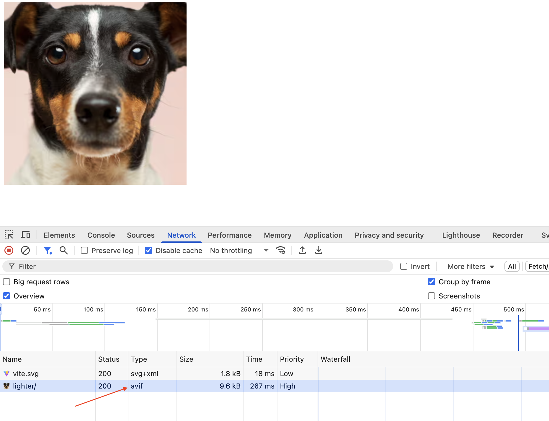
Image optimization with Uploadcare CDN
If adaptive image delivery is enabled in your Uploadcare project,
Uploadcare will automatically determine the best image quality and format to serve to the user, starting with AVIF.
If AVIF is not supported, it falls back to WebP and JPEG, depending on the user’s device.
By chaining the transformation parameters, you can specify the format and quality of the image you want to serve to your users.
The code above tells Uploadcare CDN to smart crop the photo by face
and apply a quality value of lighter (≈80% of the original file size).
This allows you to apply multiple transformations to your images to fit your needs without altering the original image.
Multiple image transformation with Uploadcare
Using a CDN and image optimization service like Uploadcare ensures
that you can optimize images at runtime while also reducing the load on your servers,
as images are served from a globally distributed network of servers.
In summary, by combining techniques such as serving next-gen image formats (WebP and AVIF), responsive images with srcset,
lazy loading, and leveraging React libraries, you can significantly reduce image load times
and enhance the overall performance of your application.
Also, remember that optimization isn’t a one-and-done deal.
Still, you can give your users the best experience possible by continuously monitoring your app’s performance
using tools like Lighthouse, WebPageTest, or PageSpeed insights.
These tools can help identify bottlenecks and unoptimized images and suggest
which resources can be lazy-loaded or compressed for further optimization.
Plus, with image optimization services like Uploadcare, optimizing images on the fly is seamless, without manual intervention.
FAQs
What’s the best way to optimize images in React?
Using a combination of techniques that work together to reduce load times and improve visual performance can be effective.
First, serve your images in modern formats like WebP or AVIF whenever possible — these formats are more efficient
and load faster than older formats like JPEG or PNG.
Next, lazy load images that are not immediately visible in the viewport using the native loading="lazy" attribute
or a React-friendly library, such as react-lazyload.
You’ll also want to serve responsive images using srcset and sizes,
so users on smaller devices aren’t downloading unnecessarily large assets.
Compress your images before bundling them with tools like TinyPNG, ImageOptim, or Sharp.
Finally, consider using an image CDN or optimization service, such as Uploadcare,
to handle delivery, resizing, and format conversion on the fly.
When used together, these techniques provide your users with a fast and responsive experience without compromising image quality.
Should I use WebP or AVIF in my React app?
Ideally, use both. WebP and AVIF offer significantly better compression than JPEG and PNG,
resulting in faster load times and lower bandwidth usage, especially on mobile devices.
AVIF typically provides even smaller file sizes than WebP, but its browser support is still catching up compared to WebP,
which is widely supported across all modern browsers.
To get the most out of both formats, you can use the <picture> element to offer multiple options to the browser.
For example, you might serve an AVIF version if the browser supports it,
fall back to WebP for broader coverage, and provide a traditional JPEG as a final fallback.
This ensures users always get the best possible experience based on their browser’s capabilities.
What tools help automate React image optimization?
At build time, tools like imagemin, Sharp,
and Webpack plugins such as image-minimizer-webpack-plugin and vite-imagetools can compress images
as part of your project’s bundling process.
These tools are helpful when you manage static assets manually or via a design pipeline.
For runtime optimization, particularly when serving user-uploaded images or assets from a content management system (CMS),
services like Uploadcare can be helpful. It offers APIs and URL-based transformations for resizing,
optimization, and delivery through global CDNs.
If you’re using a React framework like Next.js, the built-in <Image> component automates many of these best practices,
including lazy loading, responsive sizing, and format negotiation.
Can image optimization improve my SEO?
Yes, when images are optimized, they contribute directly to better Core Web Vitals scores — especially Largest Contentful Paint (LCP),
which Google uses as a ranking signal. Faster load times reduce bounce rates
and improve the likelihood that a user will stay and engage with your content.
Additionally, optimized images that include descriptive alt attributes are more accessible and easier for search engines to understand,
which can improve your site’s visibility in image search results.
Trust Jamin Okpukoro is a Developer Advocate and Senior Technical Writer with a strong background in software engineering, community building, video creation, and public speaking. Over the past few years, he has consistently enhanced developer experiences across various tech products by creating impactful technical content and leading strategic initiatives. His work has helped increase product awareness, drive user engagement, boost sales, and position companies as thought leaders within their industries.